Looking for some Shopify landing page examples to inspire your next ecommerce product page?
You’ve come to the right place.
We’ve assembled 11 of the most effective ecommerce landing page examples we could find, and broke them down piece-by-piece to show you how they’re laid out and why they’re so successful.
As you read, keep an eye out for any strategies that might be a good fit for your product page.
Here’s how this post is organized.
We’ve categorized the landing page examples according to the 3 main types of landing pages: short-form pages, long-form pages, and mini-sites.
For each type, we start with an in-depth review of a landing page example that does everything right. We go through it step by step, pointing out and explaining all the important conversion elements on the page.
Then we list even more product landing page examples for that type, along with a shorter explanation of what that page does well.
Sound good? Then let’s dive into our short-form landing page examples.
Short-Form Shopify Landing Pages
This is the classic. When you think of an ecommerce product page, the image that comes to mind is probably a short-form-style page.
As their name obviously implies, these pages are relatively short. They’re a good choice for products that don’t require much explanation because they are either:
- Simple and easy to understand
- Highly visual
- Inexpensive
In our examples below, you’ll see killer short-form Shopify landing page examples for grooming, clothing, and household items. And for our deep-dive, we’ll take a look at one of the most successful skin care products online today.
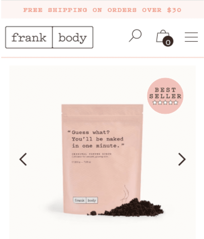
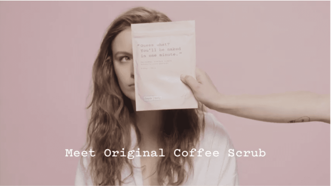
Short-Form Shopify Landing Page Example: Frank Body Coffee Scrub
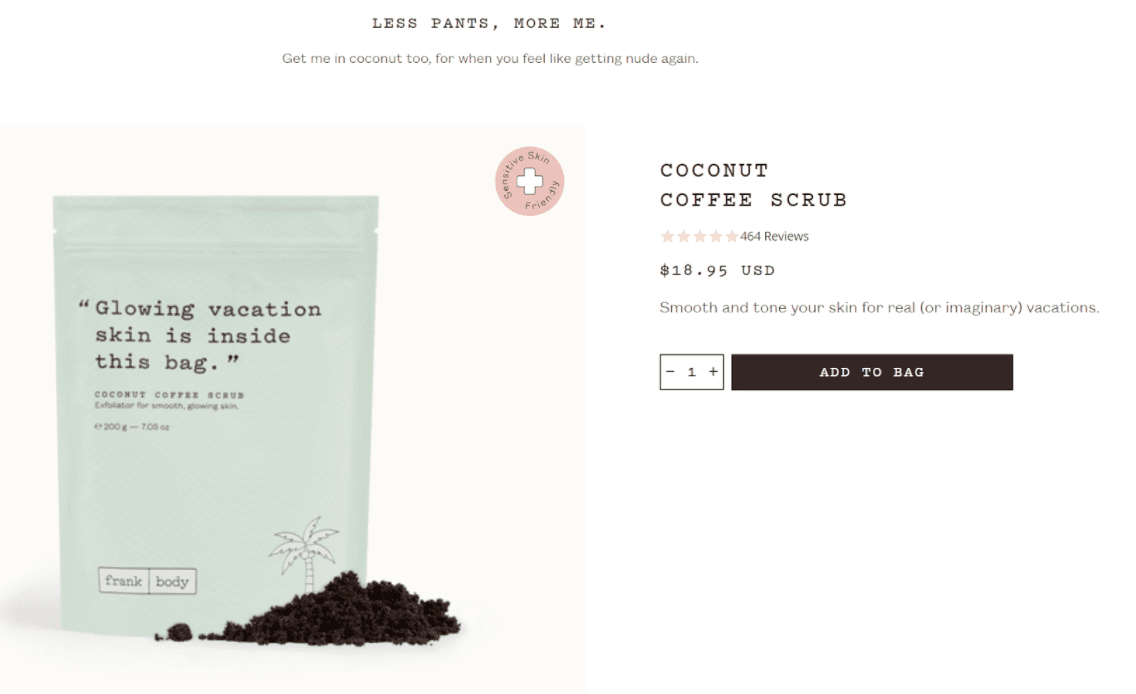
Frank Body has a lot of successful products, but their Coffee Scrub is their bestselling home-run hit.
Here’s the short-form landing page they use to sell it:
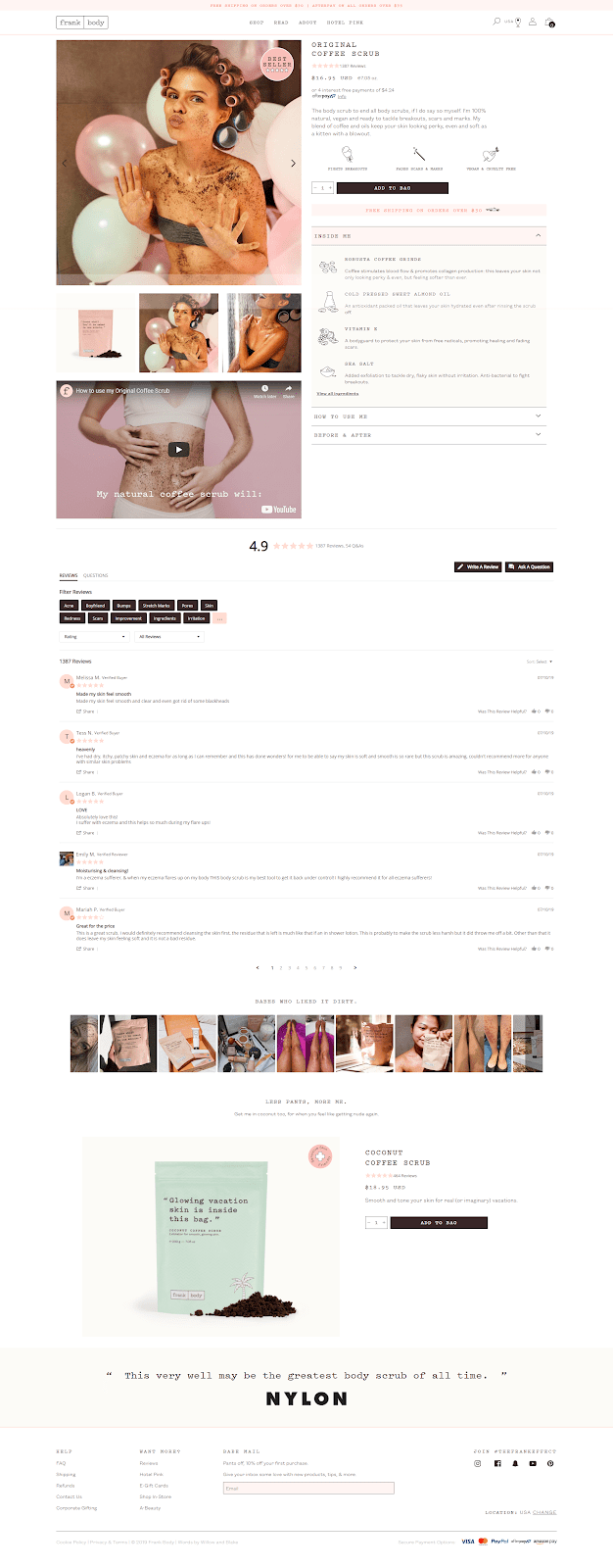
We’re going to go through this page piece by piece, and deconstruct what they’re doing that is so effective.
Header & Menu
Starting at the top, let’s zoom in on Frank Body’s header and menu:
Some people make the mistake of not putting much thought into this part of their page. But remember: this is what people use to get around your site. A good header will make your site easy to navigate, while a bad one can lead to a frustrating experience for your visitors.
Frank Body starts with a pink bar at the top, calling out free shipping on orders over $30. This is a smart thing to do, since free shipping is HUGE for ecommerce. According to a recent poll, free shipping is the single most important consideration for 79% of consumers:

Source: https://www.shopify.com/enterprise/ecommerce-fulfillment-free-shipping
Frank Body’s menu/header is very slim. It includes the logo, a handful of important links, and some website options on the top right—most important of which is the cart.
Now when you’re working on your menu and header, you should always think about mobile, too. With mobile traffic now taking up a big percent of all visitors, this is a really important thing to get right. It’s also more difficult, because there’s less screen real estate.
Here’s what Frank Body does on mobile:
They’ve kept the most important things in plain sight: the free shipping call-out, the logo, and the cart. The hamburger button opens the menu, which looks like this:

It’s not bad—it contains all the important links, and it’s all legible—but if we were to nitpick, it’s a bit too long. (You can scroll down to see a half-dozen more links.) One easy solution would be to take some of those links at the bottom and put them under a collapsible header.
Another thing to note about Frank Body’s header is that the entire thing is sticky, which means it sticks to the top of the page as you scroll down. This is a smart way to make your site even easier to navigate.
A sticky header probably isn’t as important on a short-form page like this, since it doesn’t involve as much scrolling as a long-form page. But since Frank Body keeps their header small enough to where it isn’t taking over the screen, there’s no harm in keeping it always visible.
Copywriting
Most short-form product pages don’t contain much copy, and Frank Body’s Coffee Scrub fits that mold. In fact, the only copy above the fold is this short paragraph:
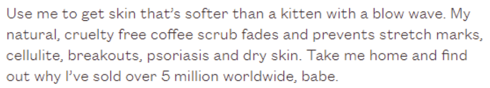
This product description is short and sweet, and like everything else on this product page, it’s oozing with personality and a playful voice. It quickly hits the product’s main benefits without going on and on.
How Does The Product Work?
Shoppers today are skeptical. So anytime you make a claim—like Frank Body’s claim that their Coffee Scrub will fade stretch marks and reduce breakouts—you need to back that up with copy that explains how and why your product works.
Like most skin care products, Frank Body does this by pointing out some of the product’s key ingredients and explaining why they’re good for your skin:
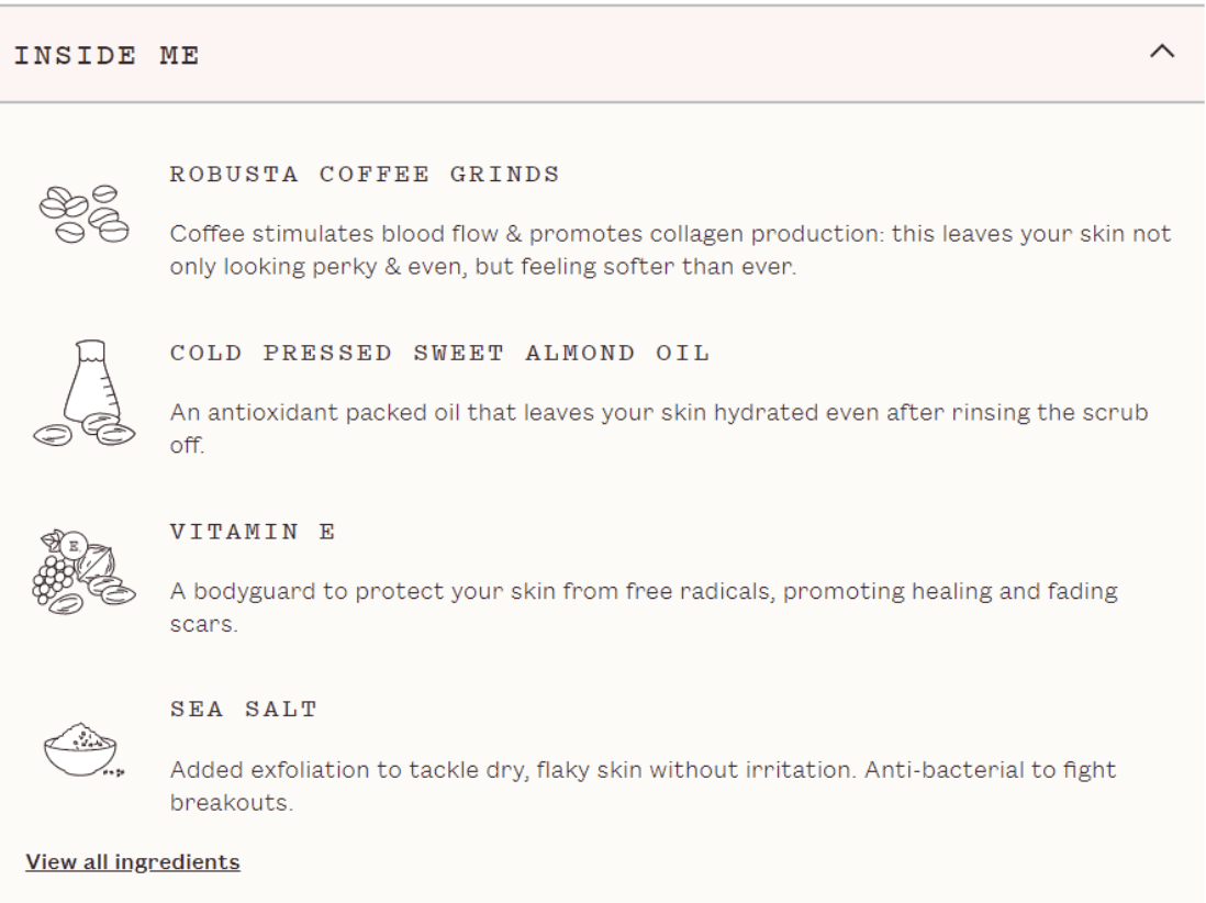
This is the section where you take a peek under the hood and give your visitors a glimpse of what it is that makes your product so effective.
Sales Video
Adding a video to your page is a great way to build desire for your product. It can help shoppers to visualize the product and see it in action.
Frank Body embeds this 30-second product video on their page. Like their copy, it’s short and paints the product in a fun light:
Having a short product video like this is super useful, because you can also use it to promote your product on social media.
USP Image
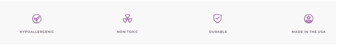
Here are the simple USP images Frank Body uses for this product. They focus on two product benefits and on the fact that they’re vegan/cruelty-free:
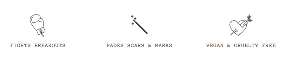
Keep in mind, your USP images can highlight any benefit at all—free shipping, made in the USA, cruelty-free, and so on.
If there’s any reason people might want to buy from you, it’s a good idea to put it in that image.
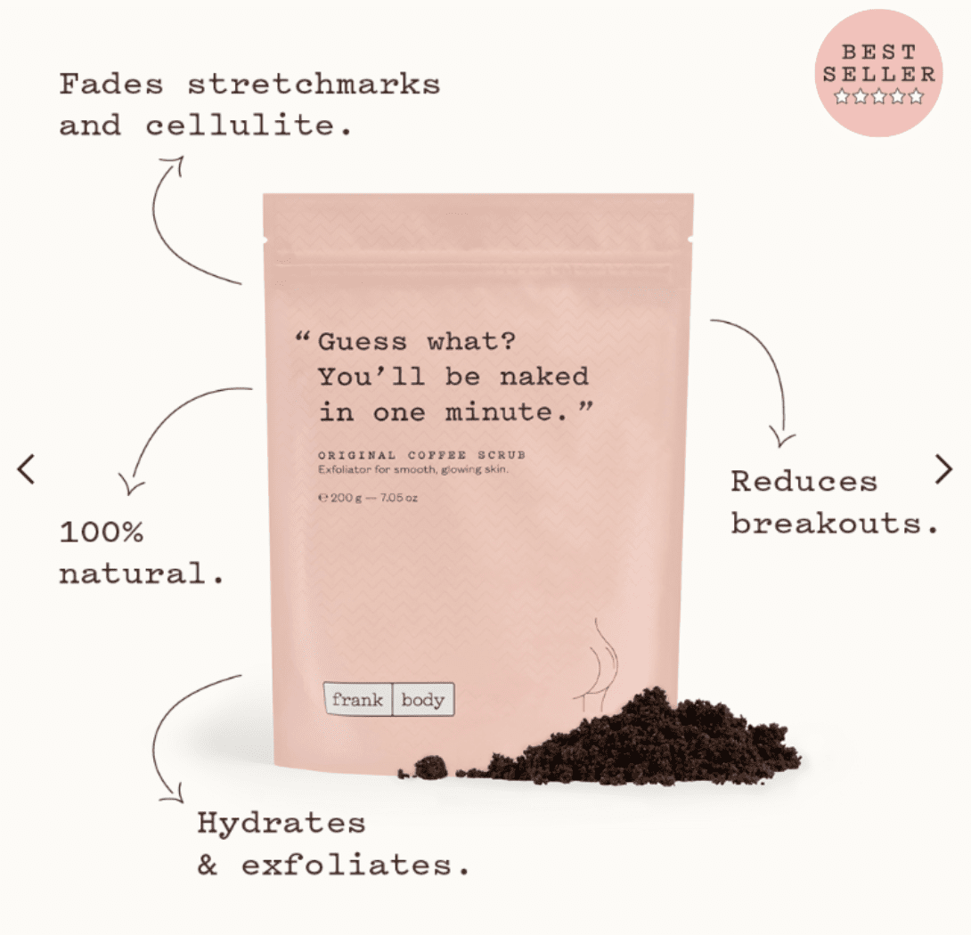
Product Images
Frank Body has added some copy to their main product shot to call out some of the product’s main benefits:
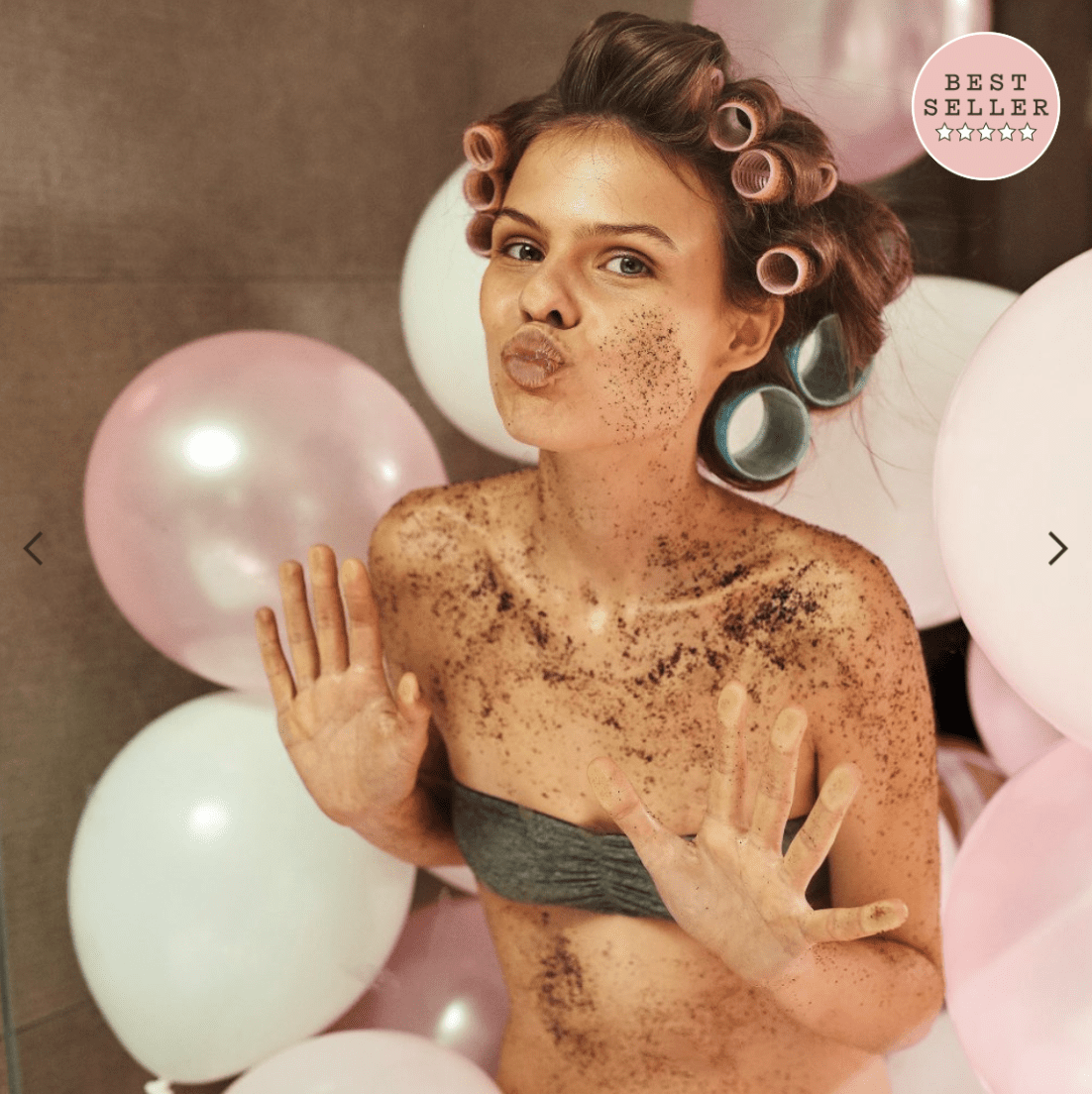
Then they go into a handful of lifestyle images showing a woman using the product and—this is important—having fun while she does it:
And they use one more type of product image, which is a before & after image:
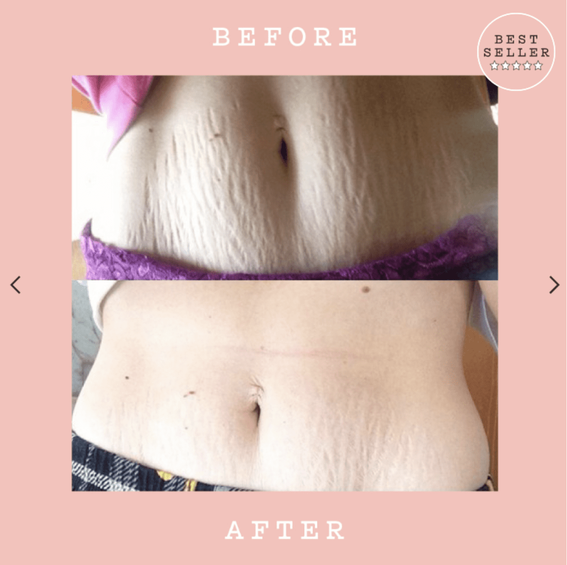
Depending on your product, you might need to be careful with these kind of images—in some cases you can potentially get in hot water with the FTC if they think you’re making unrealistic promises about the effectiveness of your product or service. (This can be an issue with weight loss products, for example.)
But that said, a good before & after image can be extraordinarily persuasive to the right person.
(Check out this article about OneClickUpsell’s new Image Carousel feature.)
Social Proof
Without a doubt, social proof can carry a lot of weight with consumers. Frank Body does a fantastic job of leveraging this great quote on their product page:
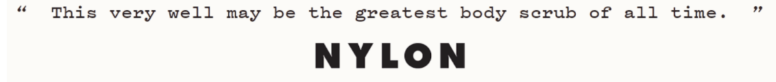
Notice that they don’t post a big long paragraph here. Instead, they focus on the ONE most powerful sentence to maximize impact and get their message across in a way that’s impossible to ignore.
Upsells, Cross-Sells, & Recommended Products
This is one aspect of Frank Body’s product page that could use a little work. They only recommend one other product to visitors, and that recommendation comes at the very end of the page:
Frank Body has a decent number of products, so there’s no reason they couldn’t recommend more up-sells or cross-sells to their visitors. For example, they could offer an upsell to this kit that contains 5 different coffee scrubs:
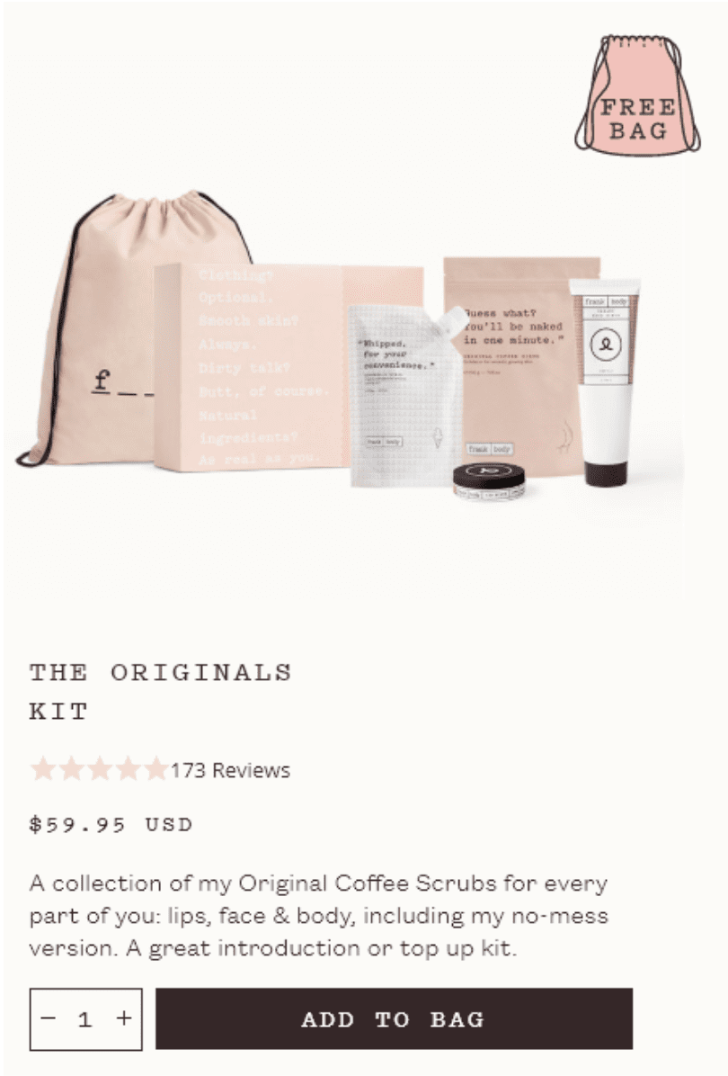
Even though the take-rate on this offer may be low, it would more than triple their revenue from anyone who upgraded to the kit.
For more information on adding pre-purchase upsells and cross-sells to your products pages, check out this article.
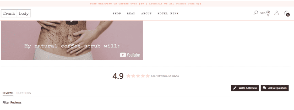
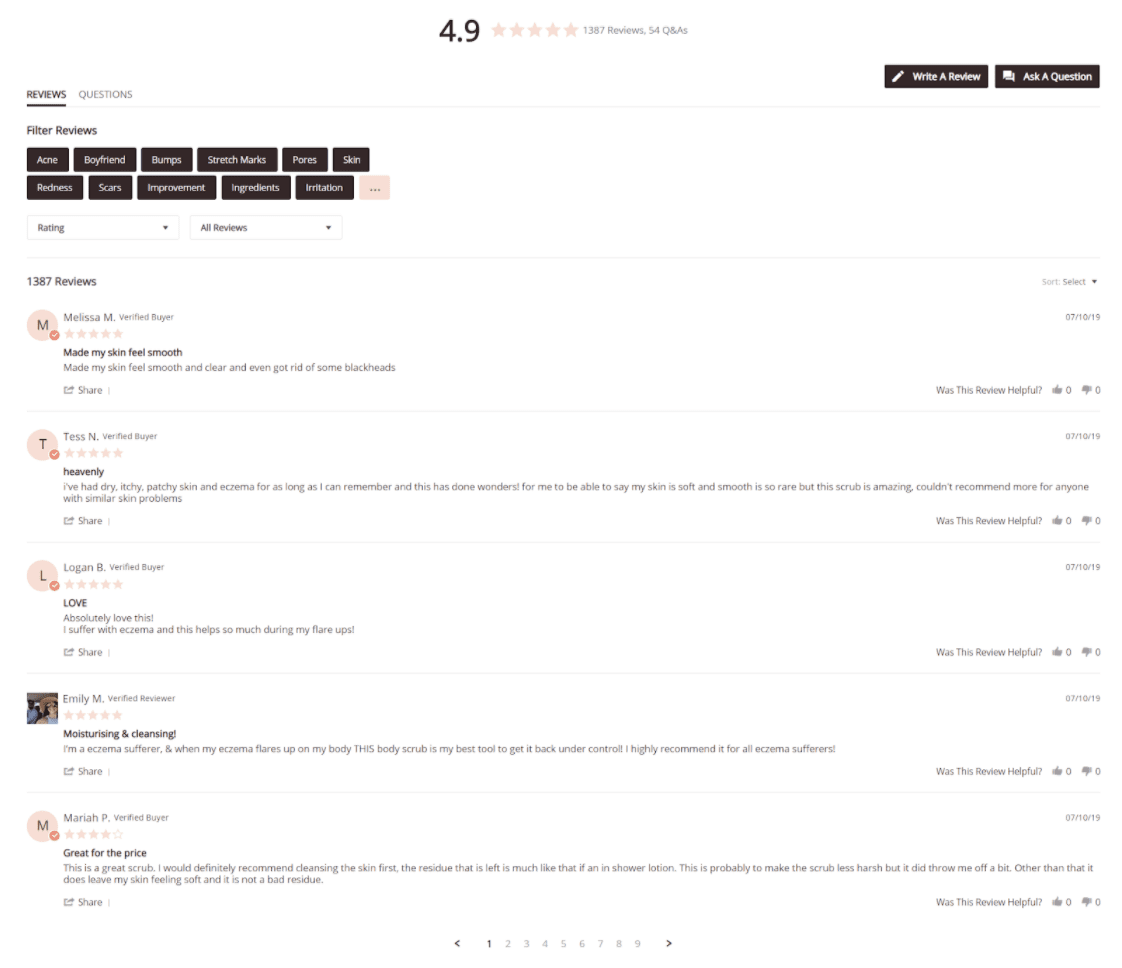
Reviews & Featured Testimonials
Reviews can be one of the most powerful conversion assets on your product page, and Frank Body does a great job leveraging their product’s phenomenal 4.9-star rating. They make it easy to view Q&As about the product, and you can even filter for reviews based on the rating or keyword.

Buy Box
Frank Body puts their Buy Box in the top-right, which is pretty typical for most short-form product landing pages. Here’s what it looks like:
In addition to the basic information (product name, size, price, and brief description), notice that Frank Body also includes a snapshot of the product reviews, the USP image, and a reminder of the free shipping policy.
More Short-Form Shopify Landing Page Examples
Harry’s Truman Shave Set
Harry’s uses a short-form landing page for this shaving set:
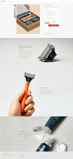
This is a bit long for a short-form page, but that’s mainly because Harry’s chose to break out 3 of their copy points next to a big image.
It’s an effective layout.
Imagine if Harry’s had taken those 3 chunks of copy (5 German Blades, Increased Control, and Smooth Shave) and simply listed them in bullet-point form. They wouldn’t have nearly the same impact, would they?
This example page is a great illustration of how you can use design to draw attention to specific elements of the page that are important.
House of Holland
House of Holland is a clothing brand with very simple product landing pages like this one:
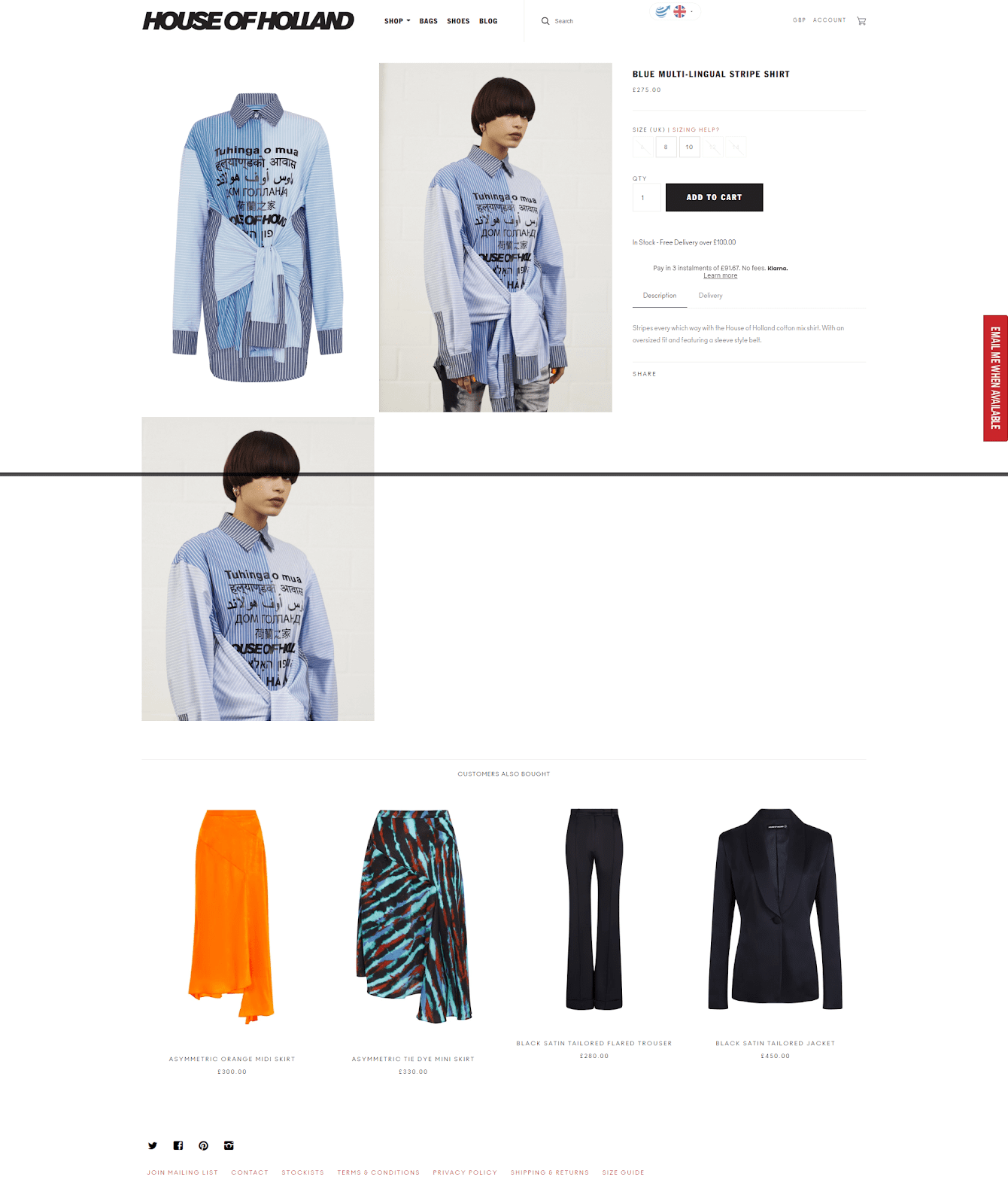
This is about as simple and straightforward as a product landing page gets.
And for a clothing company whose product is all about appearance, this makes sense! After all, there isn’t much to say about a shirt. All the shopper really wants to see is what it looks like from several different angles.
One smart thing that House of Holland does here is to make the images automatically zoom on mouse-over. So as soon as your mouse hovers over an image, it automatically zooms in to give you a closer look.
This page doesn’t feature any reviews, which isn’t uncommon for clothing stores. Most clothing styles don’t last forever, which gives clothing products a limited time span to accrue reviews.
But instead, House of Holland draws your attention to some of their other products with a section called “Customers Also Bought.” And these product images also rotate on mouse-over, making it easy to quickly get a snapshot of 4 more products you might be interested in buying.
Instant Pot
Just to show you that not all short-form product pages have to skimp on the copy, here’s an example landing page with some meat on its bones. (And by meat, we mean copy. We’re weird like that.)
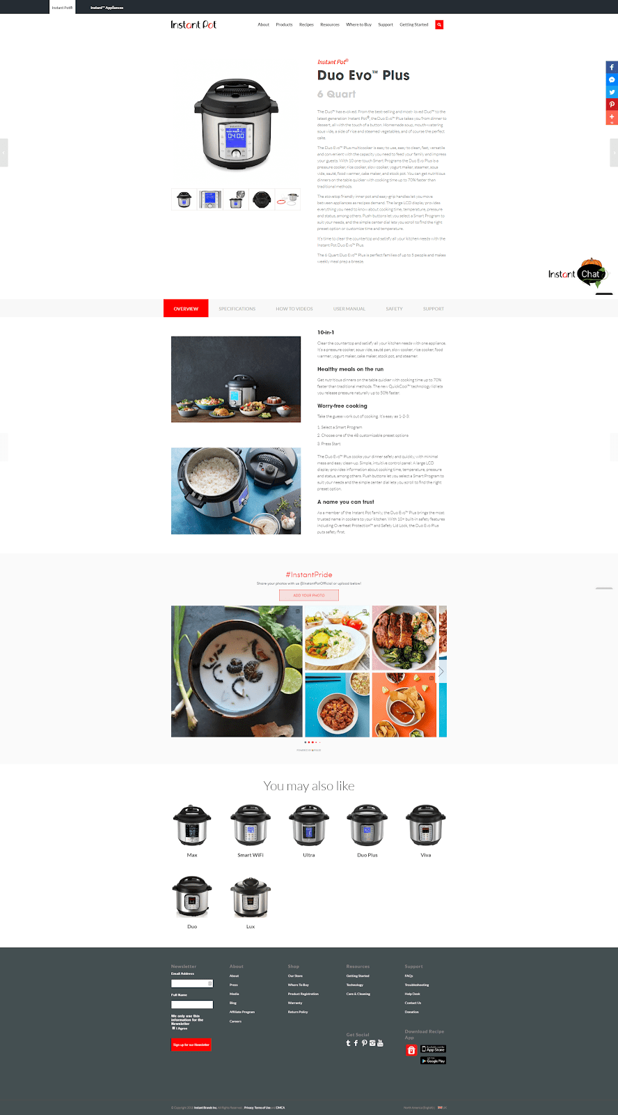
This page has a lot more copy than our previous examples, while still being a short page that gets its point across quickly.
One way Instant Pot keeps the length down is by using a tabber section that visitors can click on to view more information:
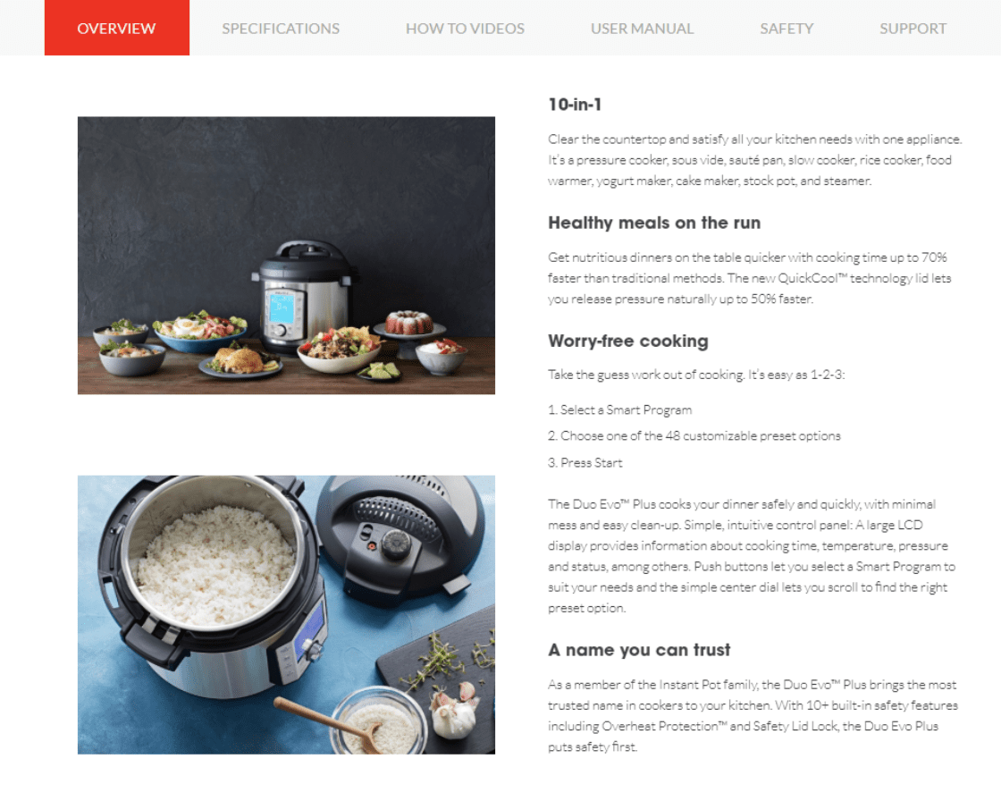
The nice thing about a tabber section like this is that you don’t have to scroll through all the different sections unless you want to.
The two downsides of a tabber section are:
1) It requires the visitor to make clicks.
2) Some people might not realize they can click.
So if you’re going to use a section like this, it might be a good idea to test it. Try it against a more straightforward page and see if your visitors like it, or if it trips them up.
Long-Form Shopify Landing Pages
Long-form product landing pages are—surprise, surprise—long!
There’s really no limit to how long your product page can stretch on. As long as you still have compelling content to add to your page, it can go on and on. Rest assured, if your visitor is interested in buying, they will keep on scrolling.
The landing page examples in this section are all lengthy pages overflowing with compelling copy, quality images, and other persuasive conversion assets.
Long-Form Shopify Landing Page Example: Purple Mattress
Purple sells high-tech, high-end mattresses online.
You might think selling a mattress online would be tough. Is it really possible to sell an expensive mattress (their most expensive model costs around $5,000) online?
The answer, it turns out, is yes. But it takes a top-notch product landing page to do it.
And that makes Purple Mattress a fantastic landing page example to study.
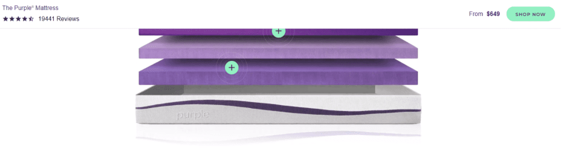
Header & Menu
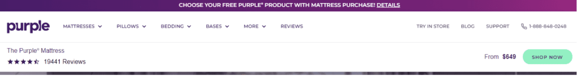
Let’s start at the top, by taking a look at what Purple is doing in their header.
Here it is, in all its purple glory:
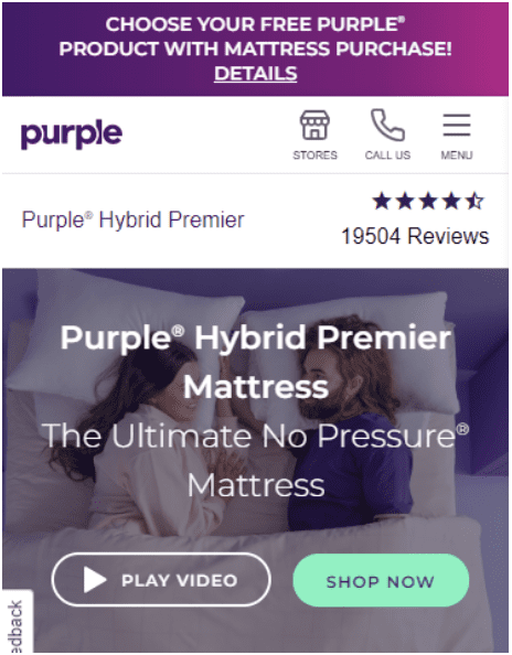
And here’s how it looks on mobile:
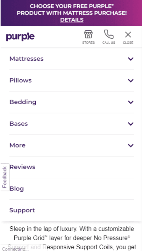
And here’s what you see when you expand the mobile menu:
All right, before we dig in here, let’s take a second to review the 6 goals of every product page header:
1) Provide access to all necessary content.
2) Not get in the way.
3) Be easy to use.
4) Support the call to action.
5) Give easy access to the shopping cart.
6) Reaffirm your brand identity.
Purple scores high marks on all 6 counts.
The menu contains all the relevant links, without taking up too much space. It’s fairly easy to use—there are a lot of choices, but they’re all important and thankfully, the icons are thumb-sized.
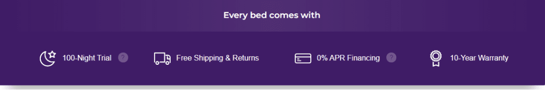
As for the call-to-action, that purple banner running along the top is clickable—it opens a popup with details on the latest promo. And when you scroll down, the sticky header ensures you can always see a “Shop Now” button:
On mobile, the sticky header becomes a sticky header and footer:
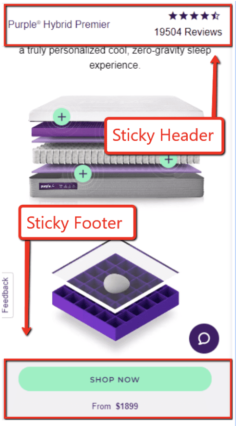
At first glance, it might appear that Purple neglected to add a “Cart” button to their landing page. But nope; they just coded the button so it only appears after you’ve added something to it:
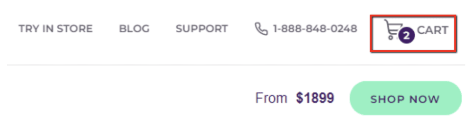
This is actually a smart strategy, because it helps avoid header-clutter when the cart is empty.
There’s really just one area where Purple’s header falls a bit short, and that’s with regard to header goal #6: Reaffirm your brand identity.
Purple includes their logo, of course, but that’s about it. They don’t include any kind of tagline, even though there’s plenty of room in the center of the header (at least on desktop).
Other than that, though, Purple does a stellar job with their header and menu.
Copywriting
As we explained in our article on how to craft landing page copy that converts, copy is one of the most important elements on your product landing page. And on a long-form page like Purple’s, you have plenty of room to explain all the compelling reasons why someone should buy your product.
Next we’re going to go in-depth and explain some of the most important questions that Purple addresses with their copy.
Who Is It For?
In Purple’s case, their product is widely understood. Everybody knows what a mattress is. And just about everyone uses one.
But even when your potential customer base is everyone, you still need to call out who your product is for—and who it may not be for—on your product landing page.
One way Purple does this is by explaining how their mattress adapts to different body shapes and sizes, and why it’s appropriate for back-, side-, and stomach-sleepers.
Purple also makes a point to explain the difference between the 3” and 4” mattress options, including which kind of sleeper might be a good fit for each:
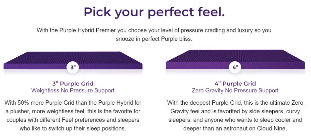
This kind of copy helps address what might be a potential objection in the visitor’s mind, which is: “I don’t know if this mattress is a good fit for me.”
What Are the Basic Product Details?
Remember: you never want your visitor to be confused or unclear about anything. If your visitor has an unanswered question, it gives them an easy excuse not to buy your product. So it’s always a good idea to make sure you explain everything.
Even boring technical specifications, like your product dimensions:
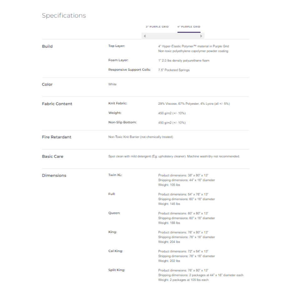
In Purple’s case, there are bound to be people who want to make sure that the mattress will fit in a certain spot in their bedroom. Your customers may have similar questions, so give them all the information they need to get their answer.
Why Is It Better Than Competing Products?
Purple sees their biggest competition as Memory Foam, and they include this section on their product page to explain why their mattress technology is superior:
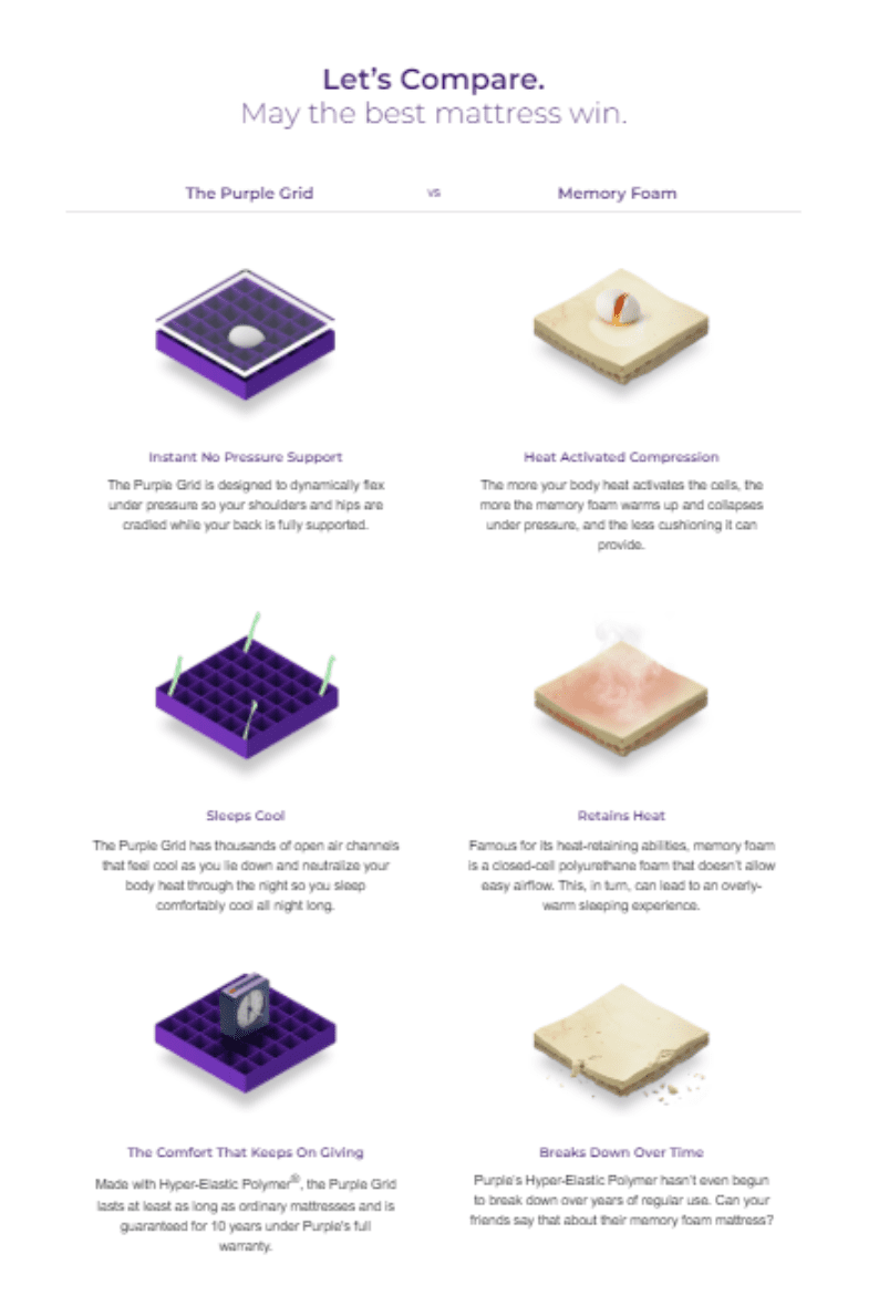
If you can lay out your features like this, and explain how your product is better than the competition in multiple ways, you absolutely need to highlight it on the product page.
Purple explains a lot of these differences elsewhere on their site (such as in their videos), but laying it out point by point like this really helps to hammer it home.
How Does The Product Work?
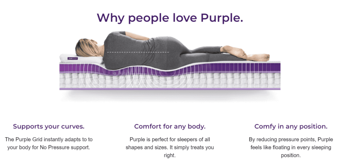
Purple uses a new, proprietary technology to make their mattresses more supportive—they call it the Purple Grid™. But in order for this to sway the minds of mattress shoppers, they need to explain what the Purple Grid™ is and how it works.
You can do this sort of thing in a very straightforward manner, like Purple does here:
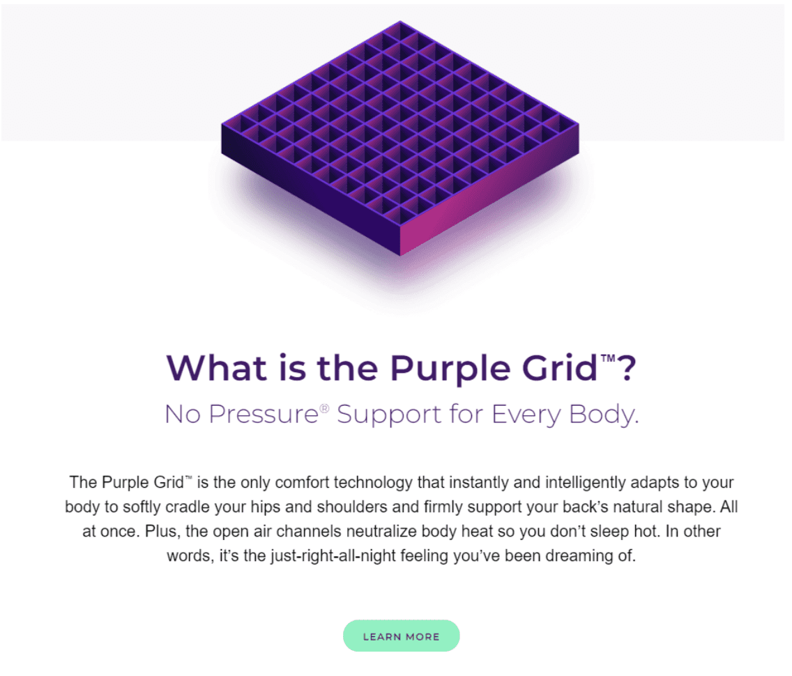
Notice how Purple uses simple language. You DON’T want the reader to be scratching their head wondering what the heck you’re trying to say. Instead, keep this explanation as easy to understand as possible.
Features & Benefits
Purple uses a good mixture of both features and benefits in their copy. Because their product uses new technology, they highlight that in their copy; but they always make sure to tie those features to a desirable benefit.
Here’s an example:
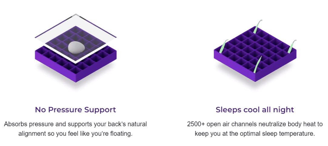
Let’s break this down. On the left, the feature is “no pressure support” that “absorbs pressure and supports your back’s natural alignment.” And the benefit of that feature is that you “feel like you’re floating.”
On the right, “2500+ open air channels” that “neutralize body heat” is the feature. The benefit of that? “Sleeps cool all night.”
The take-home point here is to make sure you always explain WHY your features are desirable. How do they help improve your customer’s experience with the product?
Page Formatting
If you take a step back and look at this landing page, you’ll see lots of white space with plenty of easy-to-scan headers. As a result, the page never feels overwhelming—even though it’s long with lots of content.
This is a particularly important consideration when you’re laying out a long-form product page.
Sales Video
Purple does a FANTASTIC job with their videos. They’re funny, memorable, and persuasive without ever feeling salesy.
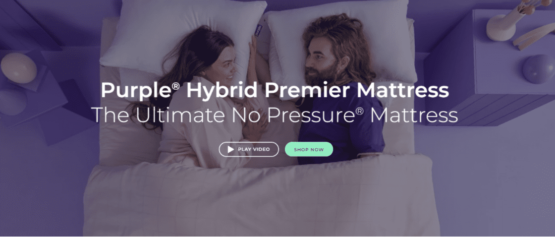
Purple wisely puts a “Play Video” link in a prominent position at the top of all their product landing pages to highlight it:
Clicking the button opens the video right there in the page:
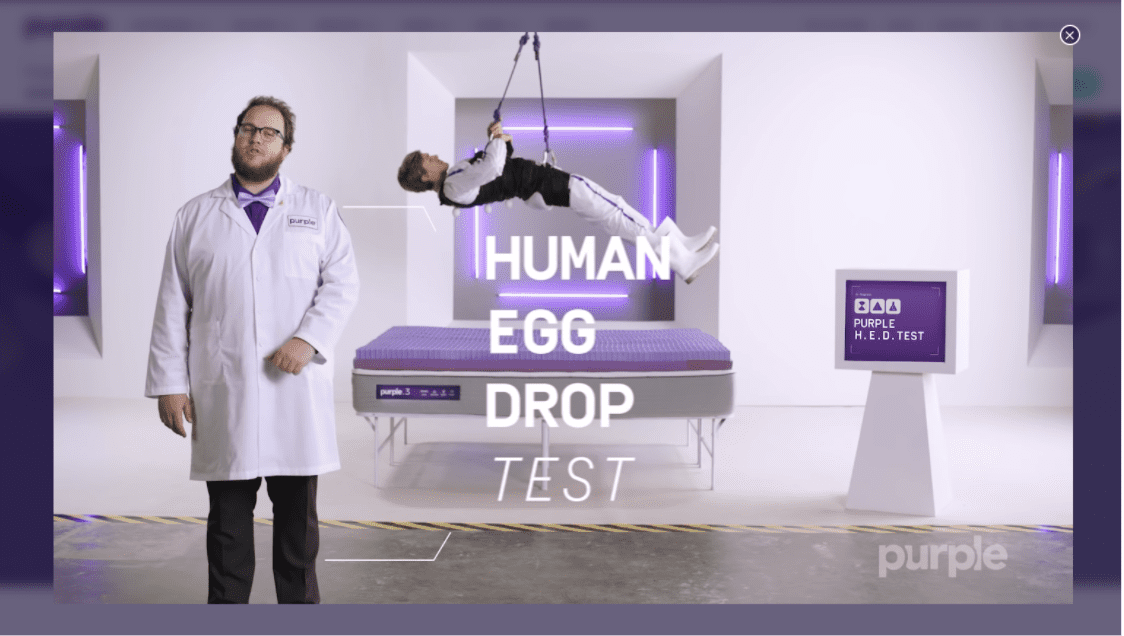
Notice that while Purple is using a YouTube video here, they DON’T send you off to YouTube.com. It’s much smarter to embed the video and keep the user on your website.
USP Image
Purple really likes to use USP images. And it’s not hard to see why—it’s an effective way to quickly summarize multiple benefits in a small amount of space.
Here’s their most eye-catching USP image:
But it’s not the only one. They also have this one:

And this one:
And—why not?—this one, too:
These images are easy to fit into your product page since they take up such little space.
Product Images
Purple’s product landing page is a bit different than most. Instead of adding the product to the cart directly from the product page, you click through to a “Buy” Page where you select your bed size, sheet color, and other details.
This is the page where they display the product images:
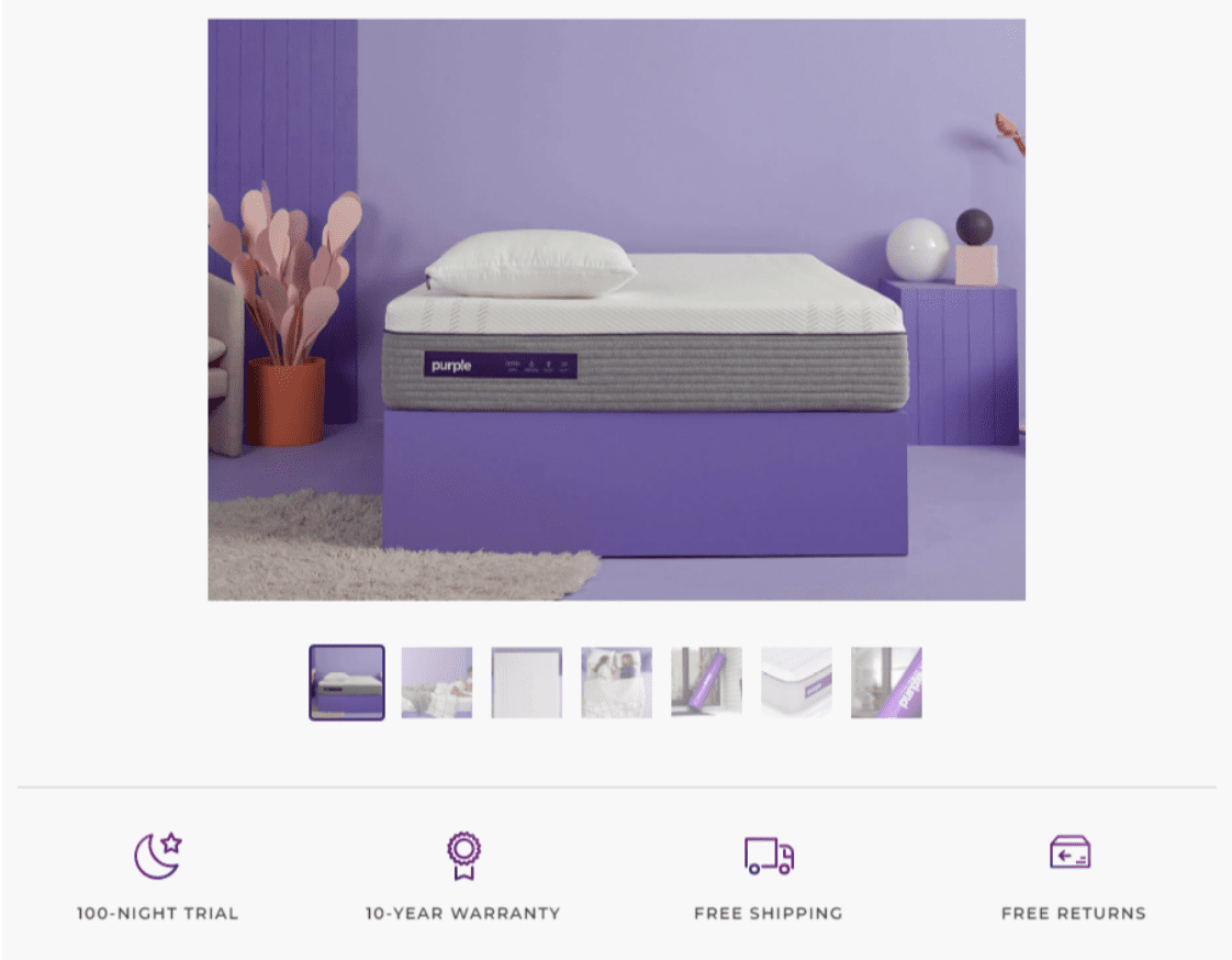
Mattresses aren’t a highly visual product—they’re usually covered by bedding, after all—but Purple still does their due diligence in adding some product and lifestyle images.
In particular, they wisely use this space to show you how your mattress will arrive:

Seeing how the mattress is rolled-up might comfort anyone who isn’t keen on having to move a giant new mattress upstairs.
Although their product carousel is on the “Buy” page, Purple also includes a few really nice images on the product landing page. Like this one, which shows all the layers that go into a Purple mattress:
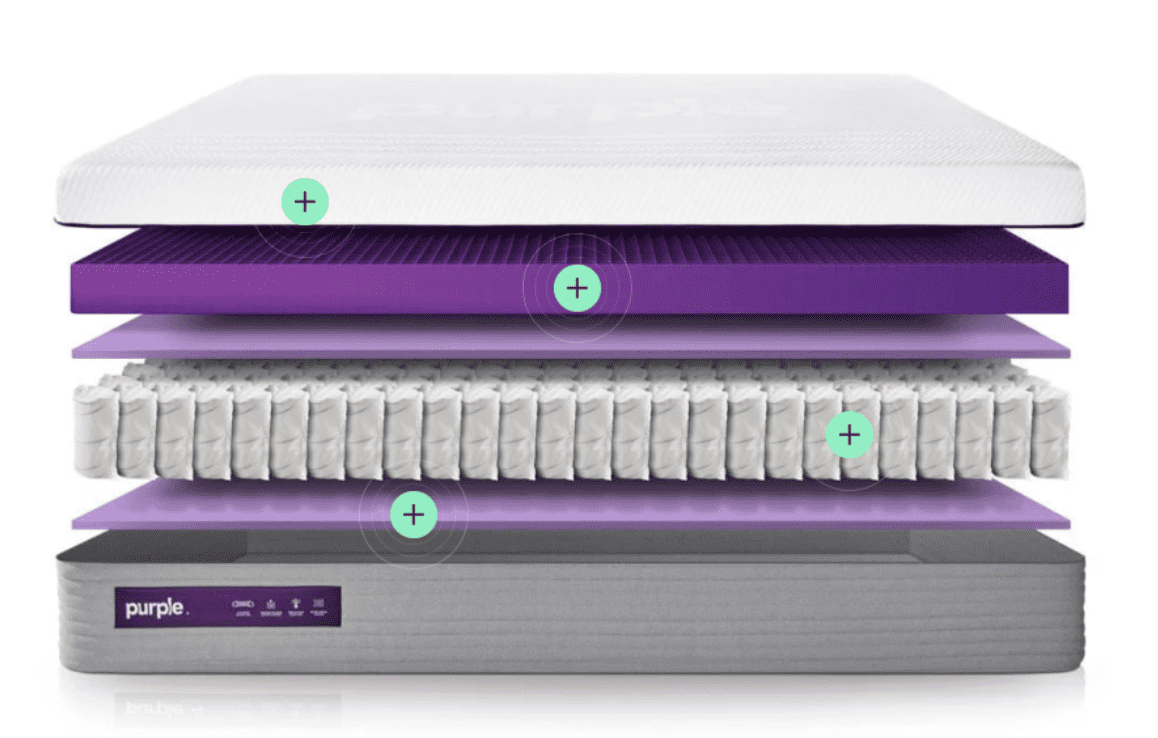
Clicking on any of the teal buttons will open a window that explains how that layer of the mattress works:
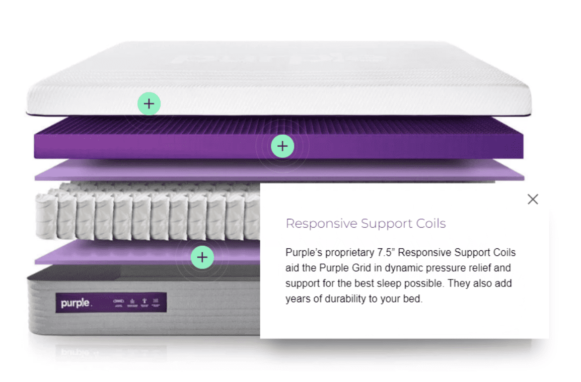
It’s an effective way to visually show all the careful thought that goes into the design of the product.
Social Proof
On their homepage, Purple includes a grayed-out panel of magazine logos that have featured their product:

Anytime you see a row of logos like this, they’re often grayed-out. This helps to de-emphasize them, so that the visitor’s attention isn’t hijacked by a bunch of colorful logos. The effect is a subtle injection of credibility.
On several other pages, they feature quotes from their media placements—like this one from BuzzFeed
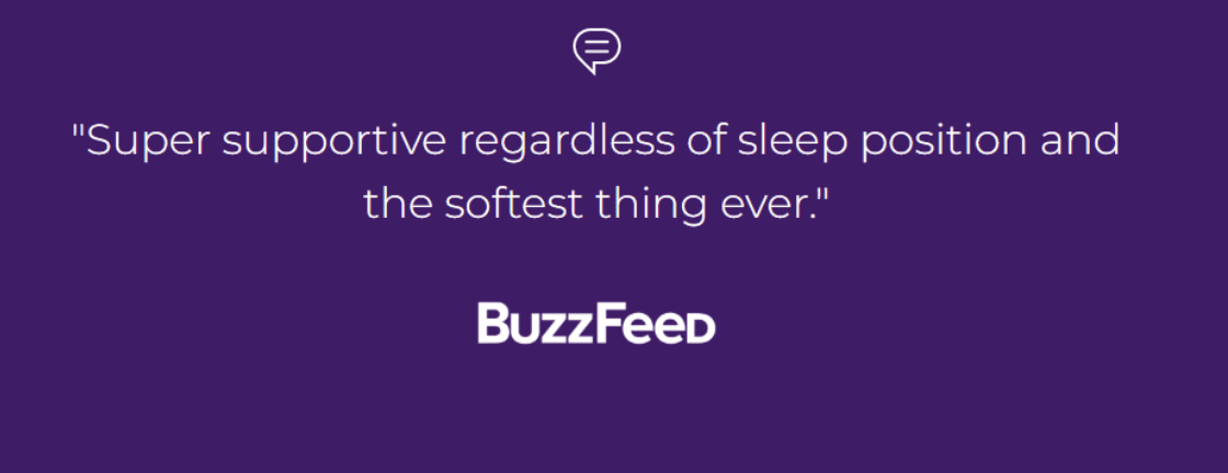
If you have a quote like this from a well-known publication, it’s a fantastic thing to add to your product page.
Upsells, Cross-Sells, & Recommended Products
Upselling and cross-selling works a little differently for different products. A company with a lot of SKUs, like Amazon, can go hog-wild and recommend all sorts of related products.
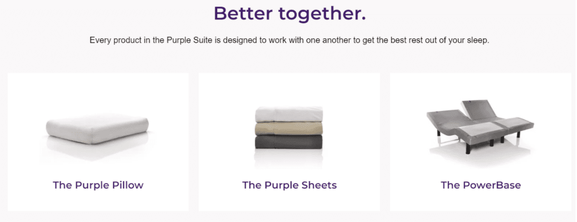
A company like Purple, which is much more focused on one particular product, can’t do as much cross-selling. But Purple still manages to find places to recommend relevant products.
Near the bottom of their product landing pages, they recommend some of their accessories and point out that all Purple’s products are designed to work together:
Curiously, their “Buy” page doesn’t even give you the option to add any accessories (except one free product that comes with the mattress):
But Purple redeems itself in the Cart, where they recommend additional add-ons like a metal platform base, pillows, and mattress protectors:
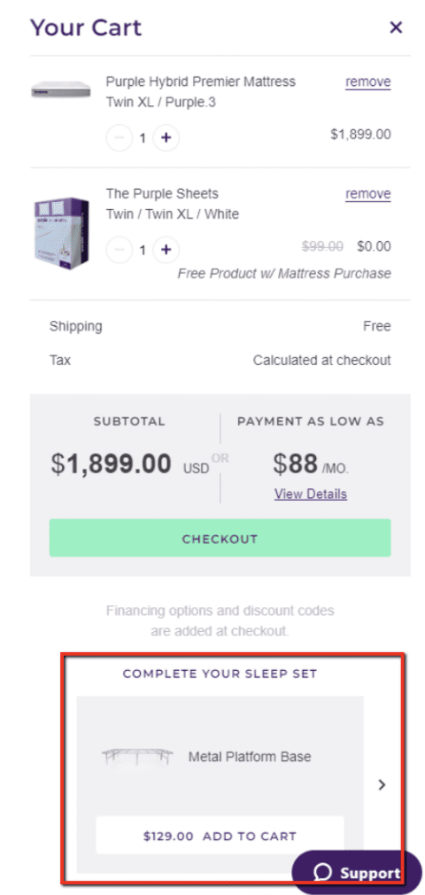
Even here, though, the cross-sells are at the bottom of the screen and don’t really stand out. This may be the one aspect of Purple’s landing page that could use some improvement.
Reviews & Featured Testimonials
Purple has a ton of great reviews, and they use them to their advantage by including a big, eye-catching reviews section on their product page:
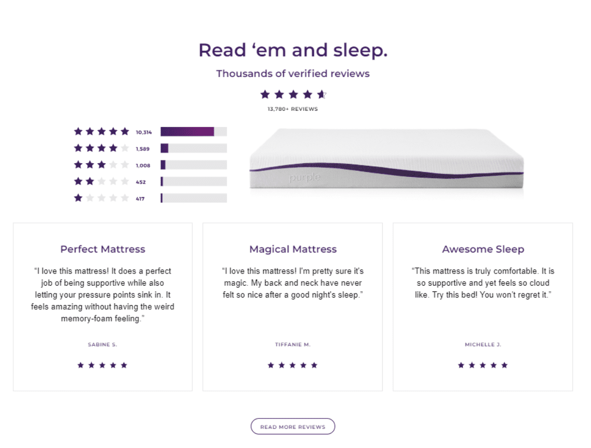
Notice how they include as many credibility-boosters as they can here, such as…
- The average rating (over 4.5)
- The total number of reviews (13,780)
- A couple of highlighted reviews
- A link to read even more reviews
Elsewhere on the page, they feature even more highlighted reviews. Like this one from John:
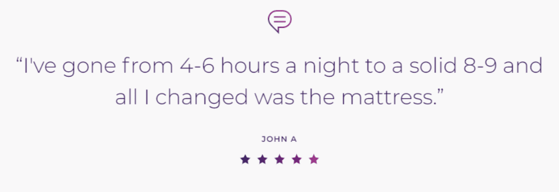
This is a GREAT addition to the product page, because it allows Purple to include messages they wouldn’t be able to say about themselves. But because this message comes from a customer, it’s believable.
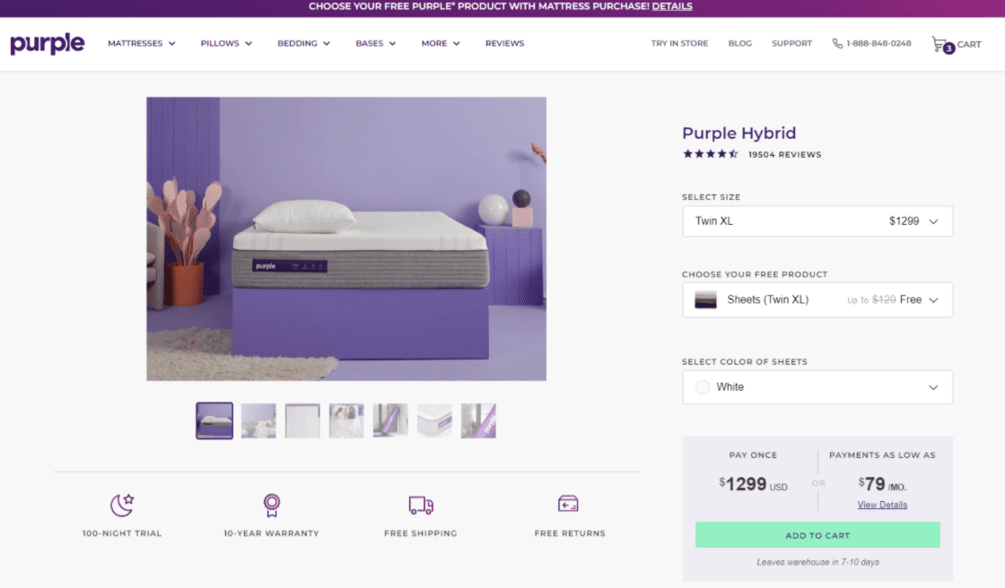
Buy Box
Purple’s Buy Box takes place on the “Buy” page, and looks like this:
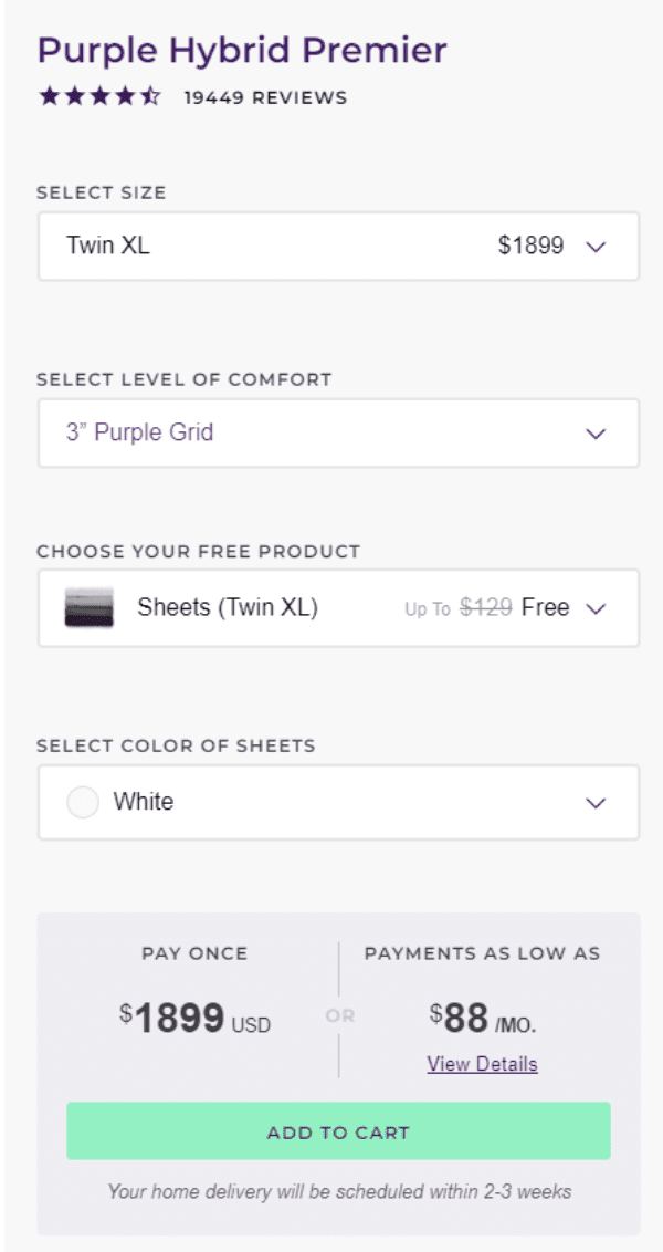
Notice what they’re including here.
First, a short reminder of how great their reviews are. Purple goes out of their way to leverage those reviews everywhere they can, and the Buy Box is a great place to do that.
Next come a few options that allow the buyer to customize their product.
Finally, notice the details Purple includes around the “Add to Cart” button. They show the total and the monthly price, which helps the product seem more affordable.
They also answer a frequently asked question right under the button, telling people how soon they can expect their product to be delivered.
Live Chat
Purple puts their live chat link on the lower-right-hand corner of the page:

This is the best place to put it. It’s where people expect to find a live chat link.
Then when you open it, you have the option to start an online chat:
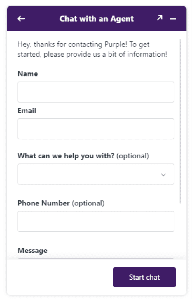
There are a few features that you’ll see repeating again and again on the landing pages in this article. And live chat is one of them. It’s a fantastic way to increase your product page conversion rate.
More Long-Form Shopify Landing Page Examples
Boosted Board
Boosted Board sells motor-driven skateboards and scooters. It’s a really cool product…but it’s also expensive, and it requires some explanation to understand how it works.
That makes Boosted Board’s products a great fit for a long-form landing page. Here’s their product, Boosted Plus:
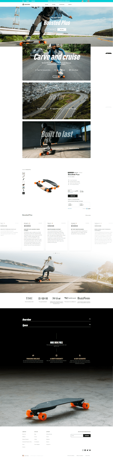
If you compare this page to Purple’s, you’ll notice the two brands are actually doing a lot of the same things. They both utilize…
- A product video
- Live chat
- A sticky header
- Product reviews
A lot of technology goes into these boards, so it’s interesting to pay attention to how they communicate this on the landing page without overwhelming the visitor.
Specifically, these 3 sections are where Boosted Board explains how the boards work:

Each section gives one overarching benefit. The first one focuses on speed and maneuverability; the second, on the product’s range and battery life; and the third talks about the product’s high quality and long lifespan.
Each of these sections has a “+ Learn More” button that brings up another screen with more details:
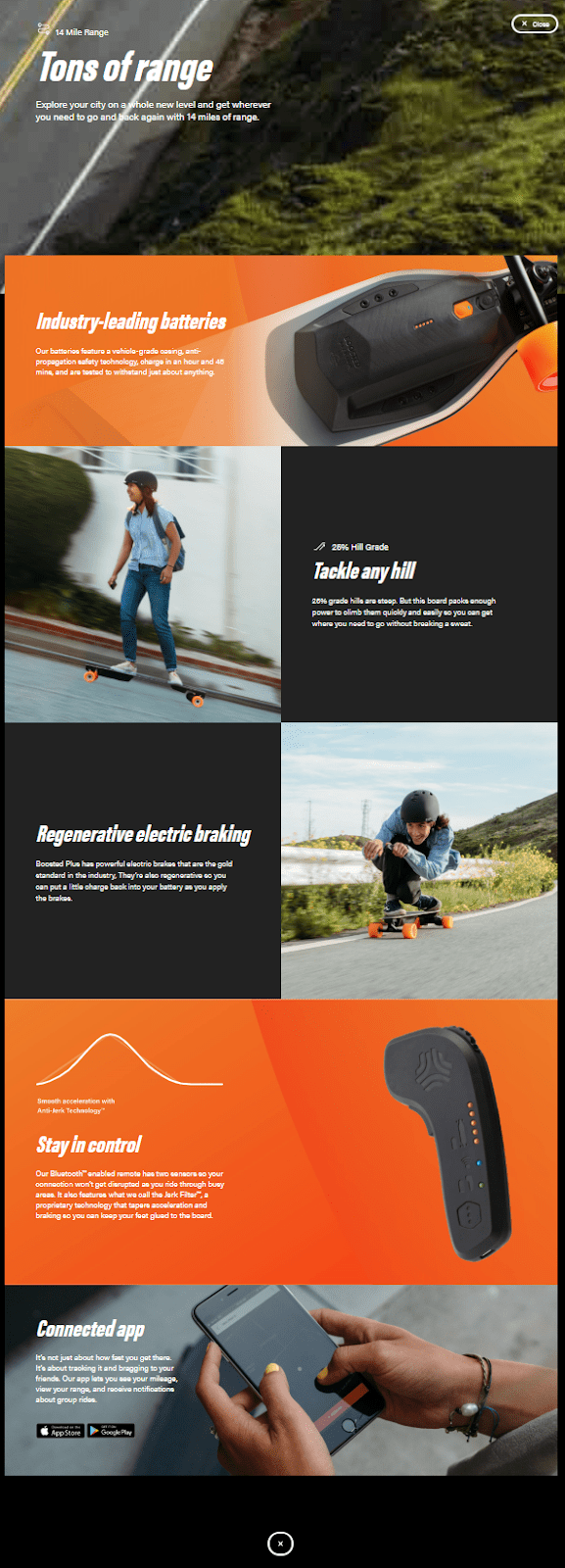
This is a smart way to handle a complex product, because it starts with a high-level overview of the product’s big benefits. And it makes the details readily available without ballooning the product page and making the product seem hard to understand.
Boosted Board also makes great use of their media mentions:

Most companies include either a row of logos, or a quote from a news article. But this layout is an efficient way to get both at once, cramming a lot of product credibility into a tiny space.
Away Luggage
Away uses a longer-form product landing page to sell high-end luggage with features like a built-in battery to charge your phone, smart compartments for easy packing, a TSA-approved locking mechanism, and whisper-quiet wheels.
Here’s what it looks like:
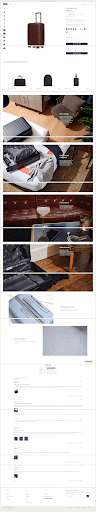
The movement catches your eye as you scroll down the page. Also notice how, even though there’s no sound, each GIF manages to tell a mini-story.
Organifi
Organifi has one of the best-selling green juices online. How do they do it?
With this long-page product landing page:

Obviously there’s a lot going on here. But one thing worth studying is how well Organifi uses third-party support to build credibility for their product.
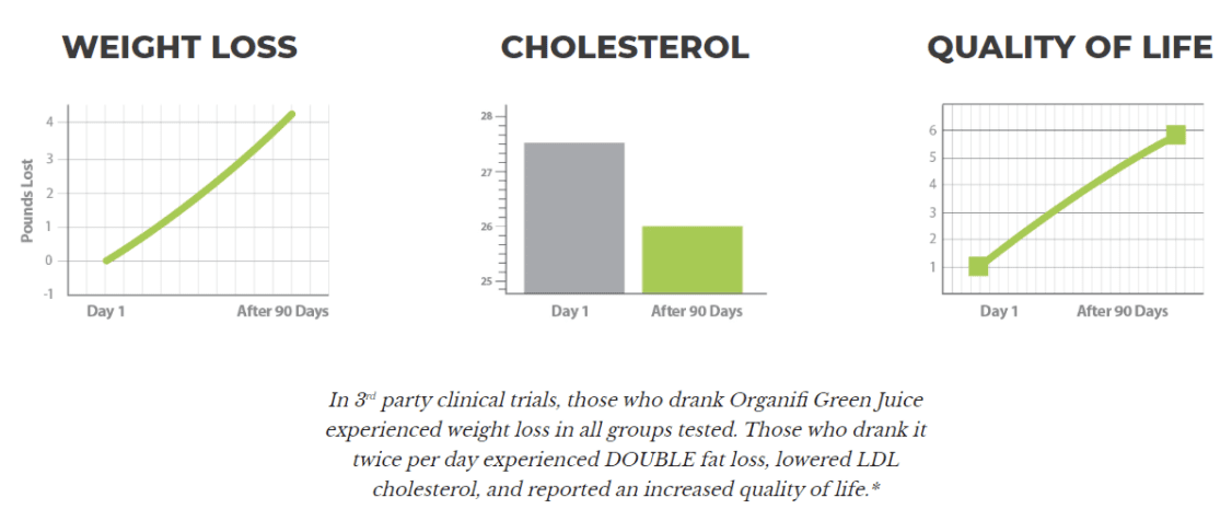
Organifi knows that a lot of people are skeptical about supplements. So they share results from a clinical trial showing that their product improved weight loss, cholesterol, and quality of life:
But they didn’t stop there. They also leveraged significant media exposure to show how popular the product is:

And they even got quotes from a handful of well-known health authorities promoting the product:

This is a great example of stacking multiple conversion elements to appeal to a wide range of personalities. Some of the people who see this page might be swayed by the study results. Other people might be more influenced by the fact that Marc Fitt or Shawn Stevenson recommend it. Either way, Organifi is doing everything they can to appeal to the broadest possible audience.
Mini-Site Shopify Landing Pages
Mini-sites can accommodate a huge amount of content—just like a long-form page. But because the content is broken up over several smaller pages, they’re easy to navigate.
It’s a flexible layout that you can use for a wide range of product types. In these examples, you’ll see a couple different ways to use a mini-site product page.
We’ll start with an in-depth review of a highly effective mini-site landing page for a skin care product.
Mini-Site Shopify Landing Page Example: Boom Clean
BOOM! by Cindy Joseph uses a mini-site landing page for their skin care product, Boom Clean. It has 6 different pages:
- Video
- Our Story
- Ingredients
- Reviews
- FAQ
- Shop Clean
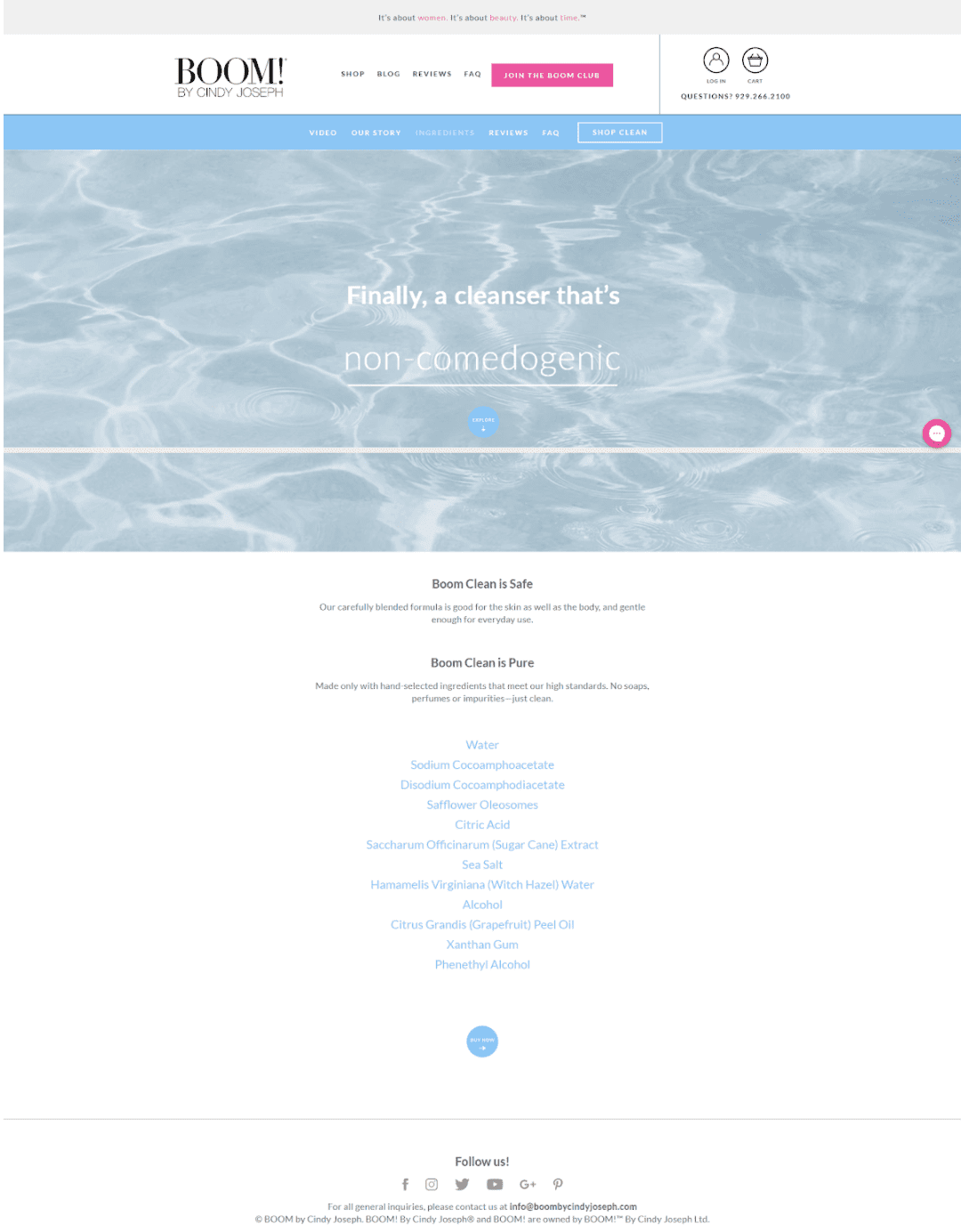
The main page of the mini-site is the video page:
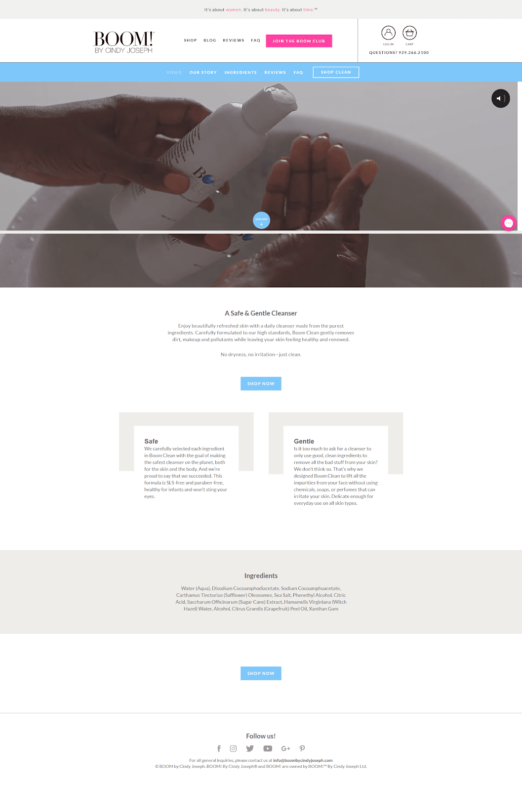
When you visit the “Shop Clean” page, you’ll notice it’s formatted much like a short-form landing page:
OK, now let’s dig into the details of what makes this mini-site work so well.
Header & Menu
Your header and menu are always important…but they’re especially critical for a mini-site, where you have to juggle two different menus—one for the primary site navigation, one for the mini-site.
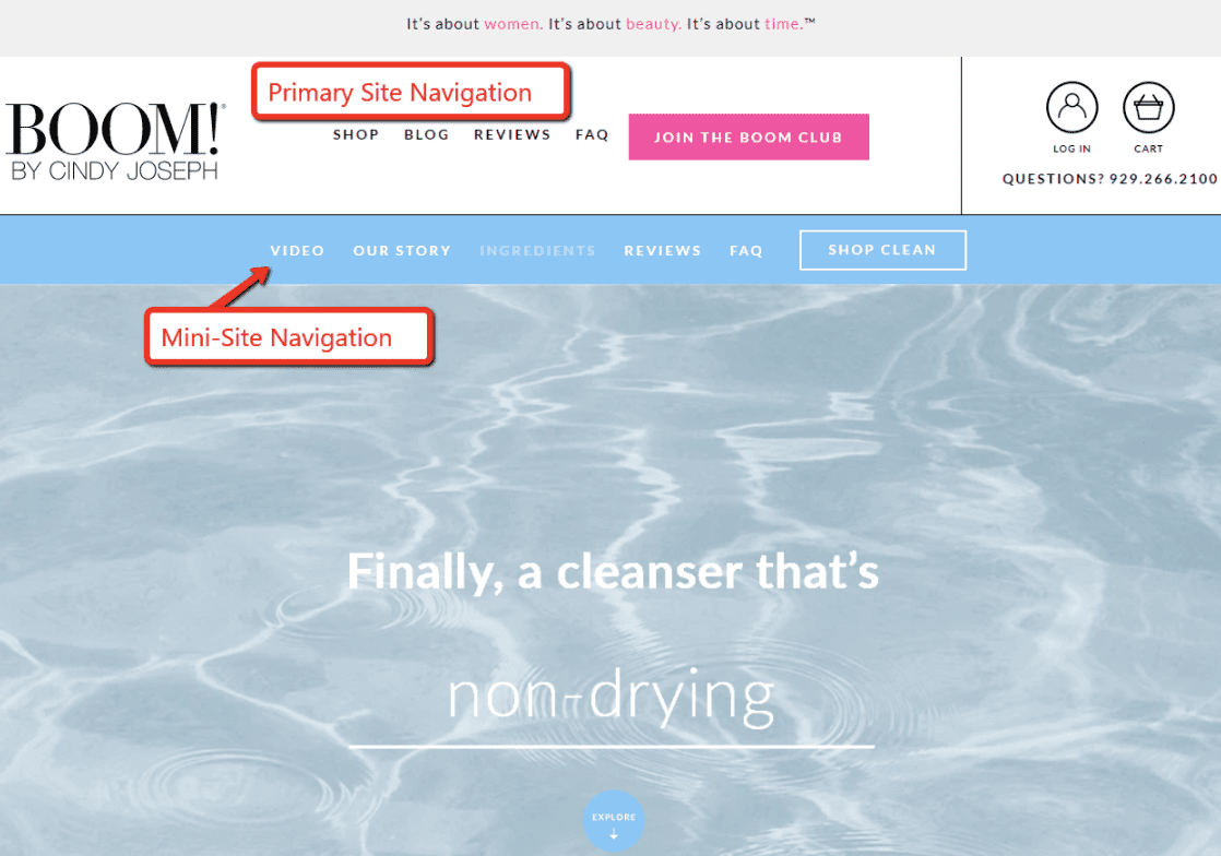
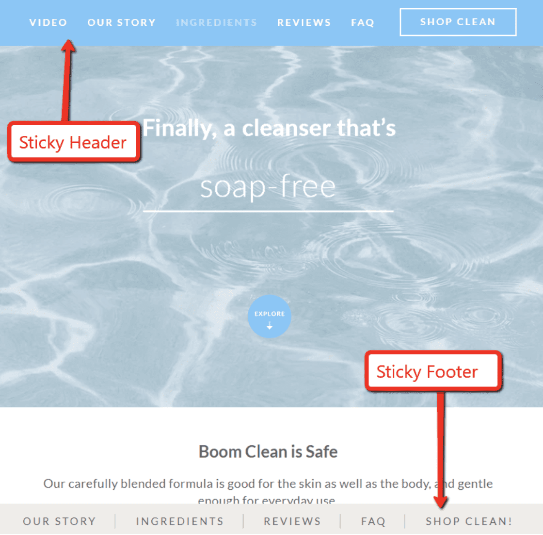
Most often, the mini-site navigation goes underneath the regular header and menu. Just like BOOM! does here:
On a mini-site, you want to prioritize the product navigation links to keep your visitors engaged with the product. So when you scroll down the page, BOOM! uses a sticky header and footer for the mini-site menu (and not the main website menu):
Mini-site navigation gets more complicated on mobile, where real estate is even more limited. BOOM! handles this situation by putting both menus inside of one “Menu” button:
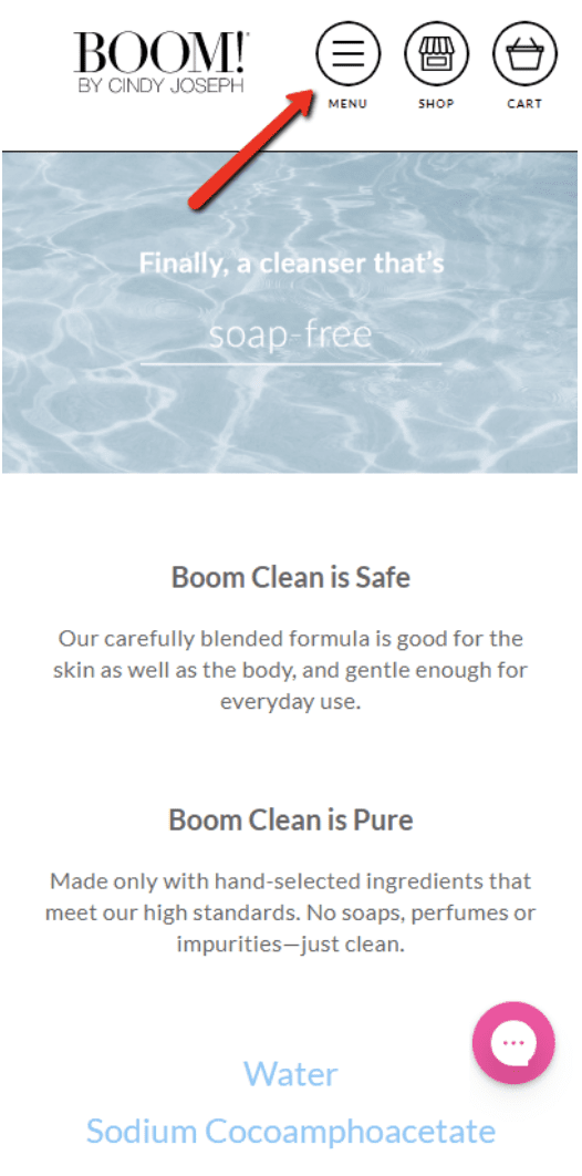
When expanded, it displays both menus:
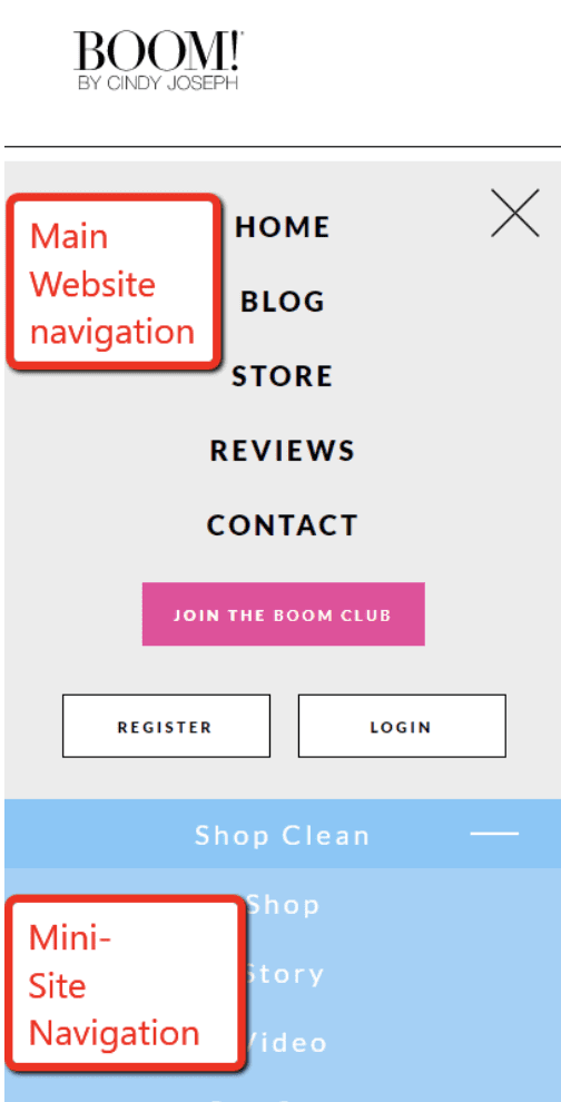
This isn’t the only way to handle mini-site navigation, so keep an open mind and find what works best for your product.
Copywriting
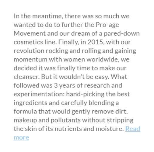
The bulk of the copy on Boom Clean appears on the “Our Story” page, where BOOM! uses a story format to talk about what inspired the company, their support of the pro-age movement, and all the hard work that went into formulating the product:
People will tune in for a good story, which makes it an extremely effective method of copywriting.
How Does the Product Work?
Just like Frank Body, BOOM! by Cindy Joseph highlights certain ingredients as a way to demonstrate how their product works. BOOM! dedicates an entire page of their mini-site to the ingredients:
BOOM! knows that many shoppers won’t be familiar with some of their ingredients (like Sodium Cocoamphoacetate), so they make sure to explain how their ingredients are safe and pure. They also highlight all the negative ingredients that AREN’T in the product (like parabens, perfumes, resides, dyes, and so on).
Sales Video
The homepage of the Boom Clean mini-site displays this high-quality product video:

In this case, BOOM! chooses to auto-play the video as soon as you arrive. But notice that the video is muted by default. In general, it’s a good rule of thumb to make sure your pages never surprise the visitor with unexpected sound.
USP Image
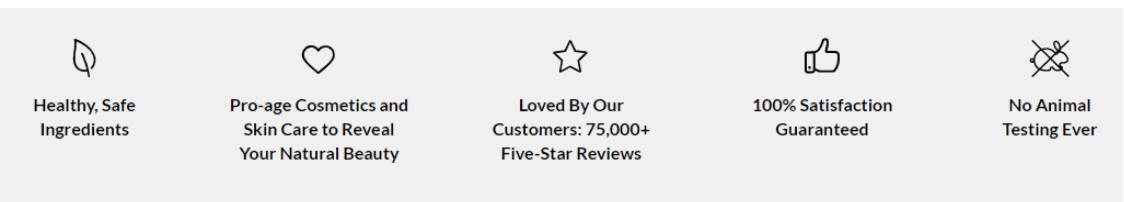
BOOM! uses a number of USP images on their site, like this one from the homepage:
Pay attention to the wide range of benefits they bring into this image: they point out their great reviews, their pro-age stance, their use of healthy ingredients, and the fact that they don’t test on animals. Any selling points that can be quickly summed up are a great fit for a USP image like this.
Product Images
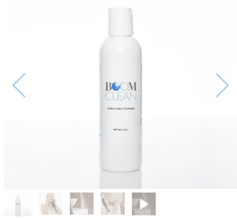
Boom Clean has solid product images in a standard carousel, including a video:
Notice the combination of product pictures and lifestyle images showing the product in use.
Reviews & Featured Testimonials
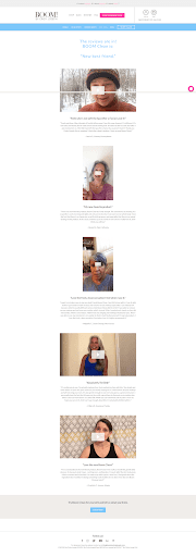
BOOM! has accumulated a huge amount of reviews and testimonials, and they put them to great effect on this mini-site.
For starters, there’s a separate “Reviews” page which contains a handful of video testimonials from women explaining what they love about the product:
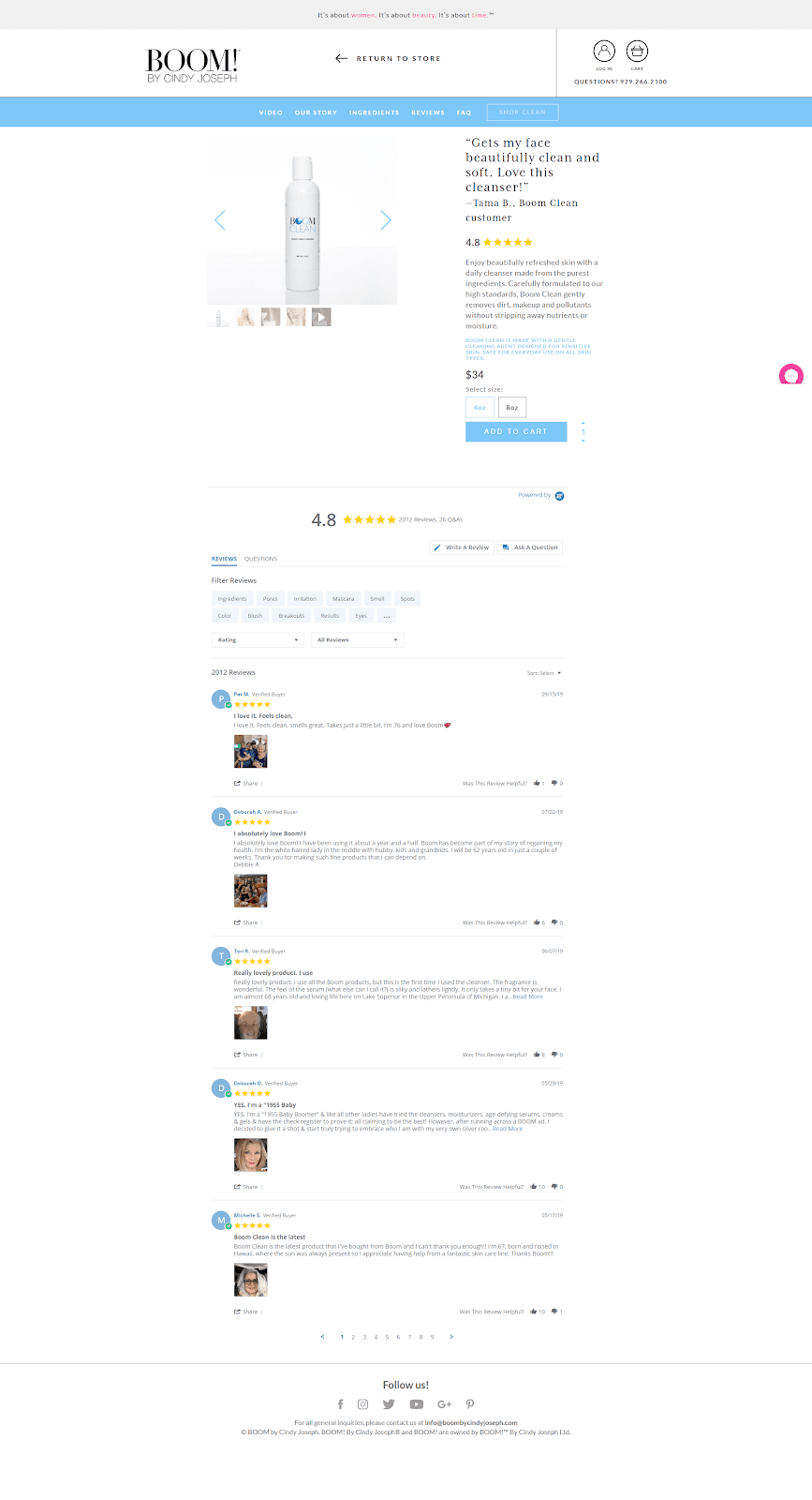
Then on the “Shop Clean” page, BOOM! has embedded their Yotpo reviews:

Remember, you can never have too much social proof. The more you can communicate that your product is well-liked and popular, the better. And when you can communicate that message in different mediums—like BOOM! does here using both text and video—even better.
Buy Box
Here’s the Buy Box for Boom Clean:

Notice how much credibility they pack into a small area. It contains a featured review, a 4.8-star rating, and copy that reiterates the primary benefit of the product. This is a fantastic example of how to maximize conversions at the point of sale.
Live Chat
Like most of the product landing pages we’ve analyzed on this page, BOOM! gives the option of live chat. It starts as a little dialogue bubble in the lower-right corner:

When you click it, you have the option of starting a live chat with a customer service rep:
Live chat is a smart addition because it enables you to answer a prospective customer’s questions immediately, while they’re still on your landing page and interested in buying your product.
More Mini-Site Shopify Landing Page Examples
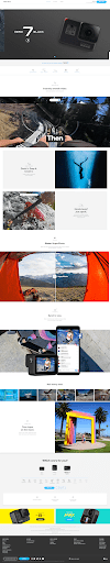
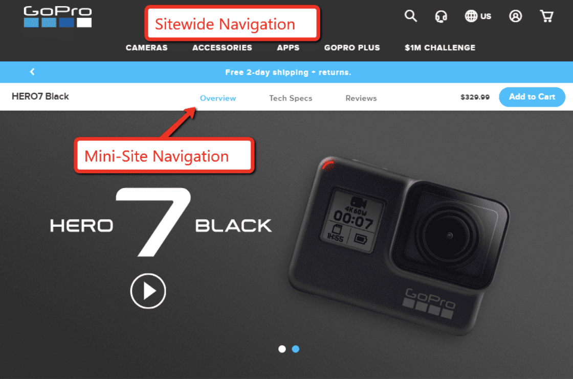
GoPro
GoPro uses a mini-site for their Hero 7 Black camera, but they take a different approach than BOOM! Instead of splitting up their content over a half-dozen separate pages, GoPro puts the bulk of their content on a long-form product page.
They reserve the other mini-site pages for details on Tech Specs and Reviews.
Here’s what the primary page looks like:
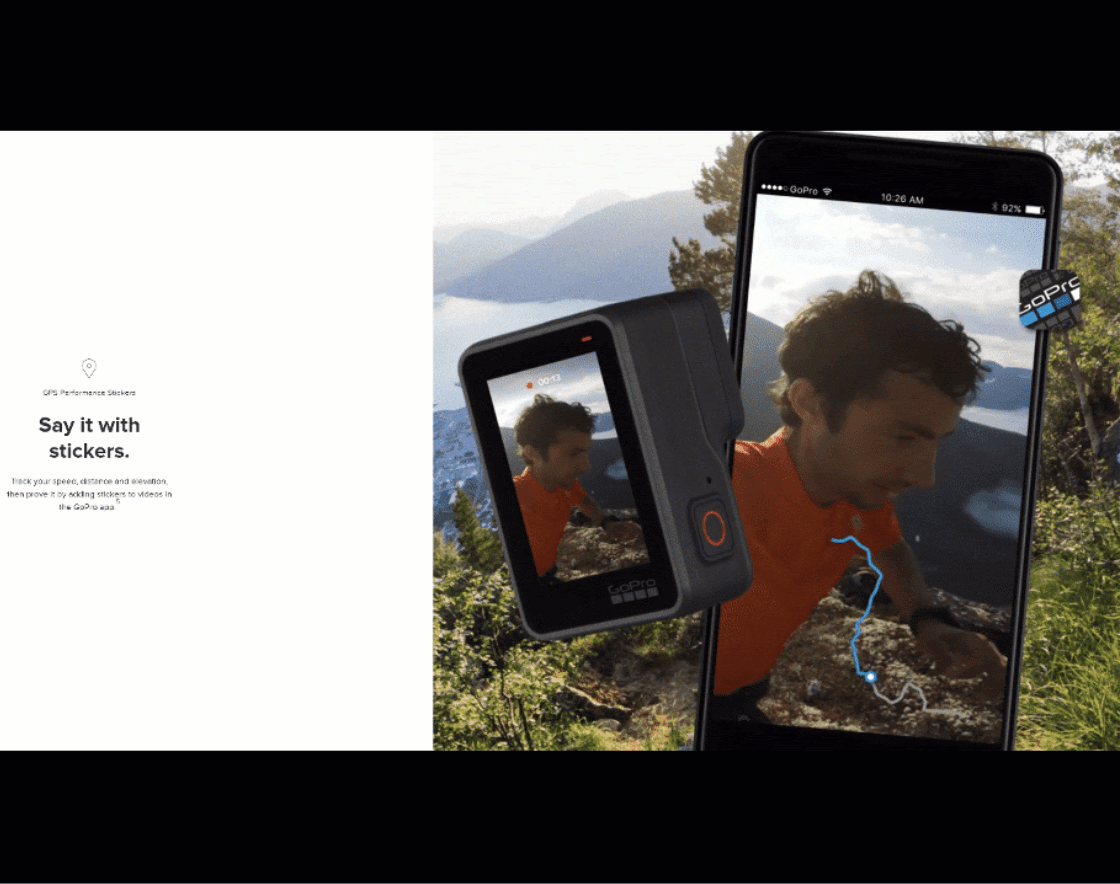
Can we take a moment to appreciate what a fantastic job GoPro does communicating features and benefits here?
First, notice that each feature or benefit is explained through copy and backed up with an image or video. They don’t just explain features like “stickers,” they actually show the feature in action:
They don’t just tell you their SuperPhoto makes amazing-looking pictures; they show you:
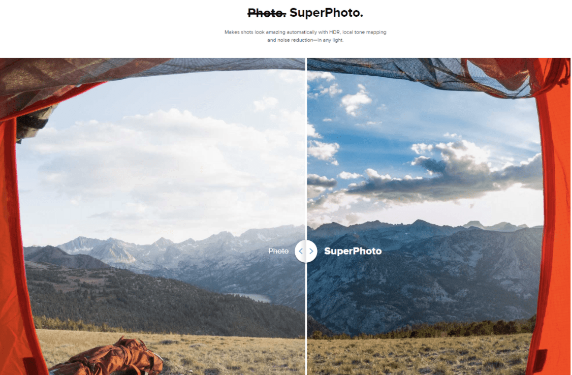
They do this over and over, finding creative ways to show you how cool their product is. This is a great example of copy and design working together.
Notice that GoPro handles their header like BOOM!, by putting the mini-site navigation underneath the main header:
But unlike BOOM!, they separate the two menus on mobile and choose to keep the mini-site navigation outside of the hamburger menu button:
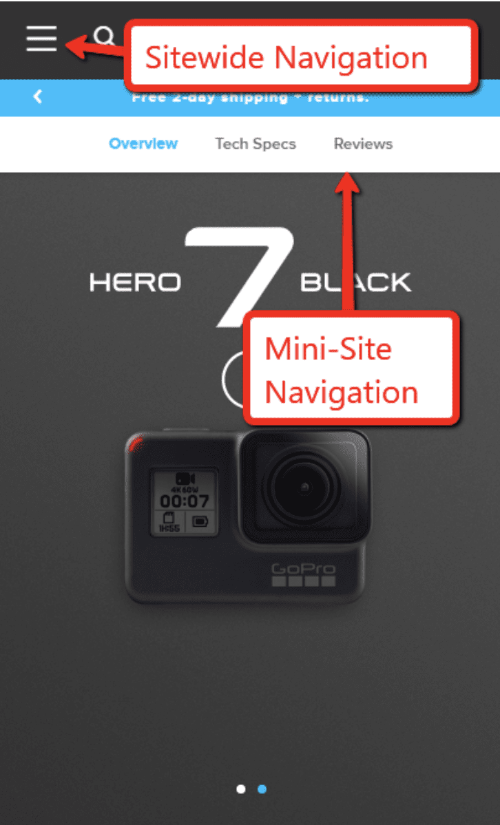
One of the benefits of having a short mini-site menu is that you can fit the whole thing at the top of your mobile site.
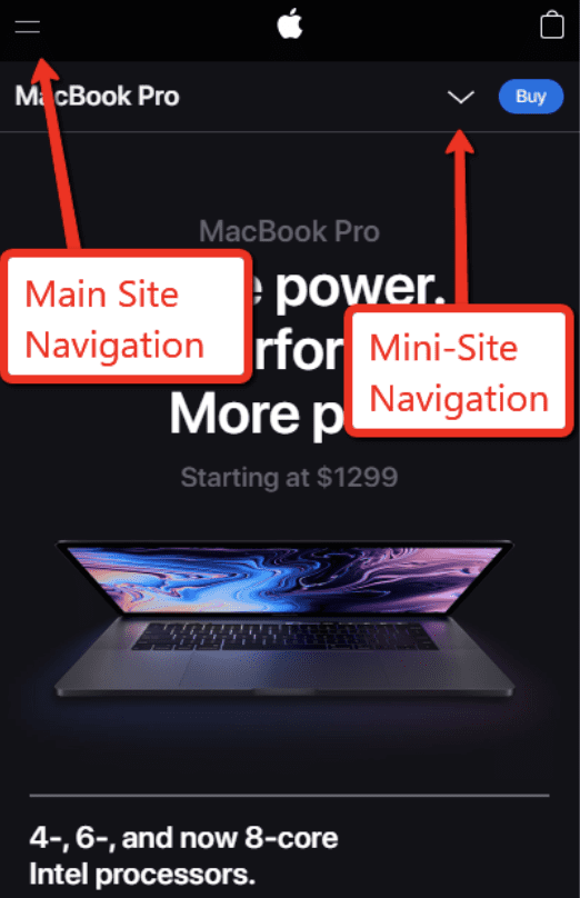
Apple
Here’s another example of a mini-site that puts the bulk of its content on one long product page, then puts a few relevant links into a mini-site menu:

This is basically a long-form product page. But just like GoPro, Apple has chosen to move some of the technical content (macOS and Tech Specs) onto different pages:

Apple shows us yet a third way to organize these menus on mobile. In this case, Apple puts the main navigation in the hamburger button, and uses a separate menu button for the mini-site links:
As you can see, there’s not always a clear distinction between a long-form page and a mini-site. In the end, you need to do what works best to effectively engage your visitors and communicate the value of your product.
Take What’s Useful. Be Creative. And Test, Test, Test!
You can think of this post like your swipe file for Shopify landing pages. Swipe files are awesome because they give you a quick-and-easy way to model your marketing on something that’s already been proven to work.
That said, you shouldn’t ever blindly follow someone else’s lead. Sometimes your product may not fit neatly into a pre-existing mold…and when that’s the case, you may need to get creative and try something new on your product page.
Either way, don’t just assume that you know what’s going to work. Test your changes to get hard data on what converts best. That’s how the world’s best ecommerce companies continue to grow.
But in the meantime, these landing page examples will give you a great starting point for your next Shopify product page.
In the next installment of our “Guide to Shopify Landing Pages,” we’ll dive into Shopify landing page builders and tools.
Try OneClickUpsell
TRY FREE FOR 30 DAYS | 100% MONEY-BACK GUARANTEE
Try Zipify Pages