Welcome to Part 3 of our “Guide to Shopify Landing Pages” series! To read the previous article, click here.
A lot of decisions go into building a high-converting ecommerce landing page design:
What should your “Buy” button say?
Where should you place it?
How many pictures do you need?
What links need to go in the menu?
What should your header look like?
All these questions have an impact on how well your landing page converts.
In fact, when it comes to ecommerce landing page design, sometimes the smallest elements—a single line about your shipping speed or your money-back guarantee—can have a big impact on how many products you sell.
To make it easy, you’ll find the answers to all these questions (and more) in this detailed article. You’re about to learn an effective 10-step process you can follow to design an ecommerce landing page that engages and converts.
If you use this article as a reference guide, then by the time you’re done, you’ll know every important element to focus on when choosing your own ecommerce landing page design.
Starting with…
Step 1: Decide on a Layout
The first step in designing an ecommerce landing page that converts and engages is to decide what overall layout your page will take. You have 3 basic layouts to choose from:
- Traditional ecommerce landing page
- Long-form ecommerce landing page
- Product mini-site
(Learn more about these different types of Shopify landing pages here.)
This step is fairly straightforward. And if you don’t already know which layout you want, there’s a simple litmus test you can use to figure it out.
Just ask yourself: Is there a lot to say about this product?
If the answer is NO, there isn’t much to say — then you’ll probably want to go with a traditional landing page.
This is the case for a lot of products that are easily understood or very visual like clothes or sunglasses:
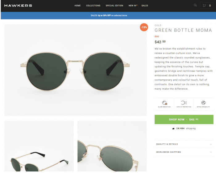
Source: https://www.hawkers.co/products/sunglasses-gold-green-bottle-moma
But if the answer is YES, there is a lot to say about this product — then you’ll want to use a long-form landing page or a mini-site.
This is usually the case when you have stories to tell, technology to explain, benefits to reveal, objections to overcome, and so on.
For example, Boosted Boards clearly has a lot to say about their product in this long-form ecommerce landing page:

Source: https://boostedboards.com/boards/boosted-mini
Just as the skincare brand BOOM! by Cindy Joseph has a lot to say about Boom Clean on this mini-site:
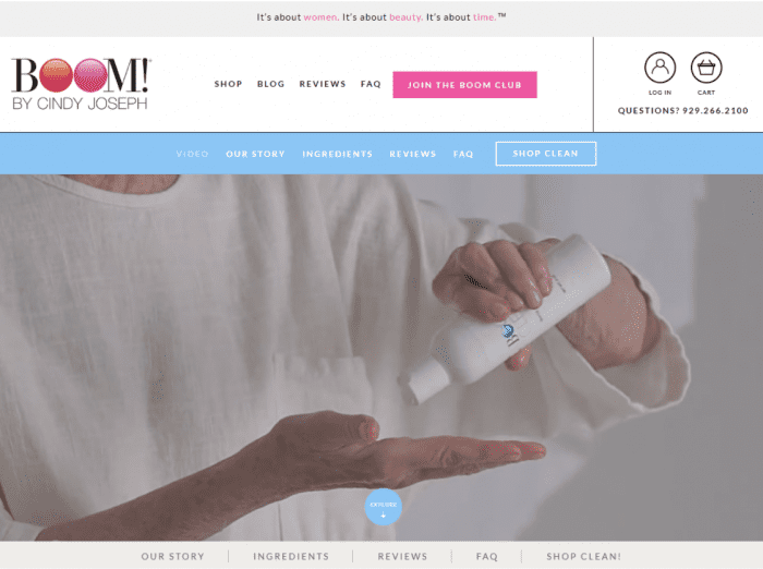
Source: https://www.boombycindyjoseph.com/products/boom-clean
The only real difference between a long-form page and a mini-site is how the content is laid out.
With the long-form layout, everything goes on one long page. With a mini-site, that same content is presented over several smaller pages.
Both layouts can be highly effective, so you really can’t go wrong.
ACTION ITEM: Decide on a layout for your ecommerce landing page design.
Step 2: Create Product Navigation Links
When designing your ecommerce landing page, keep in mind that an ecommerce store can have two kinds of menus:
Regular website navigation. This is the typical menu you’ll find in the header of just about every website. The navigation links take you to the most important pages on that site (like the Blog page, the Store page, etc.).
Product navigation. This is a menu full of navigation links that are specific to one particular product in your ecommerce store. It’s not essential to have a product menu, but in some cases, it can be a good idea.
(See which navigation menus the world’s top 10 ecommerce stores are using here.)
Everyone pretty much intuitively understands regular website navigation — but product navigation links are not as well-known, so we’re going to focus on those.
There’s no one-size-fits-all approach for product menus. Instead, it varies based on what type of page layout you’re using.
Product Navigation Links on a Traditional Ecommerce Landing Page
If you’re using a traditional layout, you probably won’t need a product-specific menu. You just won’t have enough content to justify it.
However, you might want to consider hiding, minimizing, or simplifying your regular menu to cut down on distractions.
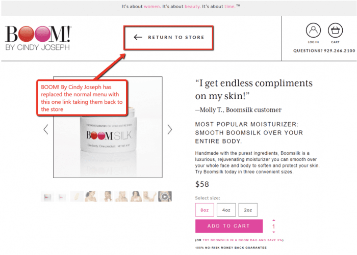
For example, this product page from Boom! By Cindy Joseph has a menu with only 1 link—“Return to Store”:
Source: https://www.boombycindyjoseph.com/products/boomsilk-product
This helps reduce distractions and keeps the visitor’s attention focused on the product.
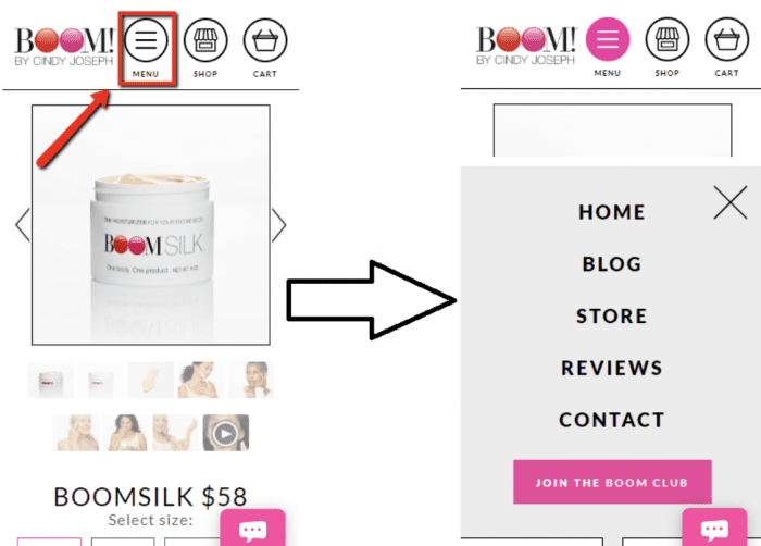
At least, that’s how it works on desktop. Mobile sites have less screen real estate, so navigation tends to be a little more difficult. On mobile you’re usually better off keeping your main navigation links. Here’s what that looks like for the same product, Boomsilk:
Product Navigation Links on a Long-Form Ecommerce Landing Page
Compared to a traditional landing page, a long-form page tends to have a lot more content. And for that reason, sometimes it can be helpful to include a separate menu on these pages to make it easier for people to navigate to each specific section of the page.
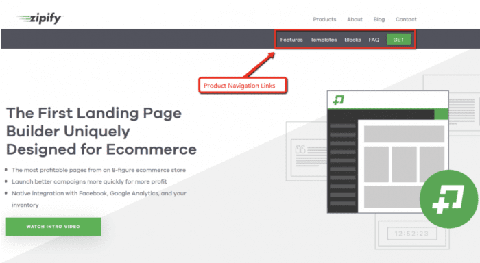
For example, take our current sales page for Zipify Pages (which is a long-form page). Right now, our header has two menus: the primary menu in the top-right, and the product-specific menu underneath it.
Source: https://zipify.com/apps/pages/
The links on that product menu are anchored to each of the main sections on the page. So when you click on “Templates,” it doesn’t take you to a separate page—it just scrolls down to the “Templates” section. This is one way to make it easier for visitors to navigate a long page.
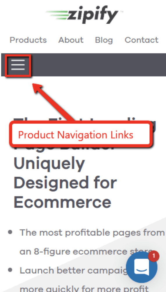
You can use the same strategy on mobile, too. In this case, we kept the main navigation going across the top of the page and house the product menu in the added icon:
It’s helpful to think of your product navigation links as your “table of contents” for that product. And it’s worth thinking through this table of contents, whether you publish it or not.
Because here’s the thing: even if you don’t add a menu to your long-form page, thinking through the links you would add to your page can still help you brainstorm and organize your content, which almost always improves the copywriting on your page.
Product Navigation Links on a Mini-Site
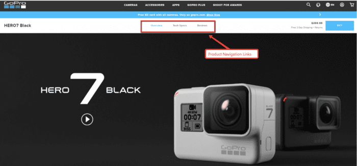
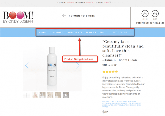
Finally, if you’re using a mini-site then you definitely need a product-specific menu because your product itself will span multiple pages. Usually the mini-site navigation goes under the normal menu.
Here’s an example of the mini-site for GoPro’s Hero 7:
Source: https://shop.gopro.com/cameras/hero7-black/CHDHX-701.html
Here’s another example from Boom Clean:
Source: https://www.boombycindyjoseph.com/products/boom-clean
Those are both desktop examples. So how should you handle this on mobile?
The answer there is a little less straightforward. If one of your menus is short enough to fit across a mobile screen, you can do what GoPro did:

For Zipify Pages, we did the exact opposite — we left the main navigation running across the page (since it has only 4 links), and put the longer product menu in the icon button:
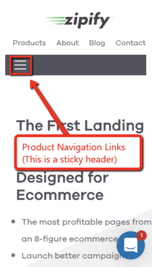
Notice that in both of these cases, it’s the product menu that follows you down the page in sticky fashion — not the main website navigation. When someone’s on your mini-site, you want that particular product to be front and center as much as possible.
To do this we use something called a sticky header.
(Read more about how to use sticky headers here.)
If you don’t have room for that, then you have 2 other choices: either use two “Menu” buttons or combine both menus into the same button.
Having two separate menu buttons can sometimes be confusing, which is why BOOM! By Cindy Joseph opted for the second strategy on this mobile mini-site:
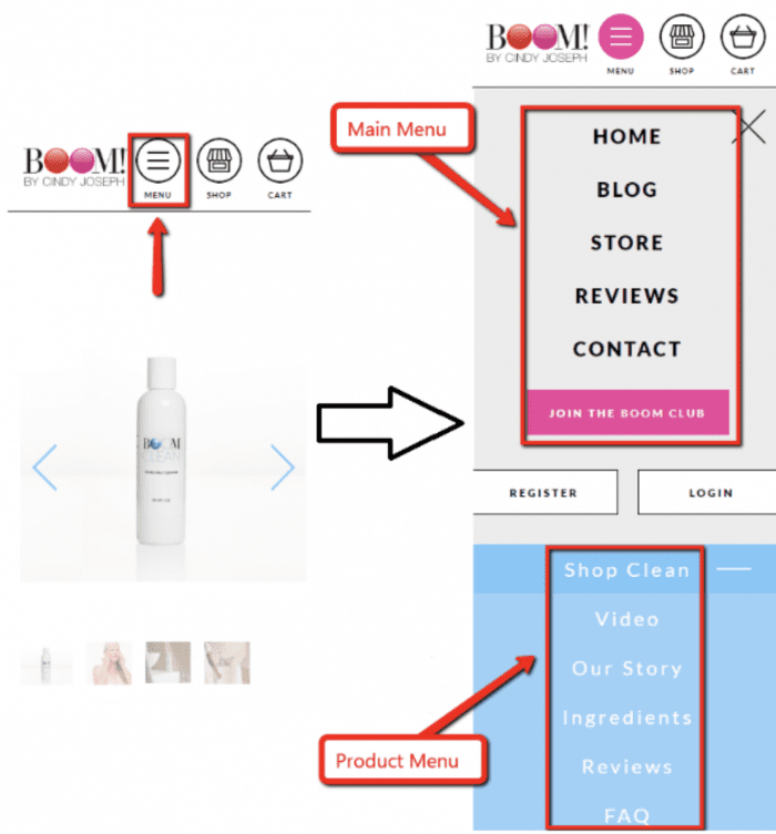
Here, there’s only one “Menu” button, which includes all the regular and product navigation links.
So now that we’ve covered how to add a product menu to your ecommerce landing page design, the next thing you need to think about is…
What Links Should I Add to My Product Menu?
Some of the most common links that might apply to your product include:
- Continue shopping (takes you back to the main store)
- Buy now
- Story
- Reviews
- FAQ
- Contact us
But these are just a few of the endless possibilities. Different products will require different links, so this is something you’ll need to take some time to think about.
Here are a few questions that can help you discover potential new links for your product page:
- Is there anything custom about this product?
If so, you might need a link to a special page.
For example, Boom Clean is a custom-made skin care product—so it includes a product link that explains the ingredients used:

Nuraphone, on the other hand, uses new technology to improve sound quality in their headphones—and they wisely created a separate page to explain how that technology works:

Is there anything custom about your product?
If yes, then consider adding a page explaining the technology, the design, the manufacturing process, etc.
Can you invent a test to prove your product’s effectiveness?
One really effective way to demonstrate your product’s effectiveness is to invent a test that shows it in action—preferably in a visual and dramatic way.
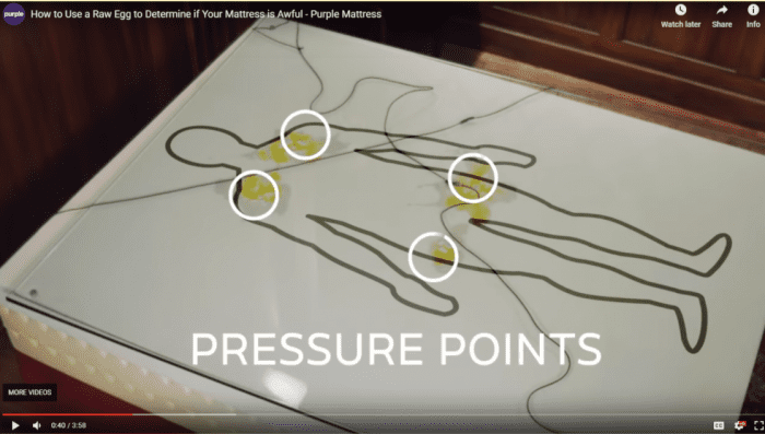
For example, Purple Mattress invented “The Egg Test,” where they drop raw eggs on top of a mattress. If the eggs break, it’s a sign that the bed has pressure points that will cause stiffness and discomfort while you sleep.
Of course, the only mattress that passes this test without breaking any eggs is a Purple Mattress.
Source: https://purple.com/mattresses/purple-bed
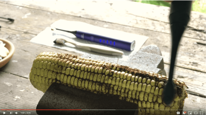
BURST Oral Care came up with “The Corn Challenge” to prove that their electronic toothbrush is better than the competition. In this test, you cover an ear of corn with coffee grinds and test various toothbrushes to see which one does the best job of cleaning out the coffee.
Source: https://www.youtube.com/watch?v=ydALMabadV4
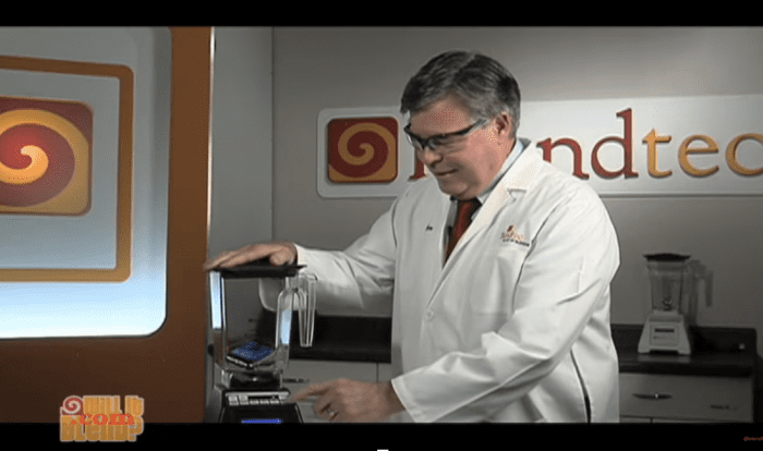
Another classic example is Blendtec’s “Will It Blend?”
In these videos, Blendtec demonstrates the power of their product by blending expensive electronic devices like iPhones and iPads:
Source: https://www.youtube.com/watch?v=qg1ckCkm8YI
If you can come up with a test like this to demonstrate how effective your product is, definitely include it in your sales page. If it’s interesting or funny, it even has the potential to go viral and spread awareness of your product.
What’s the most compelling ownership benefit?
This is a really important question to ask. And depending on your answer, it’s something that can show up in the menu. What’s the main reason why someone would want your product? What’s the most important thing it does for the user?
For BOOM! by Cindy Joseph, the answer might be soft skin. For Purple Mattress, it might be a better night’s sleep.
Now think about how you can put that benefit into your product navigation. The corresponding page would talk about all the ways your product can help the user to achieve that all-important benefit.
ACTION ITEM: Create your product navigation links.
7 Header Styling Tips
Your header is an incredibly important element of any ecommerce landing page design. So while we’re on the topic of your navigation links, let’s chat about it for a minute.
The header is simply the top part of your website. It’s where you typically have your logo, your menu, your shopping cart, and any other important links or information that you want to have present on every page.
When you’re styling your website’s header, here are a few tips to help improve your conversion rates:
1. Keep it slender.
While your header is important, it should never overwhelm the content on the page. You should try to keep your header as small as possible to allow for the biggest viewing area.
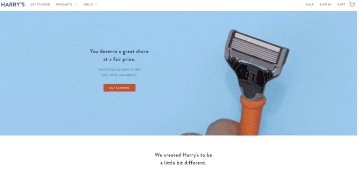
On your desktop site, try to make sure your header takes up no more than 20% of the website’s height. Like Harry’s does here:
Source: https://www.harrys.com/en/us
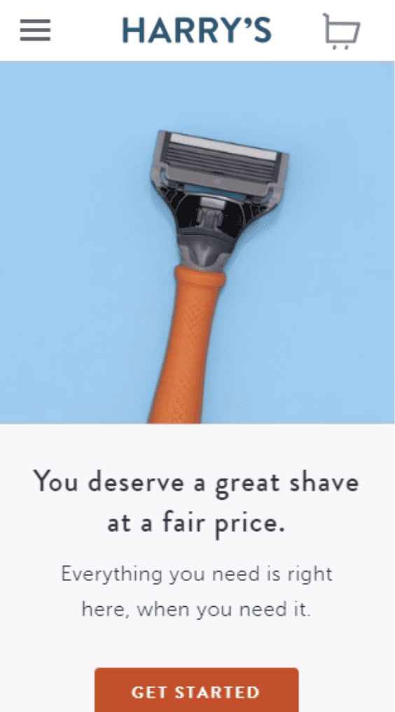
And on mobile, because screen space is even more limited, try to make sure your header takes up no more than 10% of the height. Again, Harry’s does a great job of this:
2. Always have a link to the shopping cart.
Every ecommerce store that has a shopping cart page should link to it in its header—always. This applies to desktop and mobile.
People are used to it. They expect it. And if you don’t include this in your header, there’s a chance they might get frustrated trying to find their shopping cart and leave without completing their purchase.
If you want to add a nice touch, give a notification when there’s a product in the cart, like M. Gemi does here:

Source: https://mgemi.com/pumps/the-quadro-70mm/00_3075_01.html/#!/color/410/size/39
3. Include your logo.
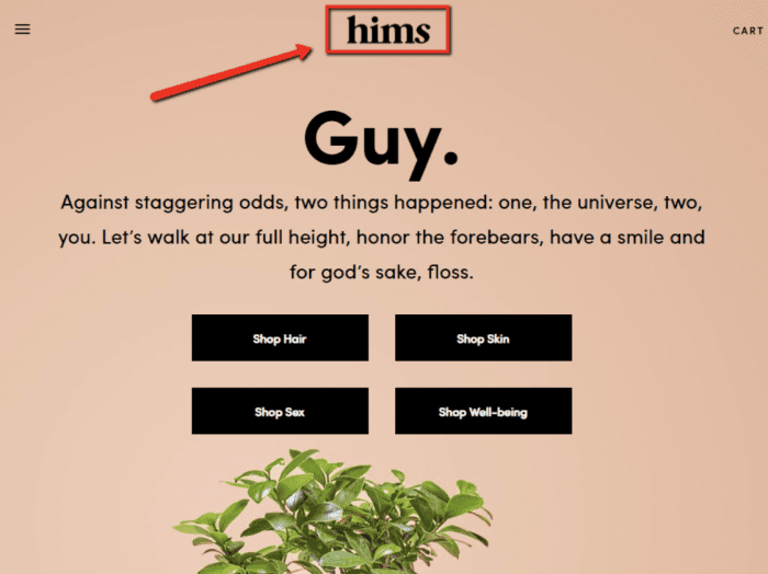
The header is definitely a prime place to display your brand logo. Anytime someone lands on your website, you want them to see that logo and instantly know they’re in the right place.
Source: https://www.forhims.com/
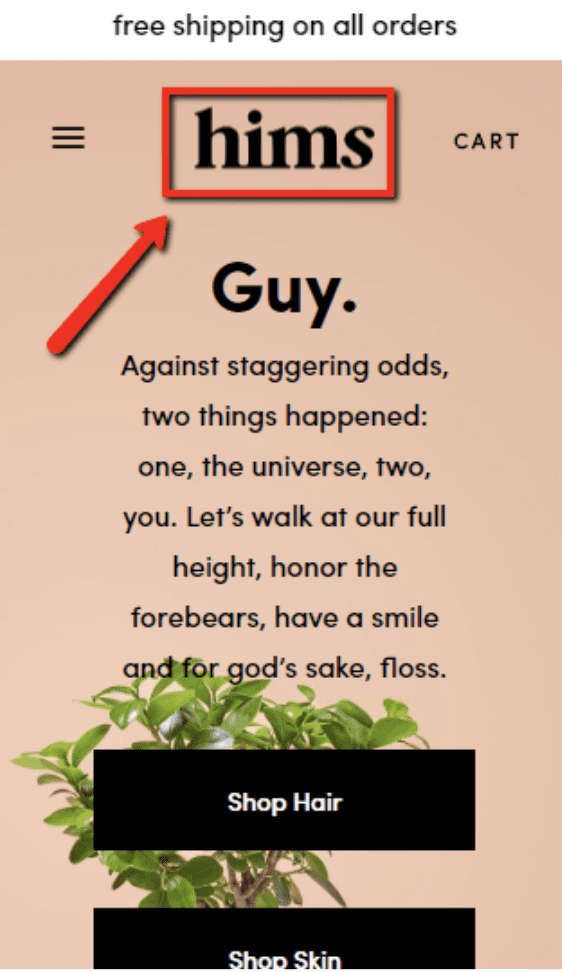
You’ll want this on your mobile site, too:
4. Include your brand’s tagline on desktop.
A good tagline can really help reinforce your brand identity. So if you have one, go ahead and put it in your desktop header.
Here’s an example from BOOM! by Cindy Joseph:

But on mobile, you’re better off skipping the tagline. The screen space is too limited and valuable.
5. Include a call-to-action for an email opt-in or a purchase.
Because your header is such a visible part of your site, it’s also a great place to put some kind of offer for a purchase or email opt-in.
In this example, Keeps uses a header bar to call out a special offer:

Source: https://try.keeps.com/keep-your-hair-nm
BOOM! includes an opt-in button in their header:

MVMT has one too — a sticky “Add to Cart” button along the bottom of the screen on mobile:
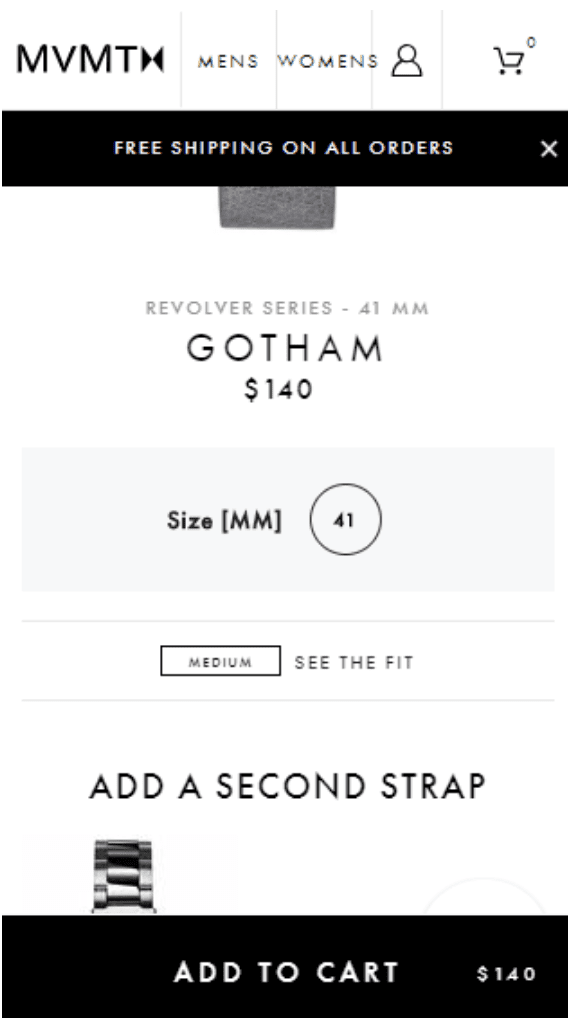
Now the downside to what MVMT is doing here is that between a sticky header, another sticky bar calling out free shipping, and a sticky add-to-cart button, they’re taking up quite a bit of space.
Another option is to put your mobile email opt-in inside the flyout menu, like BOOM! does here:
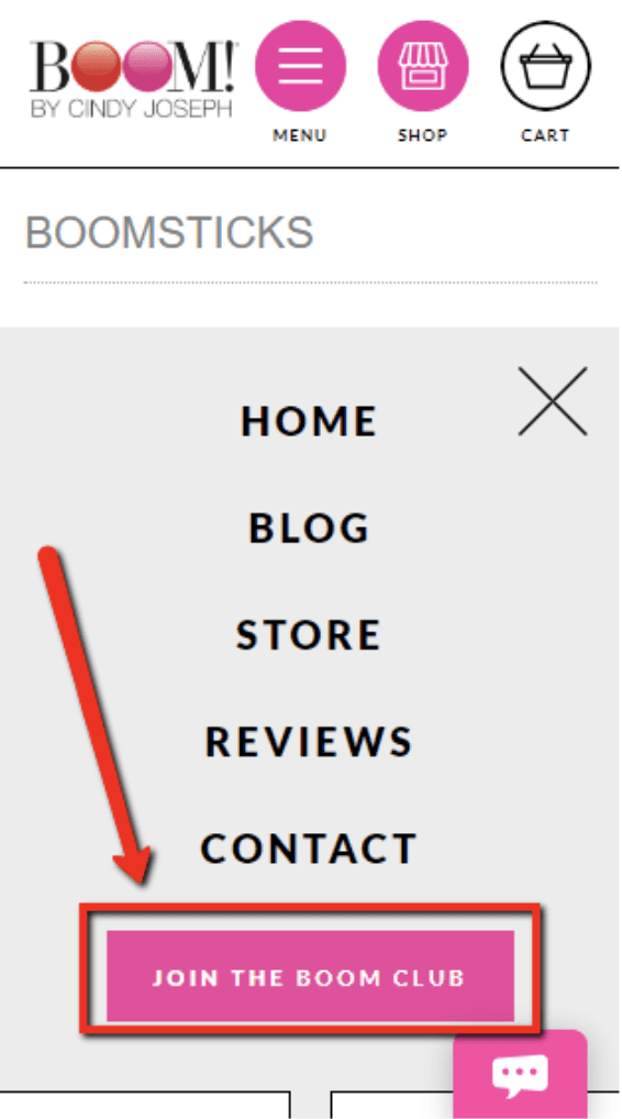
When this brand added a call-to-action to their header, they saw a 30% increase in email sign-ups. Definitely a worthwhile thing to add to your ecommerce landing page design!
6. Make your links easy to read.
Readability is always important. Make sure you use a big font that’s easy to read, in a color that contrasts the background and really stands out.
And pay particular attention to your mobile menu. A lot of companies ignore this part of their site, and as a result they miss out on the opportunity to convey value and make additional calls-to-action.
Notice how Hawkers has all kinds of wasted space underneath their menu:
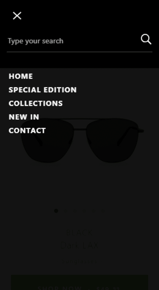
Source: https://www.hawkers.co/products/sunglasses-black-dark-lax-tr
Compare that to the company Hims, which does a great job of making their links bigger and including additional links at the bottom to their social media profiles:
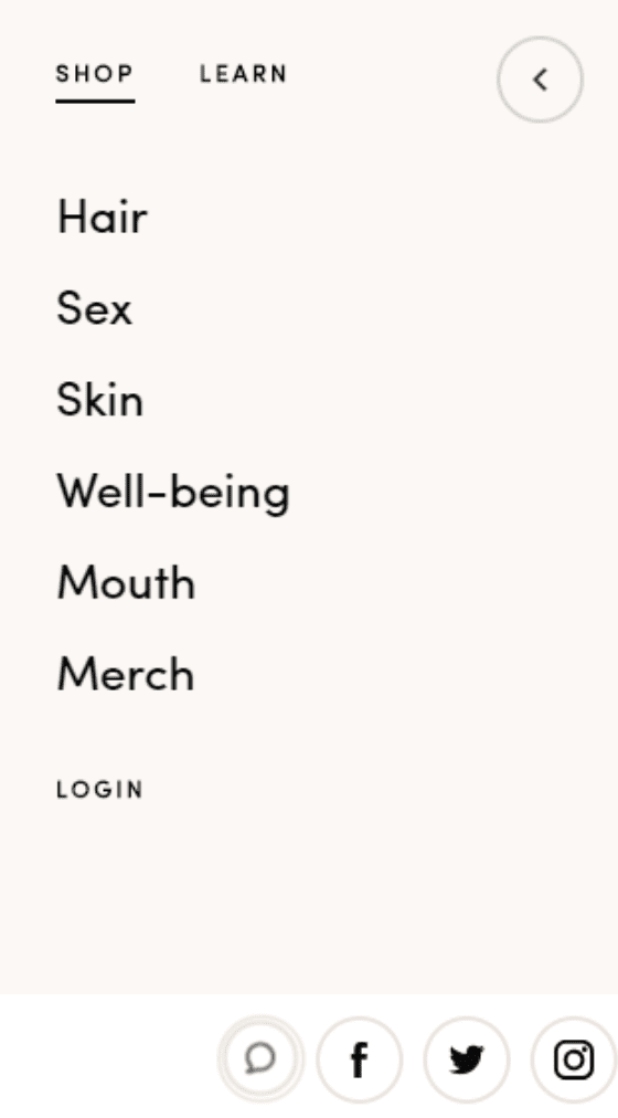
Source: https://www.forhims.com/
Big links are especially important on mobile, where it can be easy to misclick and end up on the wrong page. Keeping your links big, with space between them, helps to minimize this frustrating experience.
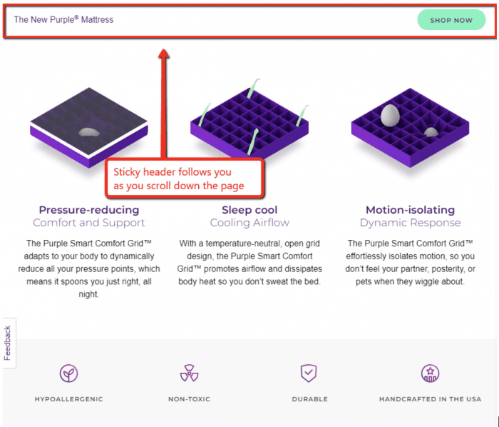
7. Make your header “sticky.”
A “sticky” header is one that sticks to the top of the page. So when you scroll down, that header is always right there at the top.
Here’s an example from Purple Mattress:
Their mobile page has it, too:
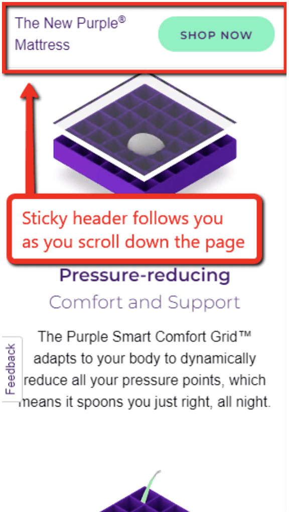
Sticky headers work really well, especially on long product pages (like Purple Mattress’s). This is because you can keep a call-to-action on the screen at all times.
Notice that on Purple Mattress’s sticky header, for example, the only clickable link is “Shop Now.”
BOOM! takes it a step further on their mobile site. When you scroll down, there’s no sticky header:
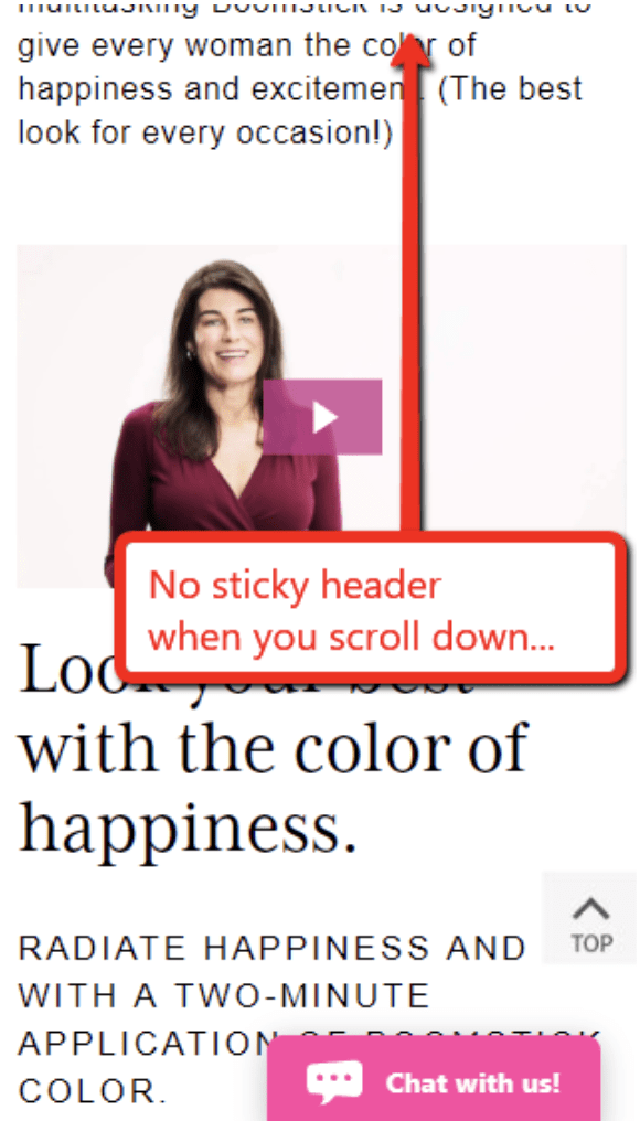
But as soon as you start to scroll back up, this appears:
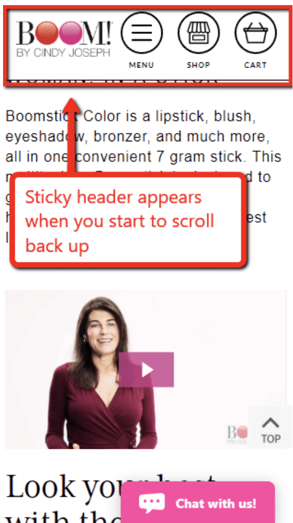
Here, the benefit is that you maximize screen space and minimize distractions while the visitor is scrolling down and engaged with the content.
But as soon as they start to move back up the page, indicating an intent to go somewhere else, they instantly get a menu with helpful links for the menu and cart.
In fact, while we’re talking about BOOM!’s mobile header, let’s dive deeper into how it evolved over time. This will give you a few ideas for how you want to design your own mobile header.
How BOOM! by Cindy Joseph Improved Their Mobile Header
Not long ago, this is what BOOM!’s mobile header looked like:
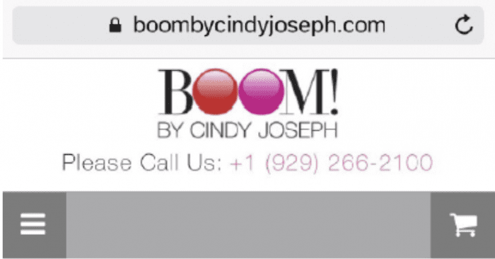
It’s not bad. Pretty basic, but it has all the important stuff: a menu, a cart, a logo, even a phone number.
But when the BOOM! team dug into their website analytics, they learned that over half of their traffic came from mobile visitors:
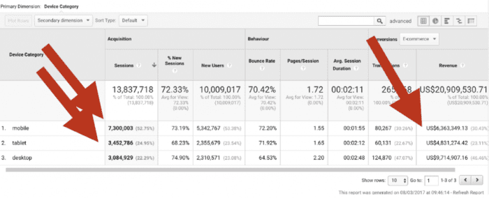
And while mobile accounted for the majority of sessions and users, it also had the lowest conversion rate and the lowest per-session value:

So the BOOM! team decided to improve their mobile experience by making it easier for people to navigate the site on a smartphone.
Here’s what the new header looked like:
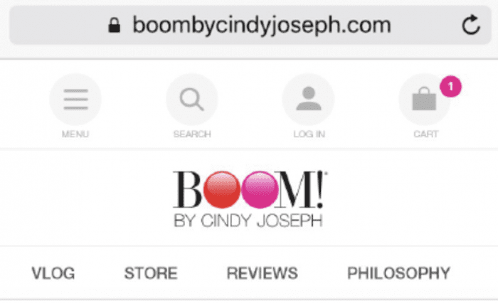
So what did they change, and why? Here are some of the biggest takeaways:
- They labeled the buttons. (Notice how the menu button says “Menu” underneath it, and same for “Search,” “Log In,” and “Cart.”) This way, it’s 100% clear what each button does.
- They added a search option, along with an easy way to log in. So if you can’t find what you’re looking for, you can just search for a page rather than having to hunt for it.
- They bookmarked certain important pages underneath the logo, giving users an easy way to find the vlog, store, reviews, and philosophy pages.
But they didn’t stop there. They also redesigned the mobile menu itself.
Here’s what the original looked like:
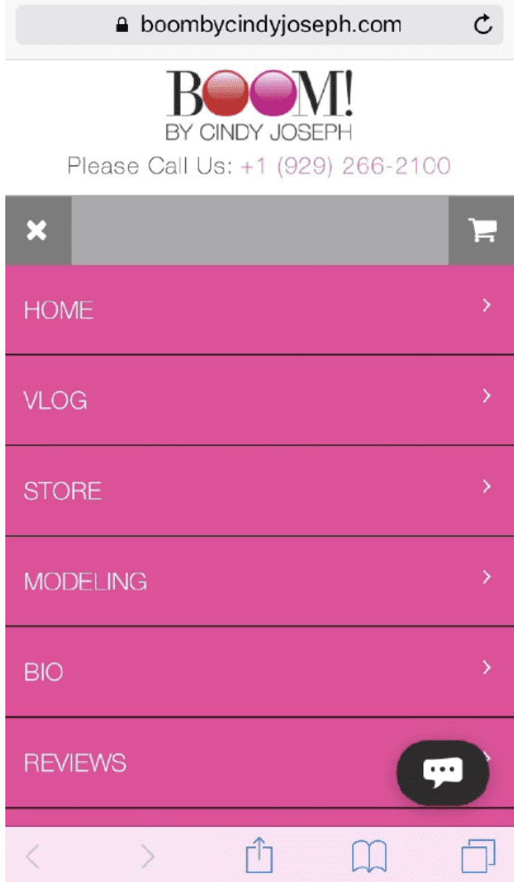
The biggest problem with this menus is that the small, white-on-pink text was hard to read. So they redesigned the menu, creating this version:
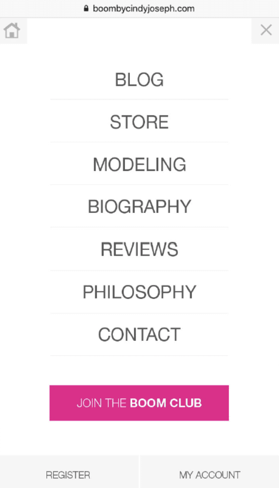
What changed?
- It’s less bold, with a white background (rather than pink).
- The text is thicker, making it easy to read.
- The overall appearance is cleaner.
- They moved the “X” to the top-right (which is where people usually look when they want to close something).
- The menu takes up the full screen, hiding the header. As a result, all the links fit onto one screen without having to scroll.
- They’ve added a call-to-action to “Join the BOOM Club.” And because the background is now white, this pink button really stands out.
Most importantly, all the links are big, easy to read, and well-spaced so they’re easy to tap.
And what were the results of these changes? Did they help improve BOOM!’s mobile conversion rate?
They did. In fact, the new header increased their ecommerce conversion rate by a whopping 20.56%:

Take another look at those numbers. This is clear evidence that your mobile header isn’t just an aesthetic choice. A well-designed header can have a real impact on your bottom line—so take time to get yours right.
(Learn more about the evolution of Boom!’s mobile header here.)
Step 3: Select a Featured Testimonial
Next up, it’s time to choose a featured testimonial.
This is different from your reviews. You still want a “Reviews” section with lots and lots of people saying how much they love your product.
But what we’re talking about here is a single testimonial you put inside your Buy Box. This will be a highly visible customer quote, so make sure it’s a good one.
(Learn how we edit the Shopify buy box here.)
Why do you want to add a featured testimonial to your product? Because it improves your conversions.
BOOM! tested this also. They took their original Buy Box, which looked like this:
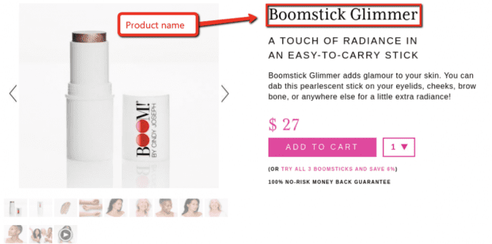
And tested that against this version:
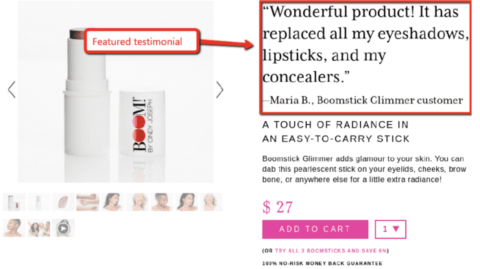
The only difference is that one version has the product name at the top, while the other uses a featured testimonial.
Adding the testimonial increased their conversion rate by 5.25% and their average revenue per user by $1.25. They repeated this test many times over, and the testimonial won every time.
This is a testament to just how important it is to leverage social proof on your product landing page.
When you’re choosing a featured testimonial, here are three tips:
1. Choose a testimonial that enthusiastically endorses the product.
It sounds obvious, but it bears repeating. You want this to be one of the best quotes you can find about your product.
2. Keep it short.
Because if it’s too long, people will skip over it.
Here’s a great example of a concise and effective testimonial:
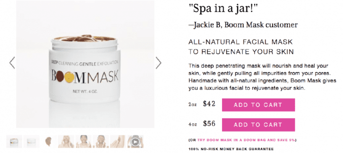
3. Choose a testimonial from your biggest customer demographic.
If your buyers are 75% female and 25% male, use a testimonial from a woman. You can’t rotate this featured testimonial, so make the most of it by having it represent your most common buyer.
ACTION ITEM: Select your featured testimonial for your ecommerce landing page.
Step 4: Select Product Carousel Photos
Now it’s time to add product pictures to your ecommerce landing page design.
Here’s an example of a typical product image carousel:
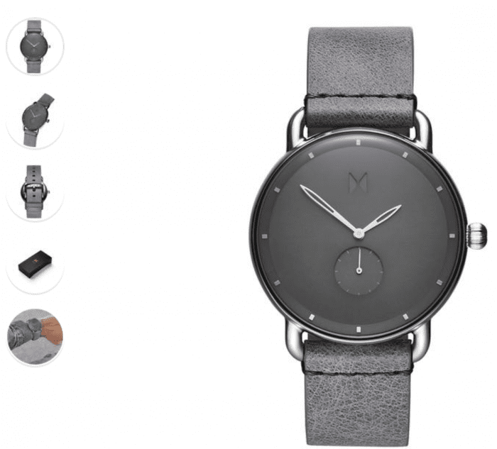
Source: https://www.mvmtwatches.com/collections/all-mens-watches/products/gotham
On an ecommerce site, having a good selection of high-quality product images is super important. Remember, people online aren’t able to pick your product up and inspect it for themselves. They have to rely on your pictures to give them a good idea of what the product is really like.
To put it another way, your images represent your product’s perceived value and quality.
A recent survey revealed that 93% of consumers consider images to be essential when making a purchasing decision online.
So it’s not surprising that product page pictures get a lot of engagement. Here’s a sample heatmap to prove it:
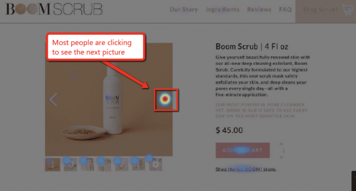
The same thing is true on mobile, even when that button is pushed below the fold:

Because your photos get so much attention, they need to be as good as you can possibly make them.
And generally speaking, there are only two main kinds of product photos:
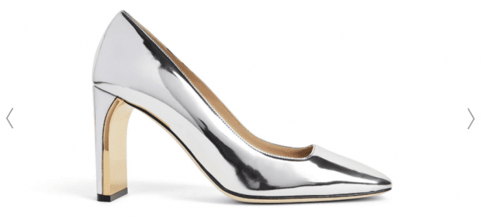
1. Pure Product Pictures
This kind of photo just shows the product itself against a pure white background (or a background of another color).
For example:
Source: https://mgemi.com/pumps/the-quadro-90mm/00_3074_01.html#!/color/041
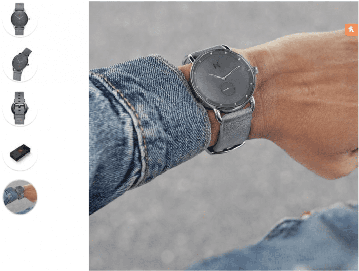
2. In-Context/Lifestyle Images
These photos show your product being used in its intended environment. Basically, they show the product in use.
For example:
Source: https://www.mvmtwatches.com/collections/all-mens-watches/products/gotham
You need both kinds of images on your product page.
And you need multiple photos. The minimum is 6-8, but you can always add more.
Here are some tips for creating your product image carousel:
Quality matters.
Your images absolutely need to look as good as possible.
This is NOT to say that you need a $5,000 camera. You can do this on an iPhone if you want.
But the pictures need to be taken by someone who knows how to take pictures well. You have to consider things like lighting and resolution.
Show the product in multiple forms.
Show your product in as many forms and positions as you can.
If it opens and closes, show it opened and closed. If it comes with a case, show it in the case and out of the case. If it folds up, show it folded and unfolded.
The more varied your images, the better people will be able to picture it in their minds.
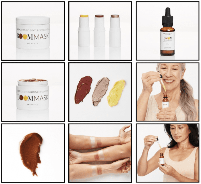
Here’s an example of how BOOM! shows their products in a variety of forms. They even give a close-up of the cream itself and show you how it looks on different skin tones:
Show the product in use.
You also want to show people actually using the product. And when you do this, make sure it looks like they’re enjoying the product — they should look happy and excited, like they’re having a good time.
Boosted Boards does a great job of that here:

Source: https://boostedboards.com/boards/boosted-mini
About 90% of the information that’s transmitted to our brain is visual. So take advantage of this chance to visually communicate to people how great your product is going to make them feel.
Show how the product is made and/or what it’s made of.
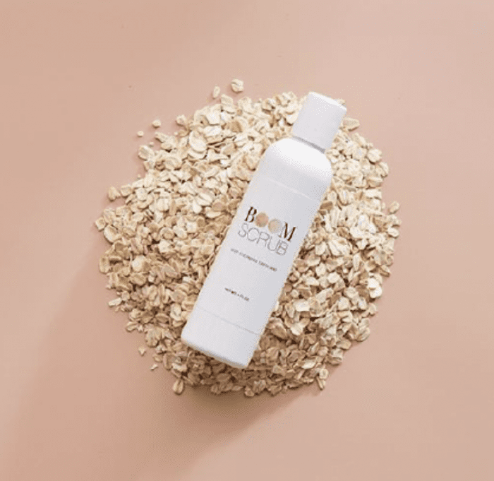
Another effective picture type is one that shows people what your product is made from.
BOOM! does this by highlighting certain ingredients, like this facial scrub that’s made with oats:
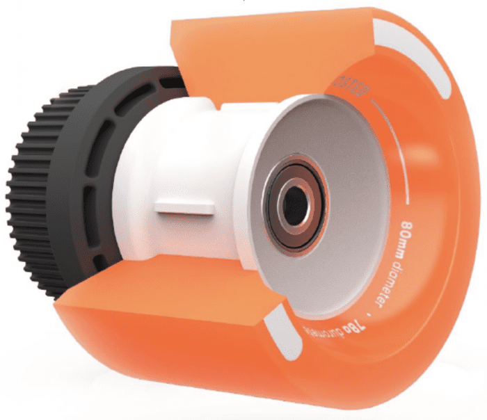
Boosted Boards uses animated photography to give you a close-up of some of the product’s most important components:
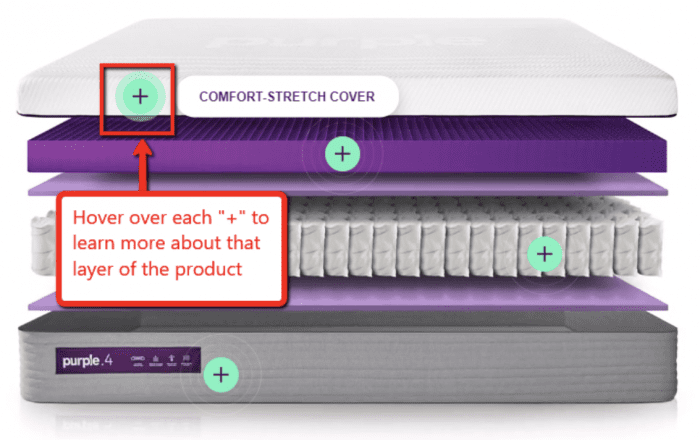
And a third way to do this is to give a visual overview of all the parts that come together to make your product. See how nice this image from Purple Mattress looks?
Show icons of each picture on mobile.
A lot of stores will show you a thumbnail of all their pictures on desktop…
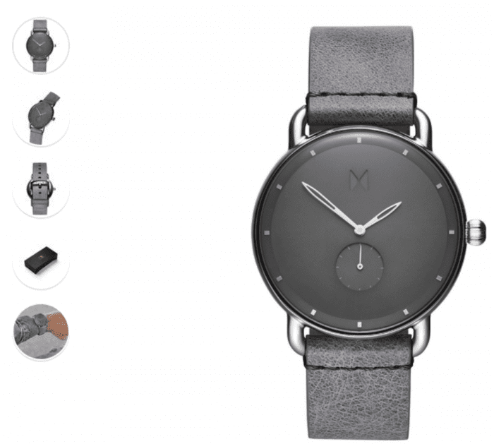
But then hide them on mobile:
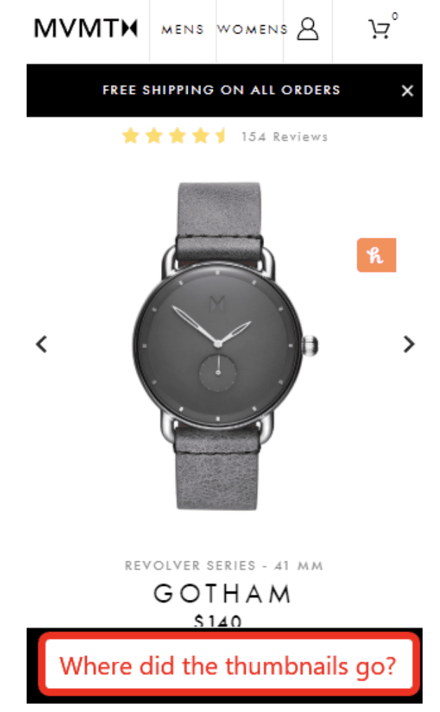
While it’s true that mobile screen space is limited, you should still show your image icons. Your pictures are that important.
And thumbnails are the only way for people to see, at a glance, all the images available.
BOOM! has the right idea:
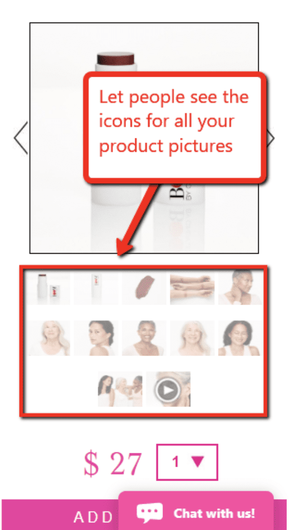
It takes up more space, yes. But it also improves conversions and engagement.
Optimize images for quick loading.
This is a reminder that your page load speed is really important. (Especially on mobile.)
YES, you want the best possible images you can get.
But NO, you do not want those images to slow down your website so it loads at a crawl.
The best course of action is to get the best images you can find, and then have your developer optimize them to load as quickly as possible.
(Learn more about how Zipify Pages helps to optimize your images for faster load speeds.)
ACTION ITEM: Decide on 4 ideas for showing off your product in its intended context.
Step 5: Create A Short-Form Product Demonstration Video or GIF
Videos work really, really well.
If you aren’t leveraging video on your ecommerce landing page, you’re missing out on one of the most effective conversion assets out there.
Now, if you already have a high-quality product video — maybe something with interviews, and testimonials, and product shots, and so on — that’s great. Keep it.
But a lot of savvy ecommerce stores are also finding it really useful to have a short-form product demonstration video.
(And this can even come in the form of a GIF.)
This is a short and simple video that shows the product in use. It’s a really useful video because you can add it to your product carousel, share it on Facebook and Instagram, use it for video ads, and more.
Here’s an example from BOOM!:

Note that it’s really short. This one is about 10 seconds long, and you should ideally keep it under 30 seconds.
This video doesn’t even have sound — although some short-form videos play catchy music in the background, like this one from M. Gemi:
(Product videos and image carousels are also covered in Part 2 of this series here.)
ACTION ITEM: Create your short-form product demonstration video or GIF.
Step 6: Add Buy Box Content
We talked about Buy Boxes in our article about the elements of a high-converting Shopify landing page.
Here’s an example of a Buy Box from M. Gemi:
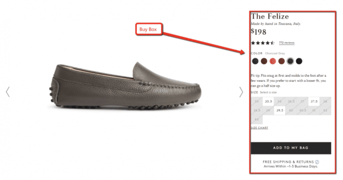
Source: https://mgemi.com/moccasins/the-felize/03_1000_41.html/#!/color/788
The goal of your Buy Box is to get the visitor to click that “Add to Cart” button. And to accomplish that, it needs to remind people of the most important reason WHY they should buy now.
In other words, your Buy Box needs to quickly summarize the main benefits of your product.
Unfortunately, many ecommerce companies miss out on this opportunity by not using any copy. As a result, their Buy Box doesn’t effectively communicate why the visitor should buy.
In this example from MVMT, they do a great job demonstrating social proof by showing their reviews near the top, but they miss out on an opportunity to include some really important copy.
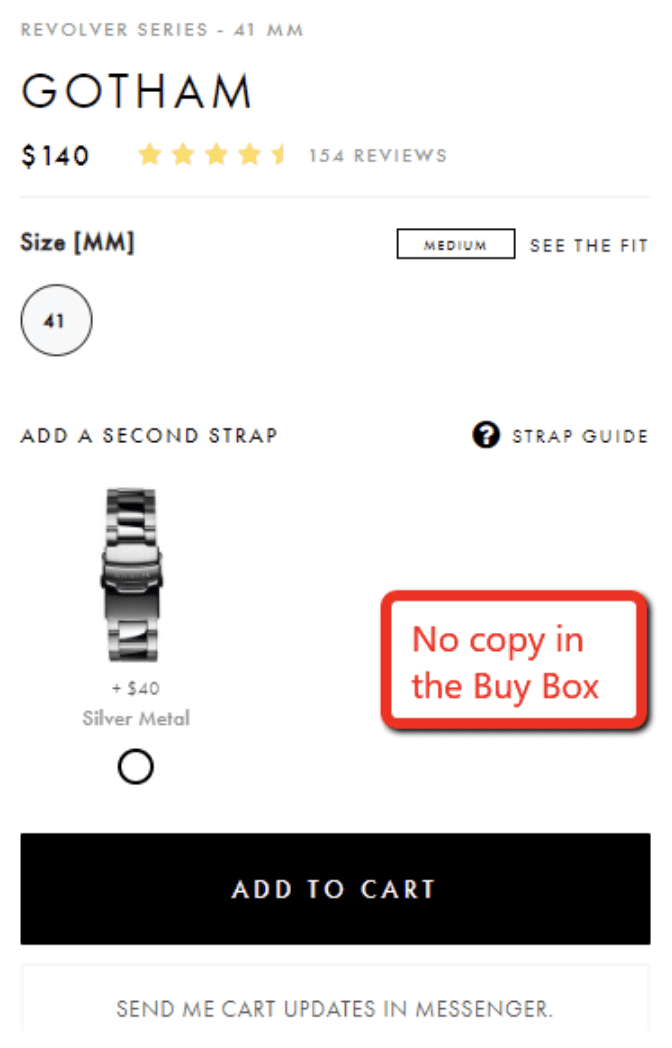
Source: https://www.mvmtwatches.com/collections/all-mens-watches/products/gotham
Compare that to BOOM!, which takes full advantage of the Buy Box to repeat the product’s main benefit along with additional social proof, upsells, reviews, and more:
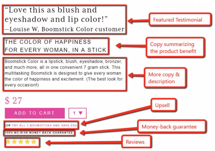
If you want to use a framework, your Buy Box should follow these steps:
- Open with a featured testimonial
- Provide a one-sentence ownership benefit
- Add a 2-3 sentence description
When you’re thinking about that one-sentence ownership benefit, the trick is to ask yourself questions like:
- What is the primary reason for someone to buy this product?
- What is the main benefit they’ll get from using the product?
- What will they get/have/obtain/become/feel after using the product?
- How will other people perceive the customer or think about the customer differently after using the product?
Put the answer in your Buy Box in a succinct and compelling sentence.
Remember, this is perhaps the most critical part of your ecommerce landing page. So take advantage of the opportunity to remind people why they should buy. It could mean the difference between winning a sale or losing one.
(Go here for 7 more tips on how to optimize your Buy Box for more conversions.)
ACTION ITEM: Write your Buy Box content.
Step 7: Choose Call-to-Action (CTA) Text
Now let’s narrow in on the single most important element within your Buy Box:
The “Buy” button.
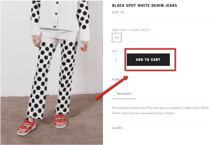
A lot of websites get creative with the CTA text on their buttons. Like Netflix, for example:
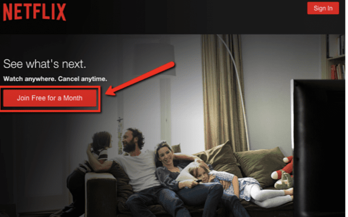
Source: https://www.netflix.com/
This may work really well in some situations. But it’s generally NOT a good idea for ecommerce.
For ecommerce, you should be using one of these common CTAs:
- Buy Now
- Add to Cart
- Checkout Now
- Add to Bag
What’s so magical about these CTAs?
In a word, they’re clear. People have been shopping online for years now, and they’re used to seeing a button that says one of these things.
If you break with that tradition and do something different, some people are liable to get confused and wonder if your website works differently.
So, for your own good, don’t try to get too creative here. Most ecommerce stores should just stick with “Add to Cart” and move on. (Unless you’re in Europe, where “Add to Bag” seems to be more popular.)
ACTION ITEM: Choose your CTA text.
Step 8: Decide on USPs and Create USP Images
USP stands for a “Unique Selling Proposition.”
In a nutshell, USPs are things that make you different; the things that set you apart from your competition.
They’re reasons why people should buy from you instead of somebody else.
Now, it’s always good to mention these USPs in your landing page copy. But it’s also a great idea to take your USPs and turn them into USP images.
This is a really effective technique that a lot of ecommerce stores are doing. Like Puravia:
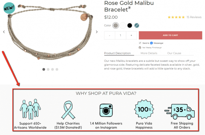
Source: https://www.puravidabracelets.com/products/rose-gold-malibu-bracelet
Or Suavs:
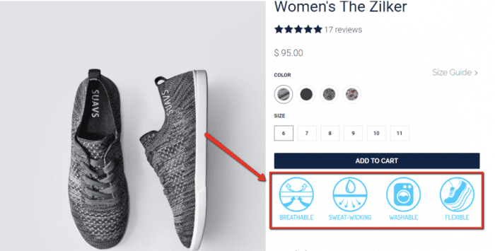
Source: https://www.suavshoes.com/products/womens-the-zilker-knit?variant=32993062721
Or Purple Mattress:
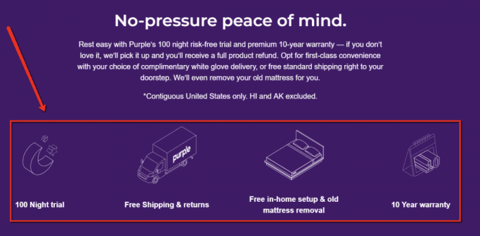
Source: https://purple.com/mattresses/purple-mattress
Now it’s time for you to figure out your USPs, and put them into an image format!
If you already know your USPs, great. But if you’re still working on that, here are some ideas for USPs for your business:
- What makes you cool?
- Do you offer guarantees or special financing?
- Do you provide fast and/or free shipping?
- Where do you go above & beyond to make your product special?
- Do you have any relevant certifications?
- Do your products use some special technology?
- Is your product made in the USA, cruelty-free, organic, or 100% natural?
- Is there any other reason people should buy from you instead of your competitors?
These kinds of things make for great USPs.
So take some time to think about it, and when you have your USPs ready, put them into an image format. Then stick those images somewhere on your product landing page.
ACTION ITEM: Decide on your USPs (pick at least 3-4) and stick them somewhere on your product landing page.
Step 9: Decide on Guarantees
Guarantees are another thing that can have a major impact on the effectiveness of your ecommerce landing page.
Because think about it: Anytime you buy something online (especially if you’ve never bought from this company before), you’re taking a little bit of a gamble.
You can’t see the product in person, so you don’t really know for sure what it looks like. And while you can read reviews and see testimonials, you can’t always be certain that the product is going to work the way it should.
That’s why a guarantee can be so powerful. It’s just a way of telling your visitors, “If you don’t like this product, you can get your money back.”
It reduces that feeling of risk and makes people more likely to click the “Buy” button.
You can offer all kinds of different guarantees:
- Money-back guarantee
- Satisfaction guarantee
- Lifetime guarantee
- Buy-back guarantee
- Happiness guarantee
- Low-price guarantee
In general, nothing seems to ever beat a money-back guarantee. The most effective guarantee you can give your shoppers is the promise that you’ll give them a refund if they change their mind.
But that doesn’t mean you can’t have multiple guarantees. You could offer a money-back guarantee AND a product-specific guarantee, like Away Luggage’s “Smooth Ride” guarantee:
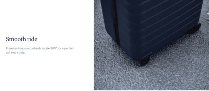
Source: https://www.awaytravel.com/luggage/large/navy
So next, take some time to think about guarantees you can offer. Your goal here is to minimize any feeling of risk and replace it with a sense of security in your shoppers.
ACTION ITEM: Decide on your guarantee(s).
Step 10: Select Social Proof Images
Our final step in creating a high-converting ecommerce landing page design is to add social proof images to your page.
These are usually small images or logos — about the same size as your USP graphics — that lend credibility to your product or your company in some way.
If you’ve been featured in a magazine or on a website, for example, you can add their logo for a little extra social proof:
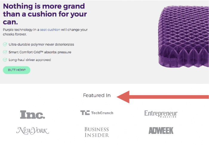
Even more effective is to feature a quote along with the logo, like Frank Body does here:

Source: https://www.frankbody.com/us/
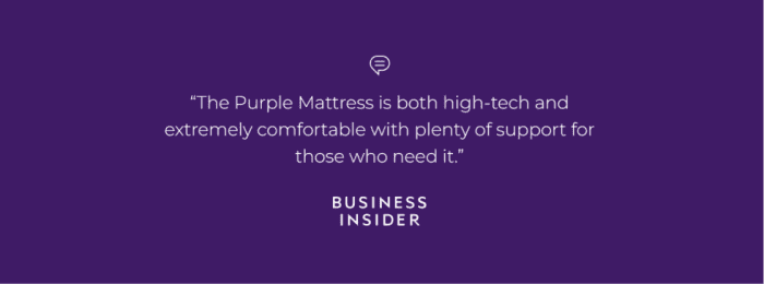
Purple Mattress follows the same formula:
Source: https://purple.com/mattresses
Having a quote like this from a well-known media source is ideal. But if you don’t, you can always use quotes from current customers.
The idea is to add more social proof to your product page.
Here are a few places you can look for quotes to turn into social proof images:
- Reviews or testimonials from current customers
- Celebrity endorsements (remember that a “celebrity” could be anyone who is well-known in your niche; this doesn’t have to be an international movie star)
- Certification logos (if you’re certified with the USDA, certified organic, certified with PETA, etc.)
- Quotes and/or logos from magazines or blogs
- Expert reviews or recommendations (such as “9 out of 10 dentists recommend it”)
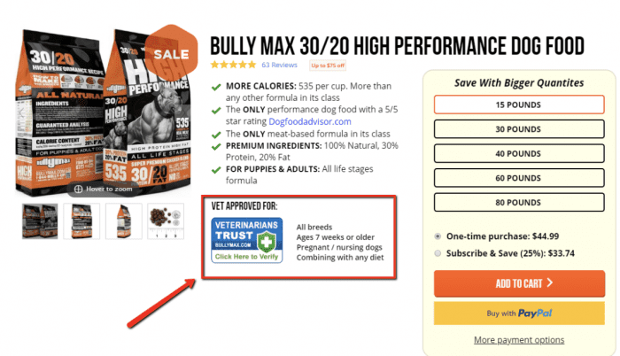
Bully Max displays this logo to prove that their product has been evaluated by an independent veterinarian for safety and quality:
Source: https://shop.bullymax.com/products/dog-food/
Along those same lines, you can also add the logos for any certifications you’ve achieved or memberships you’re associated with, such as…

In short, you’re basically looking for anything from a third-party source that gives your product greater credibility. Then throw those credibility-boosting images onto your ecommerce landing page.
ACTION ITEM: Select social proof images.
Now it’s Time to Design Your Ecommerce Landing Page
If you’ve been following along, you should have everything you need to finalize your high-converting ecommerce landing page design.
Just take the assets you created from each of the 10 steps and build them into which type of ecommerce landing page you selected in our article 1. Going step by step will ensure that you don’t forget any of these important conversion-boosting elements.
When you’re finished, you might realize there’s one thing still missing…
Your landing page copy!
But don’t worry. What you write on your product landing page is so important that we’ve created an entire article just on that topic.
The next article in this “Guide to Shopify Landing Pages” will be available soon: (Part 4) Learn how to write Shopify landing page copy that converts.
You can view articles 1 and 2 in this series here:
(Part 1) 3 Types of Shopify Landing Pages That Feature Your Product Offers
(Part 2) Choosing the Elements of a High-Converting Shopify Landing Page
The First Landing Page Builder Uniquely Designed for Ecommerce
If you’re not a Zipify Pages member and you’d like to leverage engaging and converting landing pages on your Shopify store (or any of our other high-converting templates), start your membership today.
Get Zipify Pages

