

Hey, it’s Ezra! Thanks for joining me for a new Zipify blog post.
Here at Zipify, we’re all about helping you get more from your ecommerce store…
And for the last year, we’ve been focusing a lot on buy boxes. This is the section of your product pages, usually above the fold, that contains a pared-down pitch for your product — image, copy, variant selectors, etc. — along with a call to action.
It usually looks something like this:
Why have we been working so hard on such a small part of the website?
Well, the buy box is probably the most important section of your product pages, and your product pages are probably the most important pages on your site, so…
Buy boxes are pretty important!
Yet most ecommerce stores aren’t leveraging them correctly, often failing to include the right page elements or optimize this section for mobile.
So in this blog post, I’m going to show you how I improved the buy boxes on my $20 million/year Shopify store…
Including one small change that had a huge impact on revenue, and six more tweaks you should make to your buy boxes right now.
Can You Spot the Difference?
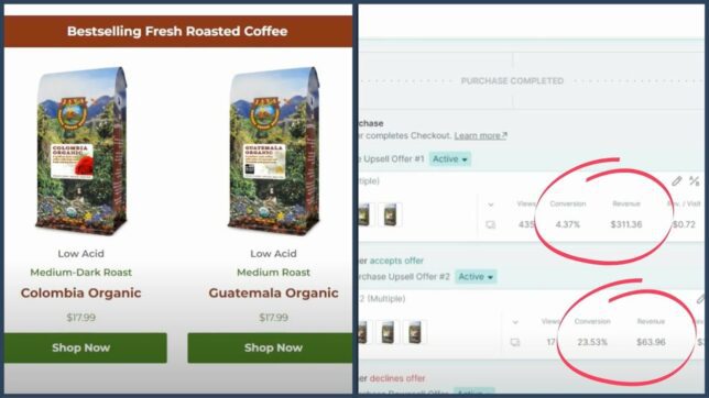
Recently, we made one small change to our buy boxes that produced a $5.50 increase in average revenue per user (ARPU), resulting in an extra $30,000 a month for just one of my products.
Think you can guess what that change was?
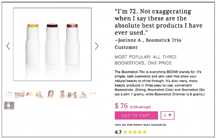
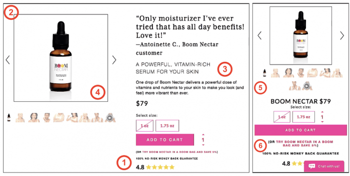
Look at these product page buy boxes and see if you can spot something that stands out from a traditional ecommerce buy box:
I’ll give you a hint: It’s somewhere near the top…
Okay, time’s up. Here’s the answer… Instead of starting the buy box with the product name in the title (like every other ecommerce store in the world)…
We open with a social proof headline:
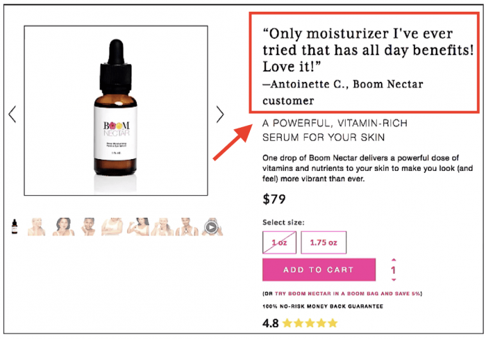
POW! Right when you land on the page, there’s a glowing customer review right at the top of the buy box.
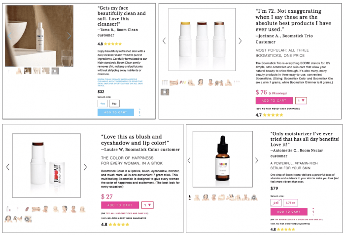
We’ve been testing this strategy across all our product pages, with incredible results:
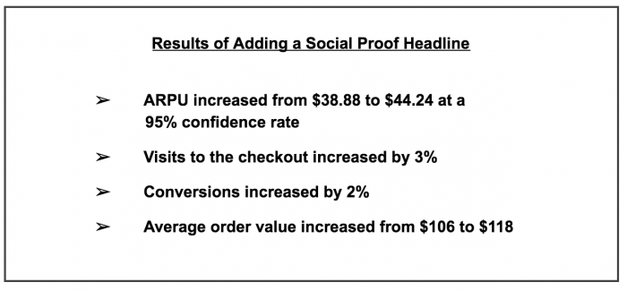
The results were incredible, but not surprising. When someone lands on your product offer page, they don’t want to hear that you think your product is great — of course you think it’s great, it’s your product…
They want to hear what people like them think about it. That’s why including social proof at the top of the page is so powerful.
This is just one of the cool things we’ve tested on our buy boxes lately that’s working really well.
Here are 6 more tweaks we’ve made that have produced significant gains, plus instructions for how you can implement them on your Shopify product pages.
More Improvements for Your Buy Boxes
Because we get so much traffic on our store, we are able to test a lot of different ideas to improve our buy boxes.
Here are 6 things we tested recently that have produced big results.
1. Star Rating – We include social proof review stars either at the top or bottom of the buy box. While this is pretty standard ecommerce strategy, we like to verify everything with actual results. When we tested it, we found that ARPU increased from $16.53 to $17.99 and conversions went up by 2.45%.
2. Image Borders – You always want to have borders around your images, especially if you’re using images with same background color as the rest of the page.
3. Product Copy – It’s surprising that I have to say this, but… You want to include a little bit of copy in your buy box! More and more lately, I’m seeing pages that don’t include any copy, forgoing the opportunity to pitch the product and express the voice of the brand.
4. Optimized Images – You want to make sure that your images are optimized so they show up correctly on different screen sizes and don’t hurt your page-load speed. (The app I created to build all my product pages is called Zipify Pages and it optimizes your images automatically, both for page-load speed and different formats.)
5. Mobile Carousels – Images sell, and the more the better! That’s why we’ve found it effective to have an image carousel on desktop and mobile that includes thumbnails for each image (instead of small dots that imply more images). This mobile carousel increased engagement with our images, which in turn increased overall conversions on these pages.
6. Mobile CTAs – On mobile, you want your add-to-cart button to span the full width of the page so it’s easy to tap. (Medium-width CTAs are okay on desktop.)
Optimize Your Buy Boxes with Zipify Pages
These are simple customizations you can make to your buy boxes to improve user experience on your pages and increase revenue on your store.
If you want an easy way to implement the same buy boxes I included in this post…
Plus get access to all the top page templates I use on my $20 million/year ecommerce store…
Check out Zipify Pages, my sales funnel and landing page builder for Shopify. This app makes it cheap and easy to grow your store by leveraging high-converting, ecommerce-specific pages in your marketing.
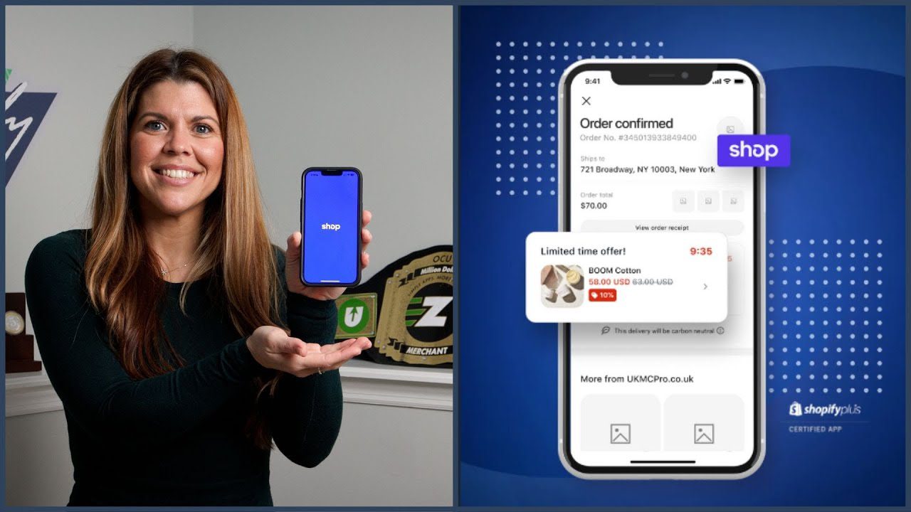
Watch the video above to see Zipify Pages in action.
Thanks for checking out this blog post. See you next time!
Try Zipify Pages