
Welcome to Part 2 of our “Guide to Shopify Landing Pages” series! To read the previous article, click here.
When you spend as much time researching landing pages as we do, you realize something: A lot of top brands are using the exact same recipe.
And once you know what those “ingredients” are, then building a winning landing page is actually pretty simple.
Let’s start by talking about the four most important Shopify landing page elements to include on your site. These are common structural elements that you’ll find on all high-converting ecommerce product pages. And if you want to maximize your own sales, you need to make sure that you follow certain best practices when you implement them.
Because these elements are so widespread, most product pages have them — no matter which type of page it is: traditional, long-form, mini-site, etc. But not everyone implements them in the most effective way.
That’s why we wrote this article. When you follow the guidelines in this post, these landing page elements will:
1. Make your website easier to use and navigate
2. Increase your conversion rates and convince more people to buy
Sound good?
Great.
So without further ado, here are…
The 4 Main Shopify Landing Page Elements
The four main Shopify landing page elements are:
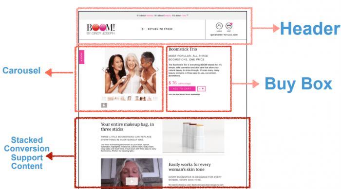
- Your header
- Your carousel
- Your buy box
- Your stacked “conversion support” content
They may not be laid out exactly the way you see in the picture above, but ultimately, every product page is going to have a header, a carousel, a buy box, and some stacked conversion support content.
Most online shoppers have been around the block enough times to recognize these landing page elements, even if they don’t do it consciously. When they come to your product landing page, they’re going to be looking for these things—and if you don’t have them, something’s going to feel wrong.
Your page might feel incomplete, like it’s missing some key information. Or maybe your website will be difficult to use and navigate. That’s why it’s important to make sure all your product landing pages have these key elements.
(Read more about the types of Shopify landing pages that feature your product offers here.)
So let’s go through these four Shopify landing page elements one by one to make sure you understand what each element is, what it needs to accomplish, and how you can get the most out of it.
Shopify Landing Page Element 1: The Header
Just about every page you’ve ever visited online has a header, and you definitely want to have one on all your Shopify landing pages.
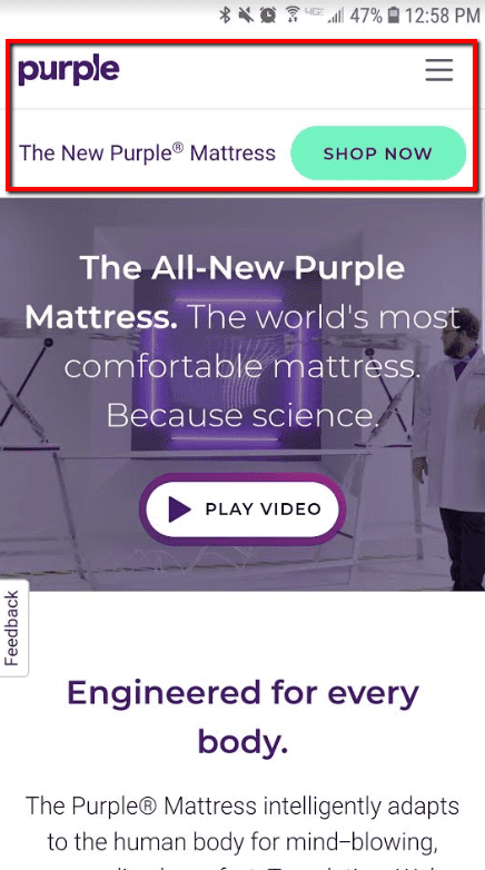
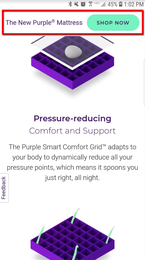
Here’s an example from Purple Mattress:

Source: https://purple.com/mattresses/purple-mattress
Obviously the header goes at the very top of your website. And people are going to expect to find certain things here—like a menu system, a link to the shopping cart, and a logo that links to the homepage.
To understand what you need in your header, first you must understand what your header is there to accomplish.
The 6 Goals of Your Header
Your header comes at the top of every single page on your website. It takes up the most prominent position on each page, so it needs to accomplish some really important things.
People are also used to headers fulfilling certain roles. And it’s in your best interest to make sure your header fills those expectations, because it makes your website easier for people to use and navigate.
With that in mind, here are the six main goals of your landing page header:
1) Provide access to any necessary non-product content.
Your header should have a menu that gives people an easy way to navigate your site. They should be able to reach any other important page with just a tap or two—like your About page, your home page, your support page, your other product landing pages, and any other pages that have important content on them.
2) Not get in the way.
Some websites have these giant headers that take up a quarter of the screen, and that’s NOT a good design.
Yes, the header is important, but it’s not the MOST important thing on your product landing page. The actual content—the “conversion elements” which include your product images, copy, and buy button—that stuff is the real meat of your page, and you don’t want the header to get in the way.
That’s why a good header should take up as little space as possible, and maximize the amount of real estate that you’re able to dedicate to all those conversion elements.
(We’ll talk about conversion elements later on in this article, BTW.)
3) Be easy to use.
The main goal of your header is to give a good user experience by making it easy for people to use and navigate your site.
This is especially important on mobile, where screen size is more limited. Look at how Purple condenses their mobile header to take up just 2 lines:
Source: https://purple.com/mattresses/purple-mattress
Mobile navigation is so important that we spent over a year developing the mobile header and navigation for our Top-100 Shopify store. You can view our new mobile header here.
4) Support the call-to-action.
Many of today’s fastest growing ecommerce brands are using “sticky CTAs”—these are those headers that “stick” to the top of the page even when you scroll down.
Sticky headers are a great place to put a “Buy” button, because it means that no matter where people are on the page—halfway down, ¾ of the way down, all the way at the footer—there’s always a “Buy” button in view, and the visitor is never more than one click away from adding the product to their cart.
Here’s the sticky portion of the Purple Mattress mobile header. It follows you as you scroll down the page:
Source: https://purple.com/mattresses/purple-mattress
You aren’t limited to just one CTA in your header either. Adding a second CTA can be very effective for increasing email opt-ins and navigating to your store page. Learn more about how to use a double CTA header here.
5) Give easy access to the shopping cart.
You should also have a link to the shopping cart in your header, preferably somewhere on the right-hand side. Online shoppers expect this, and if you don’t do it then people are going to get confused trying to use your website.
(And just in case you were wondering, confusion is NOT a good way to get people to buy your products.)
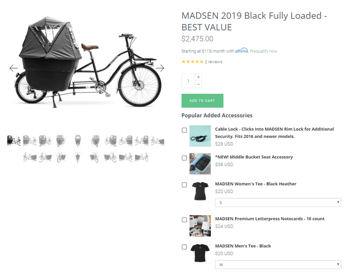
This doesn’t have to take up much space. All it takes is a little cart icon, like Madsen uses here:
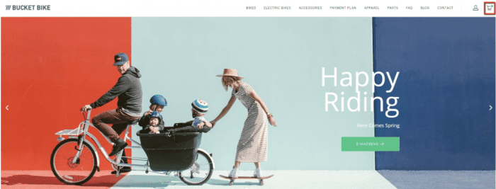
Source: https://www.madsencycles.com/
Note that not every product website needs a cart page. If you only sell one product, then there isn’t any need to have a cart, because there’s only one thing for people to buy. But if you sell multiple products, and people are going to be browsing different categories and possibly buying more than one product at once, then you definitely want to include a cart page.
6) Reaffirm your brand identity.
Finally, your header should also reflect your brand.
This means putting your logo on the left-hand side, and adding your tagline (if you have one) on desktop. It helps educate visitors on the story of your brand and communicate what the brands stand for. When done correctly, this can help your brand to appeal to the right people (i.e., your target market).
And because the header is such a visible part of your website, it’s a great place to reaffirm that brand identity.
Take Death Wish Coffee, for example. One look at their logo and tagline (which comes a little farther down the page) is enough to tell you that this product appeals to hardcore coffee drinkers who aren’t afraid of caffeine.
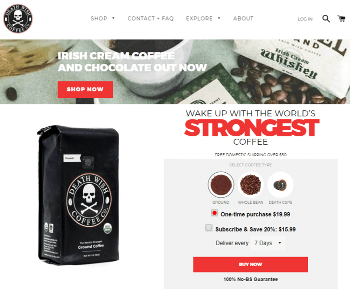
Source: https://www.deathwishcoffee.com/
(Want to learn more about mobile headers? Read our article – Make More Money from Mobile Traffic with Zipify Pages’ New Mobile Header)
Shopify Landing Page Element 2: The Image & Video Carousel
The next Shopify landing page element is your product carousel. This is where you display the images and videos that help people visualize your product.
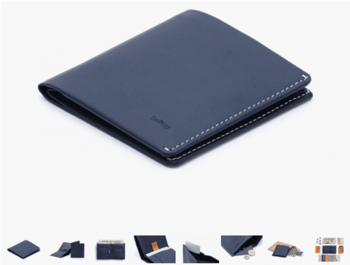
Source: https://bellroy.com/products/note-sleeve-wallet/leather/blue_steel
As you can probably imagine, the product carousel is a critical element of any product page. This is where you show potential buyers—not just tell them but actually show them, in a way they have to believe because they’re seeing with their own eyes—just how high-quality/beautiful/awesome your product is.
And because it’s such an important part of your landing page, it’s definitely worth taking the time to make sure it’s done right.
The 6 Goals of Your Carousel
Here are the primary goals of your product carousel. Keep these in mind when you’re gathering images and videos for your products.
1) Show off your product.
It’s really, REALLY important to get this part right. You want your images to be big, bright, and beautiful. Make sure they’re as attractive as possible. Good lighting is essential.
Professional shots like this really help communicate your product’s value:

Source: https://greatgeorgewatches.com/collections/watches/products/the-waverly-polished-rose-gold-white-dial-vachetta-strap-w
2) Demonstrate the benefits of ownership.
To demonstrate the benefits of ownership, you need to find a way to show—in image format—what your customer’s life is going to be like once they purchase your product. Show the benefit. Let people see how owning this product is going to make their life better.
In other words, don’t just show the product itself—show it in action.
So if you’re selling clothes, like a dress, you should include pictures of the dress by itself and also pictures of someone wearing it—so the visitor can get a better idea of how great it’s going to help them look:
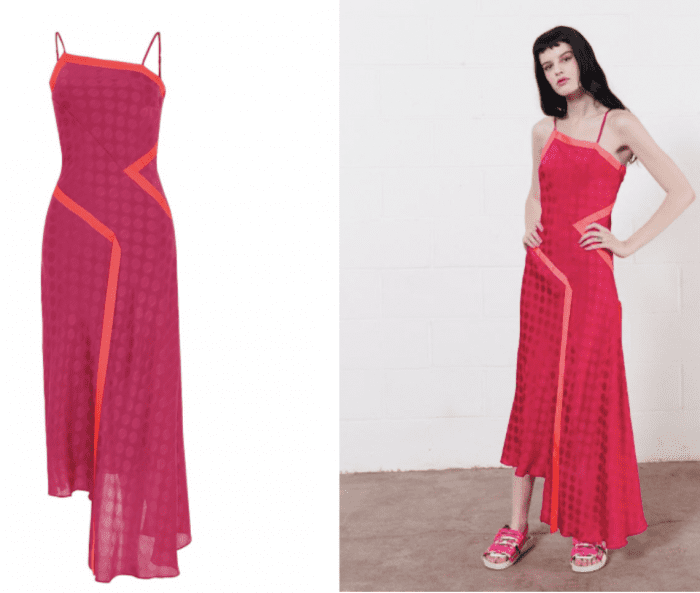
Source: https://www.houseofholland.us/products/vivid-one-shoulder-slip-dress-fuchsia
Boosted Boards is another company that does a great job with this. They show plenty of images of people using their boards and having a great time:

Source: https://boostedboards.com/boards/boosted-plus
They even include images that dramatize a specific product benefit—like this image that shows how well the board travels uphill:

Source: https://boostedboards.com/boards/boosted-plus
Another great way to demonstrate the benefits of ownership is through the use of “before and after” pictures. People often associate these with weight-loss products, but that doesn’t have to be the case. Lots of products can show a before and after transformation—like cleaning products, makeup, and even cameras:
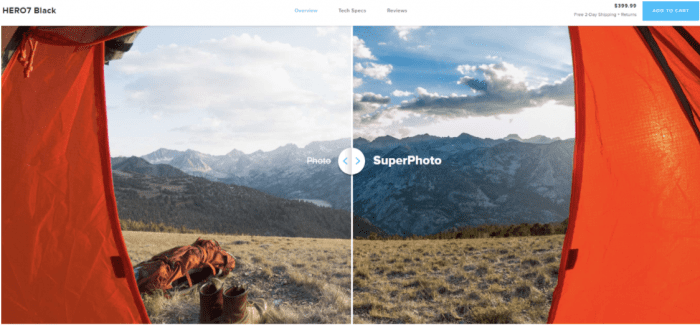
Source: https://shop.gopro.com/cameras/hero7-black/CHDHX-701-master.html
In this product image, GoPro shows you what an image looks like with and without SuperPhoto (a feature in some of their cameras). It shows you the benefit of using GoPro in a compelling visual way.
Unfortunately, a lot of product pages fail to demonstrate the benefits of ownership in their images. And that’s a shame, because it’s a big missed opportunity.
3) Load FAST.
Your carousel needs to load fast. Otherwise, people will lose patience and leave.
Make sure your images and videos are optimized. Enough said.
Take advantage of speedy features like “lazy loading” or virtual images libraries.
4) Have at least 8 “looks.”
Think about how you shop for things in a store. If you’re walking down the aisle and a product catches your eye, what do you do?
You probably pick it up, right? You hold it in your hands and look it over. You check it out and get a good feel for it.
Well, people can’t do that when they’re shopping online. But you can still give them that same kind of experience by providing a lot of different “looks.”
Show your product from different angles. Show it opened and closed, turned on and turned off, in red and in blue.
So if you sell, say, an exercise bike that folds up, show people what that looks like when it’s folded up and when it’s not! Don’t make people use their imagination.
You’ll notice that many of the best-selling products on Amazon do this really well:
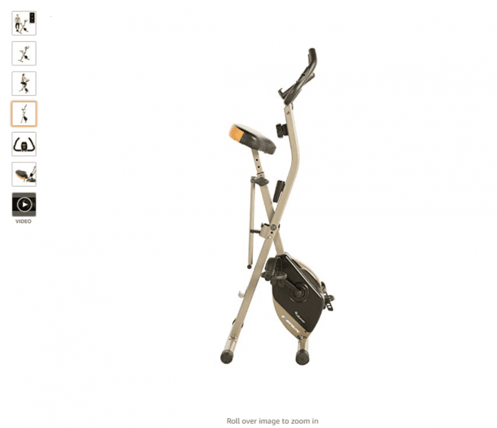
Source: https://www.amazon.com/Exerpeutic-Magnetic-Exercise-Bluetooth-Tracking/dp/B07NPDRF26
In fact, the top Amazon products all have between 6–9 images. More is almost always better, but you should shoot for 8 as a minimum.
5) Build desire for the product.
Now, let’s step back for a minute and think about the real reason for the carousel. Obviously, what you’re trying to do is convince people to buy your product.
And to do that, you want to use images that build desire.
The way to think about this is to think about the promises you’re making with your images.
In ecommerce, people don’t buy your product—they buy your promise. And very often, the second-best or third-best product will beat the first-best product simply because they’re making a better promise.
In this picture, Ford is visually demonstrating the benefit of more legroom. But implied in this picture is the promise of a comfortable ride:

Source: https://www.ford.com/suvs/expedition/gallery/#2018-Expedition-gallery-image-ebad7895deada1f4e0a951e631c441cc-ai
So really take the time to think about what promises you want to make with your product, then show those promises being fulfilled as dramatically as possible in your carousel images.
#6 Showcase product videos/GIFs.
Last but not least, you definitely want to include product videos or GIFs in your carousel.
A good video can dramatically improve your sales. Purple Mattress, for example, owes a lot of its success to its fun viral videos—and they wisely place those videos in a prominent spot on their product pages:
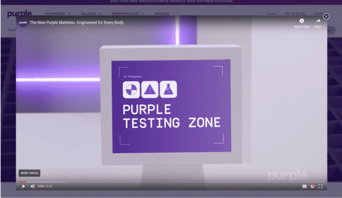
Source: https://purple.com/mattresses/purple-mattress
Not as many people use GIFs on their product pages, but these can be really effective, too. For example, take a look at how Bellroy uses this GIF to show people why their wallets are less bulky:
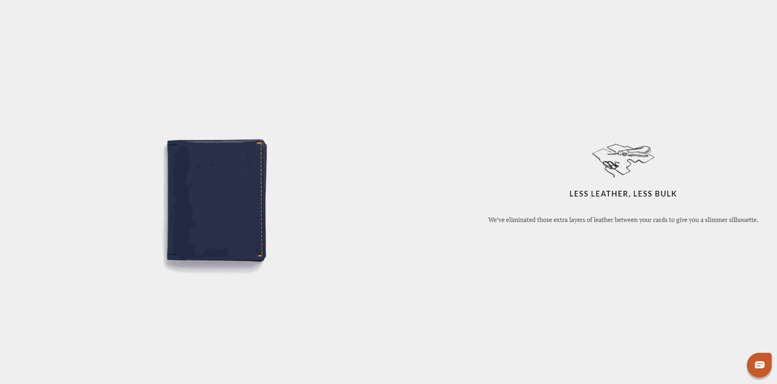
Source: https://bellroy.com/products/slim-sleeve-wallet/default/tan
And like “sticky headers,” images carousels can be used throughout your website. Find out how we add image carousels to upsell pages here.
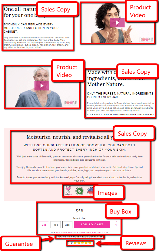
Shopify Landing Page Element 3: The Buy Box
Next up is your Buy Box. And the Buy Box is essentially where the purchase decision is being made:
As you can imagine, this is a really important element to get right on your product landing pages. So let’s dive in.
The 4 Goals of Your Buy Box
Obviously, the primary goal of your Buy Box is to get someone to click the “Buy” or “Add to Cart” button and purchase your product. But since that’s kind of vague, let’s dig deeper into 4 things that your Buy Box has to accomplish in order to make someone more likely to buy.
The 4 goals of your Buy Box are to:
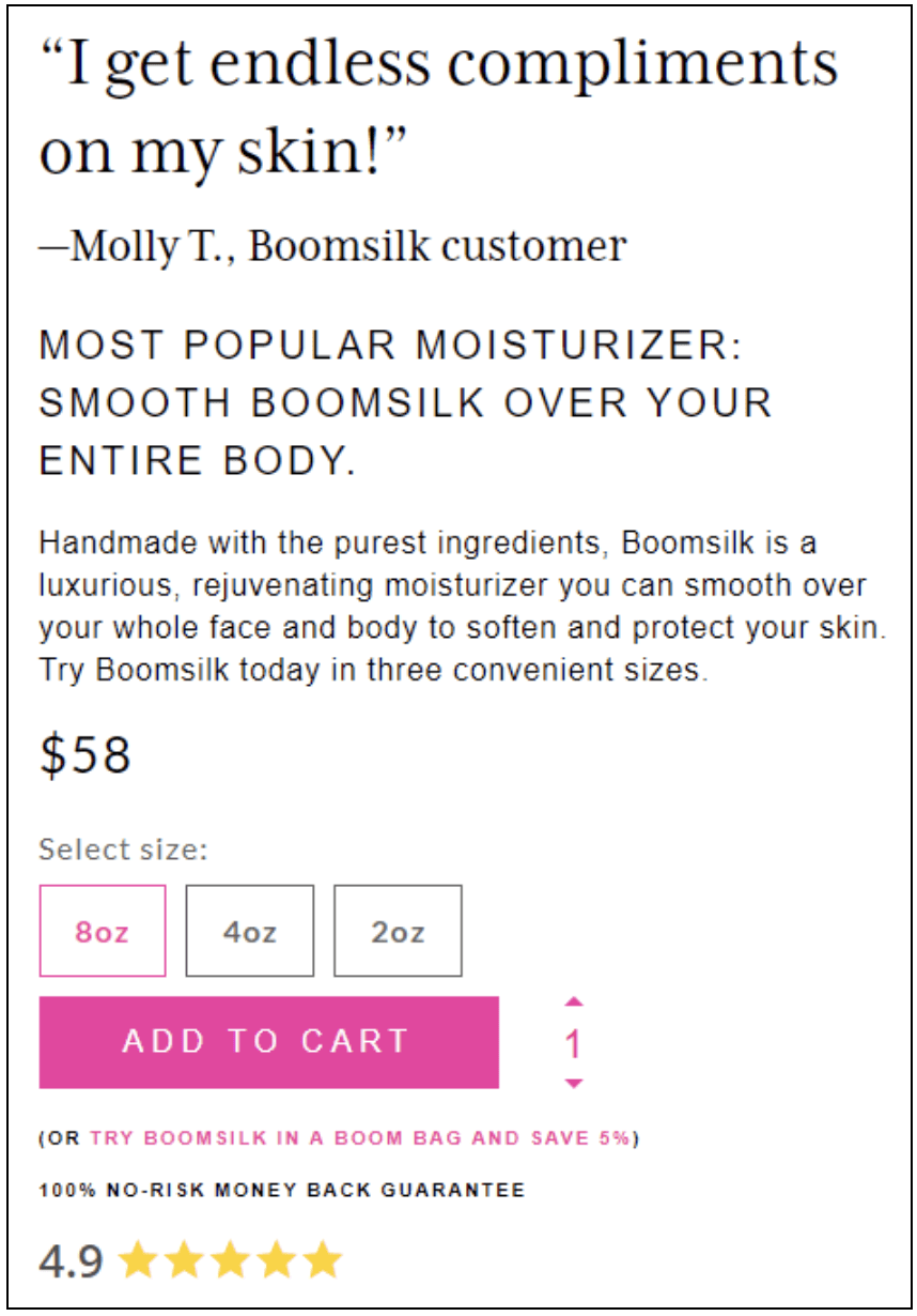
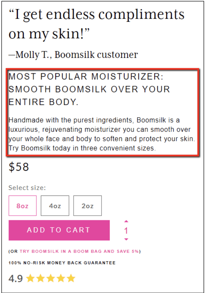
1) Simplify the sales pitch.
Your product landing page might have a LOT of content on it. If you’re using a long-form product page or a mini-site, then we could be talking about images, videos, guarantees, FAQs, reviews/testimonials, and lots and lots of benefit-rich copy.
If that’s the case, then your visitor has a lot of information to digest.
That’s why it’s important to clarify and simplify your product benefits to something that’s clear, compelling, and easy to understand.
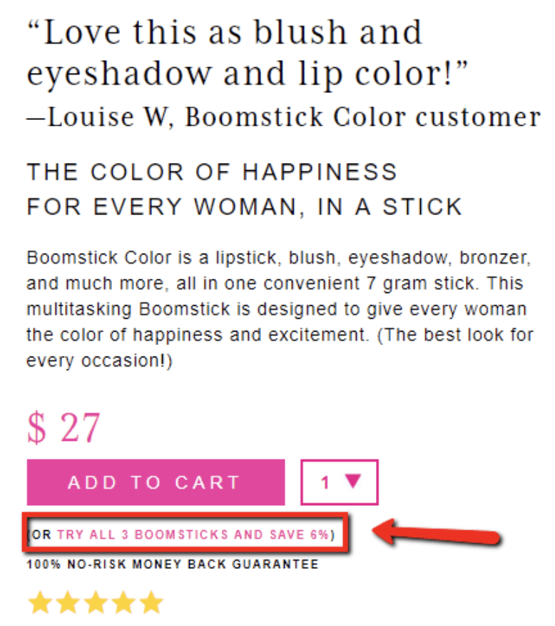
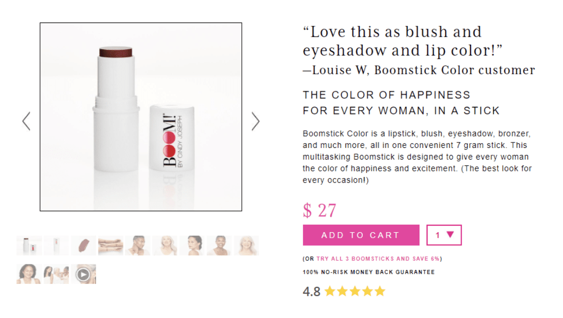
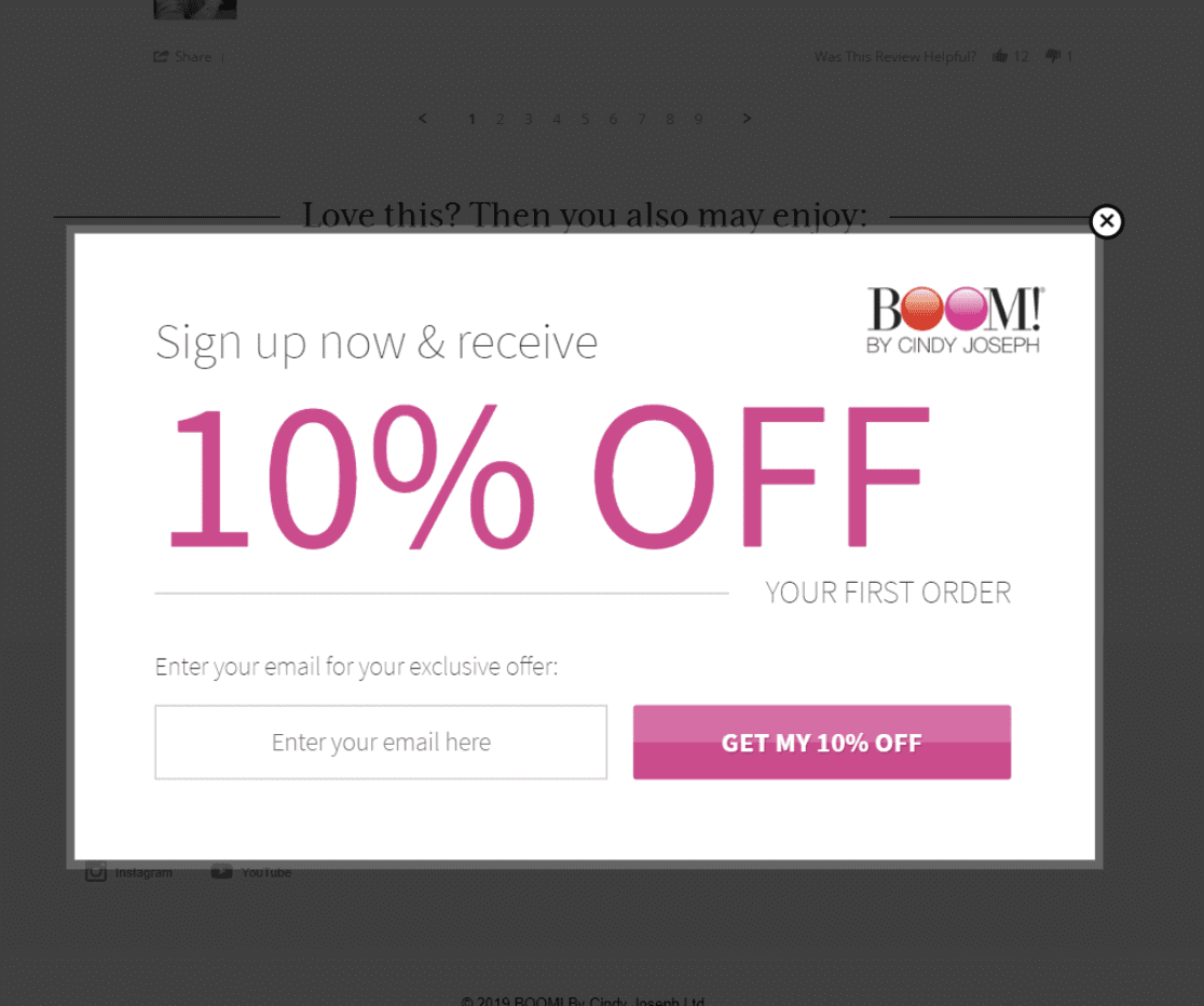
In most cases this means you’re succinctly restating the primary benefits of your product. Here’s a great example of this by the skincare brand BOOM! by Cindy Joseph. The product page for Boomsilk has a lot of copy on it, but it’s all summed up nicely right in the Buy Box:
2) Cross-sell and/or upsell.
Amazon made it popular to add cross-sells and upsells right next to the buy button. All you’re doing is giving people the option to add on an additional product or accessory, upgrade to a bigger size or even a bundle, and so on.
Here’s an example of Amazon using this space to upsell you on a protection plan:
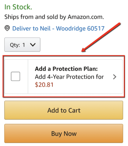
Source: https://www.amazon.com/Bowflex-SelectTech-Adjustable-Dumbbells-Pair/dp/B001ARYU58/ref=sr_1_5
Purple Mattress does it too, by letting you select your mattress size and upgrade to a thicker, softer mattress for more money:
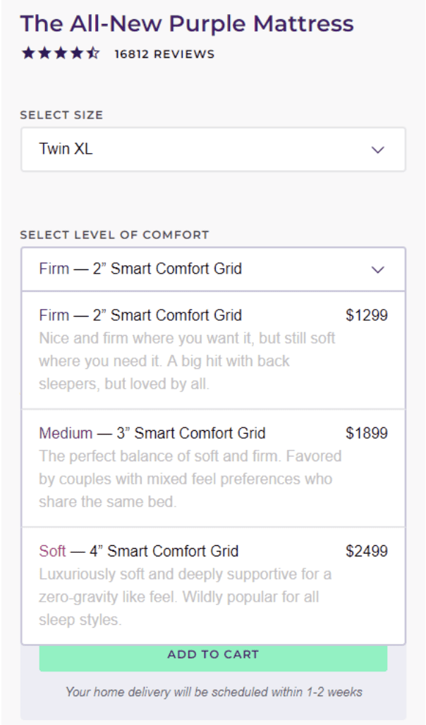
Source: https://purple.com/mattresses/purple-mattress/buy
Again—notice that this happens right in the Buy Box.
BOOM! By Cindy Joseph does this more subtly by letting people know that they can try all 3 of their Boomsticks and save 6%:
If you’re not sure what product to offer as an upsell, read this article about lessons learned from $1,000,000 in upsells.
3) Overcome final objections.
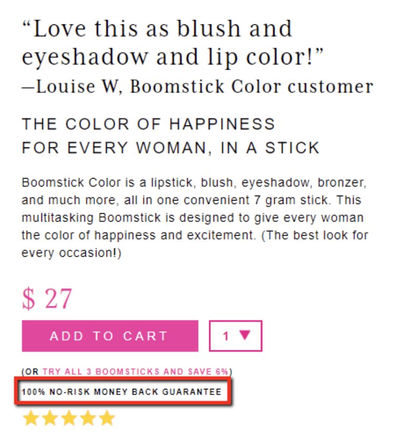
Because the Buy Box is so close to the final sale, you want to do everything you can to overcome any lingering objections that your visitor might have.
So how do you do that?
One really common strategy is to use this space to emphasize your money-back guarantee. This is a great way of mitigating any risk by reminding the person that if they don’t like the product then they can easily return it.
Here’s an example:
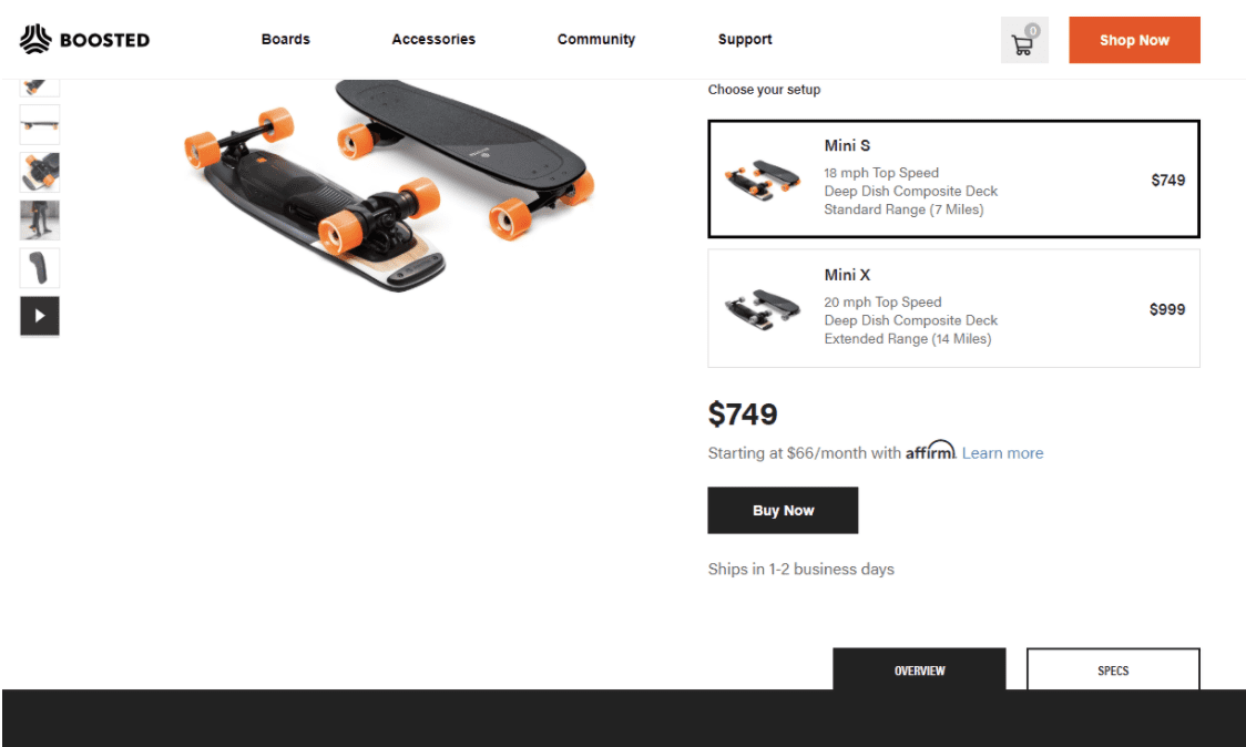
Boosted Board helps address the objection of their high price tag by letting people know, right by the “Buy” button, that they can pay as little $66/month with a payment plan:
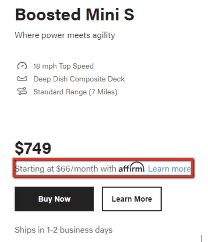
Source: https://boostedboards.com/boards
Spend some time thinking about what your most common buying objections are. Is it price? Size? Shipping time?
Once you know which questions are holding people back from purchasing, you should address them in the Buy Box.
4) Get the “Add to Cart” click!
Finally, we’re back to the big #1 goal of this area:
You want the person to click that “Buy” button!
Hopefully, by this point the person will already want to buy the product. But you can still help maximize your chances of getting the sale by making that button stand out.
People often ask, “What’s the best color for my buy button?”
And the truth is there’s no one best color. Just make sure that whatever color you pick is a bright and contrasting color so it pops. You want the visitor’s eye to be drawn to that buy button like a magnet.
BOOM! By Cindy Joseph does a great job of this, too. See how the “ADD TO CART” button is the brightest, boldest element on the page?
You also want to minimize any competing calls-to-action in the vicinity of your “Buy” button.
Don’t go putting all kinds of other links that will distract people from buying your product. Keep everything in your Buy Box focused on one goal: getting the visitor to buy.
(If you want more best practices to improve your buy box, then watch this recent video: Optimizing Your Buy Box: Ezra’s 7 Tips for Improving the Most Important Part of Your Store)
Shopify Landing Page Element 4: Stacked “Conversion Support” Content
Okay, we’ve talked about your header, your carousel, and your Buy Box. So what’s left?
Everything else on the page!
We’re calling this your stacked “conversion support” content, because it’s content that you’re layering throughout the rest of the page to support your other elements and increase conversions.
This content includes your sales copy, bullet points, reviews, guarantees, FAQs, and so on.
Now let’s dig into this part of your Shopify landing page and explore what you’re trying to do with this content.
The 5 Goals of Your Stacked Conversion Support Content
Unlike your header, carousel, and Buy Box—which are all relatively small landing page elements—your stacked conversion support content can be long. It can go on for panel after panel after panel. This might make up 95% of your entire product page.
But even though this landing page element can comprise a wide variety of content, the goal of all this stuff is still pretty straightforward.
The goals of your stacked conversion support content is to…
1) SELL!
This is where you put all the content that convinces people that you have a great product that they should purchase. Use this space to do your storytelling and paint a vivid picture of how your product is going to improve the visitor’s life.
Everything on your product page should ultimately help to sell the product. If it doesn’t, then it needs to go.
2) Demonstrate credibility.
People are skeptical—especially online. That’s why you have to go above and beyond to prove that everything you’re saying is true. The more credibility you can put on the page, the better. And this credibility can come in many different forms, such as reviews, case studies, research, etc.
Purple Mattress backs up their claims by explaining the technology that allows their mattresses to reduce pressure, sleep cool, and isolate motion:
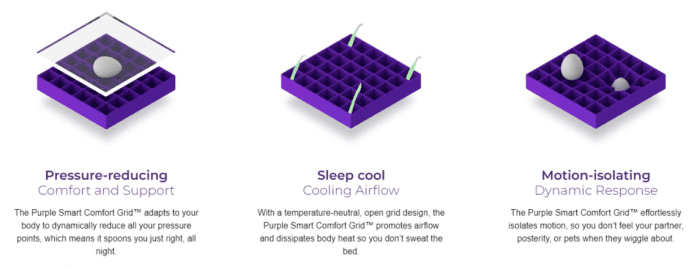
Source: https://purple.com/mattresses/purple-mattress
The more you can do to prove to validate your claims, the more people are going to trust you and the more they’re going to feel compelled to buy your product.
3) Speak to different types of consumers.
If your product appeals to multiple avatars—different age ranges, or income levels, or genders, or whatever—then this is your chance to talk to each of those groups in a different way.
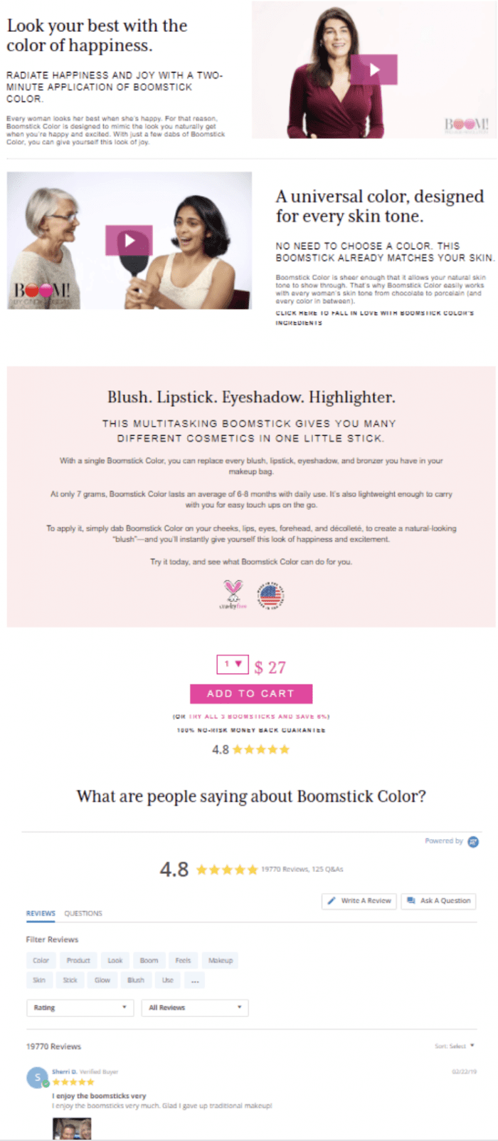
For example, as a company that sells makeup products, BOOM! By Cindy Joseph has to speak a little differently to women with different skin tones.
So they include this panel to reassure women that this product is formulated to work for every skin tone:
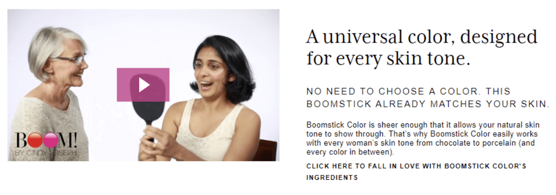
The video opens with BOOM!’s founder Cindy Joseph saying: “Will Boomstick Color work for me? The answer is YES!”
Also, if your product appeals to several different avatars, then be sure to include all of them in your images. Notice how BOOM! makes a point to show pictures of women with different skin tones in their image carousel:
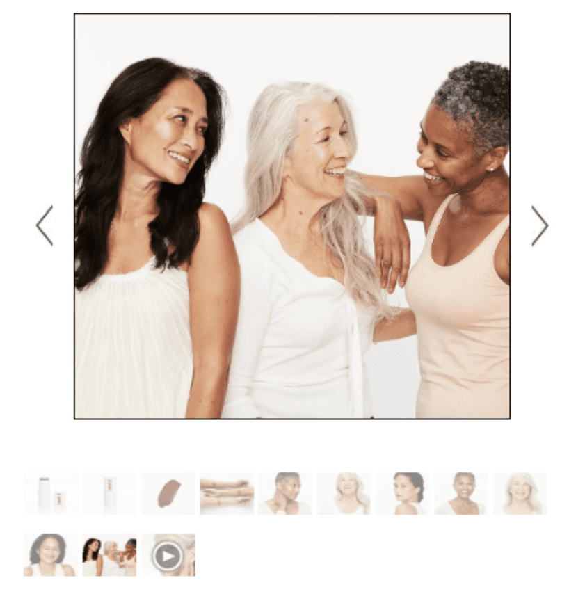
This is a great nonverbal way to show your visitors that your product applies to them.
4) Overcome objections.
Shoppers are always going to have objections, and the same is true of people who come to your Shopify landing pages.
Some common objections could include people who think:
- “This is too expensive.”
- “I don’t trust this brand.”
- “I don’t believe this product does what it claims.”
- “I don’t think it comes in the right size/color/type.”
- “I’m afraid they won’t let me return it.”
It’s here, in your stacked “conversion support” content, that you want to make sure to address and overcome as many of these objections as you possibly can. The more objections you can overcome, the more sales you’ll get. It’s as simple as that.
5) Build desire.
In general, the overall goal of this part of your Shopify landing page is to make it so the person on the page wants your product. That’s the whole point here—to sell. Now you might read that and think,
Okay, but how do I actually do it? What do I actually DO to overcome objections, build desire, demonstrate credibility, and do all those other things that will come together to generate more sales?
The answer to these questions comes down to one set of deliverables…
Conversion Assets
A conversion asset, or conversion “element,” is any piece of media—like text, image, or video—that supports a prospect in making a buying decision.
And these conversion assets are actually the whole point of having a product page in the first place:
Fundamentally, your product page is simply a collection of conversion assets working in concert with one another to support you in your goal (a conversion) and the prospect in their goal (a solution to their problem).
In other words, a product page is just a collection of conversion assets. Just like a car is a collection of parts, and a computer is a collection of chips and circuits and stuff.
Now let’s get a little more specific and look at some actual examples.
Common Conversion Assets
Here are some examples of common conversion assets that help to support a buying decision by presenting your product, and communicating the benefits of your product, in a clear and compelling way:
- Images
- Sales Videos
- Testimonials
- Sales Copy
In fact, when you start taking a closer look at really effective product pages, eventually you realize that every single element on that page is a conversion asset:
The right conversion assets, in the best possible locations, will make all the difference in the world on your product landing pages.And if you don’t know what conversion assets you should use or where to put them, then your product page won’t convert as well as it could.So next, let’s go over the essential conversion assets that every product page should have.
16 Must Have Conversion Assets For Your Offer Pages
Here are the most important conversion assets that you should have on all your Shopify product pages, along with an example of each.
1. A sticky header that supports your call-to-action (this will be different on desktop vs. mobile, but they both need to support your CTA):
Source: https://boostedboards.com/boards/boosted-mini
2. Multiple high-quality product images:
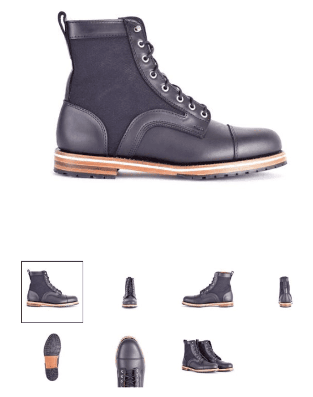
Source: https://helmboots.com/collections/sale/products/adreon
3. Image zoom, so that people can enlarge your product and see it in greater detail:
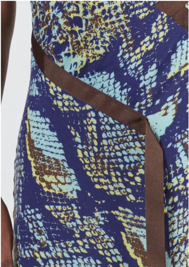
Source: https://www.houseofholland.us/products/snake-print-one-shoulder-slip-dress
4. Product sales video or GIF showing off the product in use:
Source: https://shop.gopro.com/cameras/hero7-black/CHDHX-701-master.html
5. An “Add to Cart” button that’s visible above the fold, along with multiple other CTAs on the page (especially if this is a long-form page):
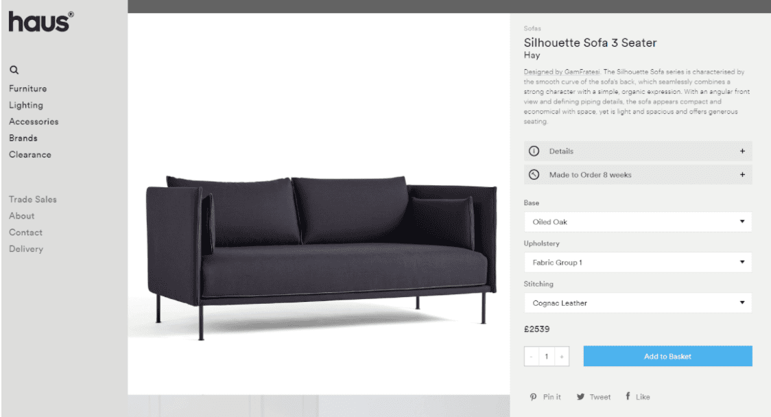
Source: https://hauslondon.com/collections/sofas/products/silhouette-sofa-3-seater-by-gamfratesi-for-hay
6. On-page “order bump” upsell:
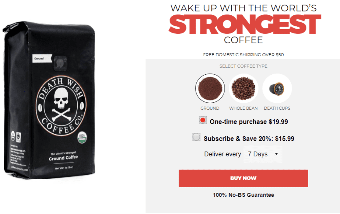
Source: https://www.deathwishcoffee.com/
7. Well-written product description (headlines, bullets, etc.) where you tell the story of your product and explain its many benefits:
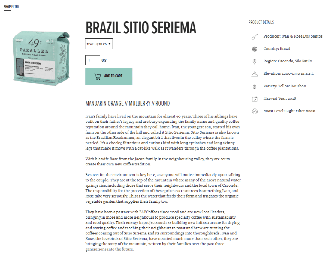
Source: https://49thcoffee.com/products/brazil-sitio-seriema
8. USPs, or unique selling propositions, demonstrated in image format (we explain these in greater detail in our next article):
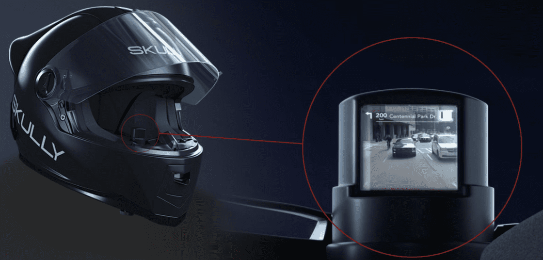
Source: https://www.skully.com/shop/skully-fenix-ar
9. Prominently displayed guarantees demonstrating that you stand behind your product:
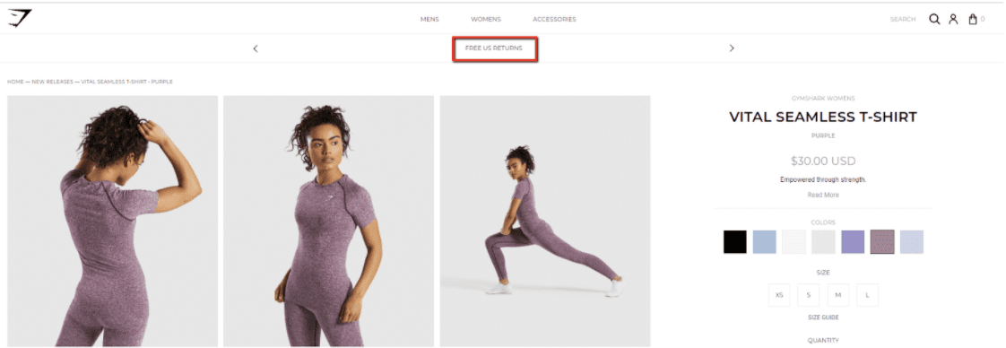
Source: https://www.gymshark.com/collections/new-releases/products/gymshark-vital-seamless-t-shirt-purple
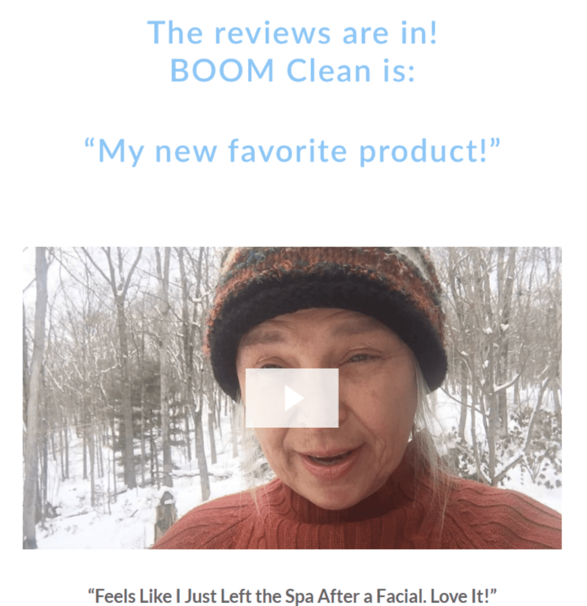
10. Reviews (written and video):
11. Social proof images and videos that show people as they’re enjoying your product:

Source: https://boostedboards.com/boards/boosted-mini
12. Frequently asked questions:
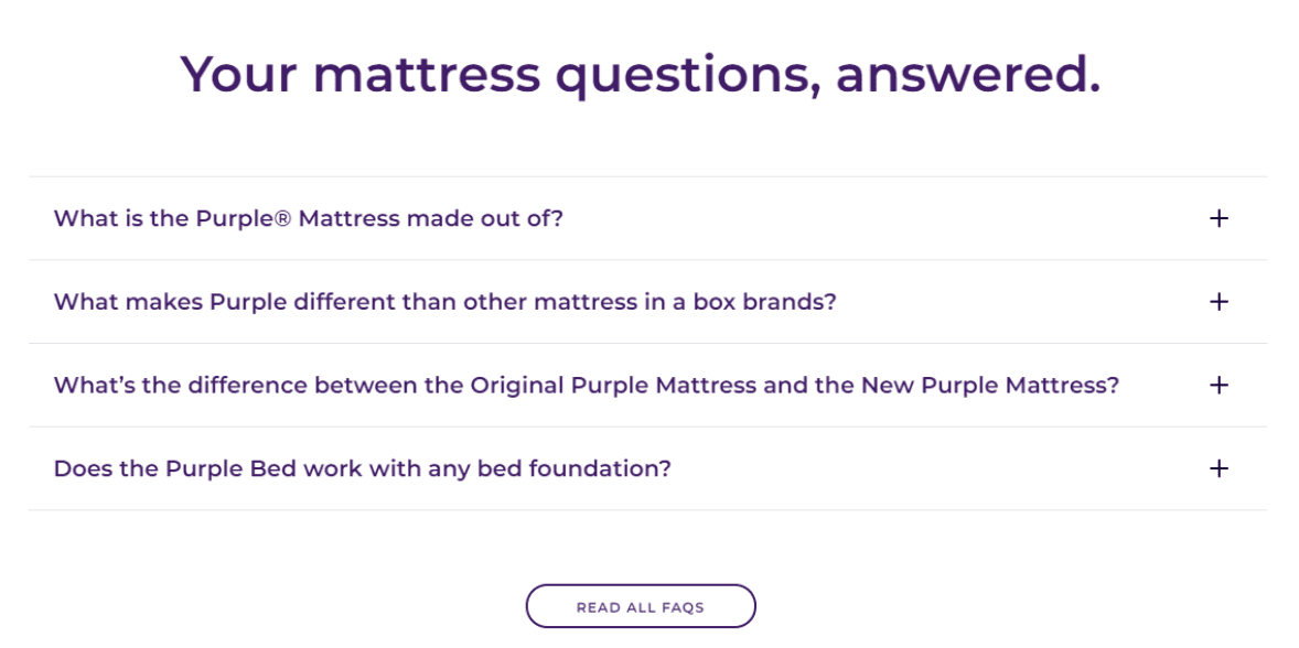
Source: https://purple.com/mattresses/purple-mattress
13. “You might also like…” cross-sells:
14. Exit-intent popups designed to save the sale or capture the visitor’s email address for later follow-up:
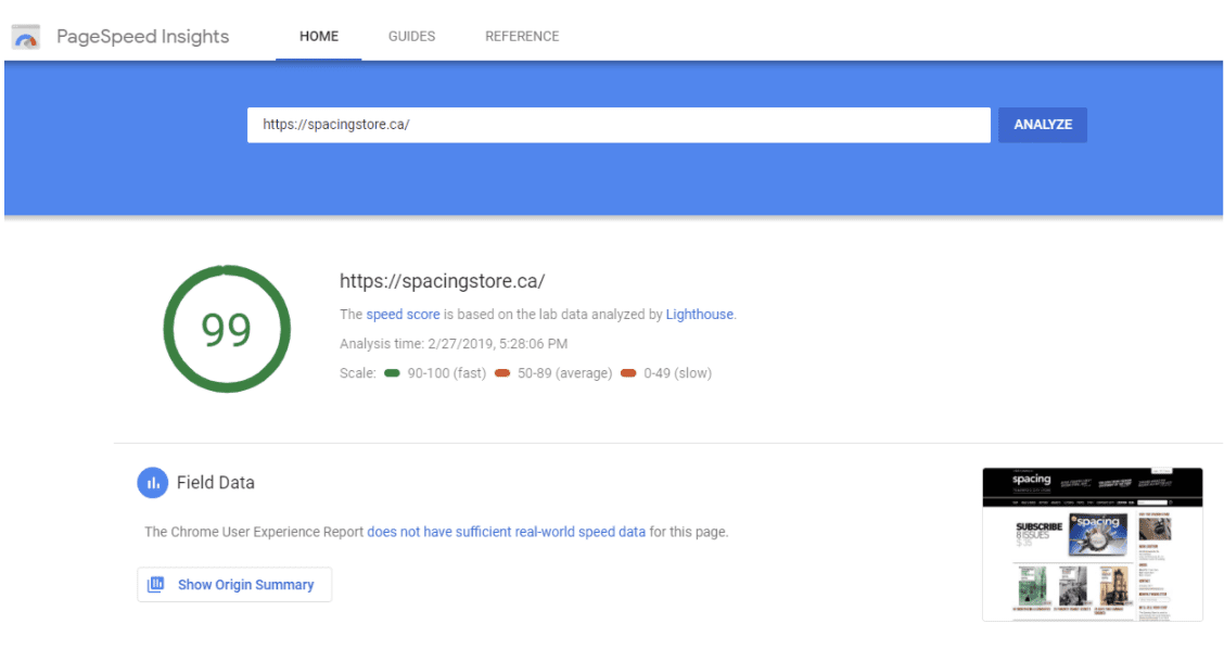
15. A fast-loading page, especially on mobile (try the Google page speed test to get an idea of your page speed):
You can also use a “lazy loading” feature for your landing pages. Read more about lazy loading here.
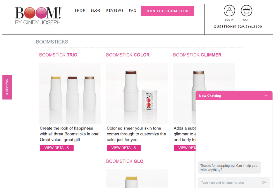
16. Live chat:
Notice that a lot of these elements are simply repeating the same information but in a different format.
For example, you should communicate your USPs (unique selling propositions) through your copy, through your images, and through your video.
The same thing goes for customer reviews. Ideally, you should have both written reviews and video reviews.
The reason you need to do this is because different people prefer to consume media in different formats. Not everyone is going to read every word of copy on your page, and watch all your videos, and look at all your images…
Some people will focus on the copy. Others will fixate on the images. And a lot of people will pay most of their attention to your product videos.
But by communicating your most important sales messages through all 3 of these mediums, you’re dramatically increasing the chances that everyone is going to receive those messages in a way that makes sense to them.
Now that you know all the elements of a high-converting Shopify landing page, the next question is:
How do you design a landing page that incorporates all of these assets while being easy to consume, engaging and matching your brand aesthetic?
We answer this question and more in Part 3 of our Ecommerce Marketer’s Guide to Shopify Landing Pages: How to Design an Ecommerce Landing Page That Engages & Converts
The First Landing Page Builder Uniquely Designed for Ecommerce
If you’re not a Zipify Pages member and you’d like to leverage engaging and converting landing pages on your Shopify store (or any of our other high-converting templates), start your membership today.
Get Zipify Pages
Try OneClickUpsell
TRY FREE FOR 30 DAYS | 100% MONEY-BACK GUARANTEE
Try Zipify Pages