“Hot dog, y’all, we got ourselves a winner!”
-Ezra Firestone
Hey! Ezra here, Founder & CEO of Zipify Apps.
Mobile users account for a huge chunk of website traffic for most business owners. For my 8-figure Shopify store, that number is over 68%:
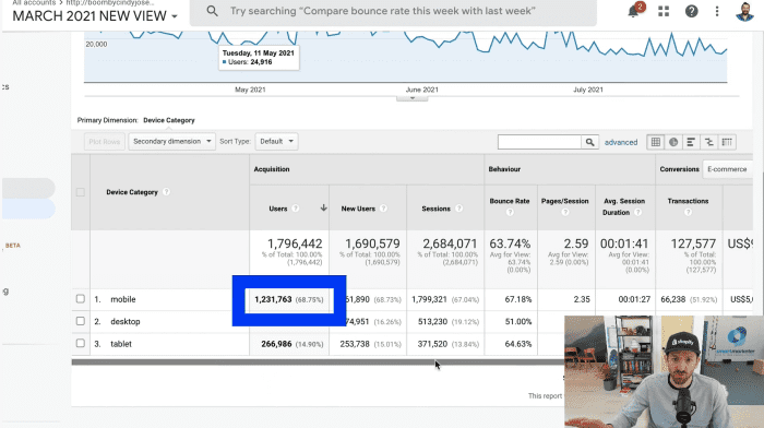
Mobile traffic is where most of my conversion opportunities are happening, and that’s why it’s so important to capitalize on this point of user interaction.
With this in mind, we decide to build the new Mobile “Sticky” Button feature for Zipify Pages.
This new feature keeps your CTAs visible and clickable as users scrolls on mobile, improving their mobile experience and increasing your chances to convert them into buyers:
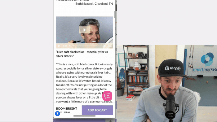
I recently conducted two split tests to compare my control sales page vs. two variants that use the mobile “sticky” button.
To see the results of these split tests and to learn why you should be using the new mobile “sticky” buttons, watch the video above or keep reading.
The First Split Test
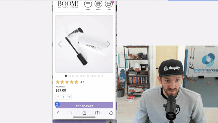
First off, I can’t stress enough how important it is to have well designed, functional, user-friendly mobile pages. Here is an example of a sales page created in Zipify Pages that leverages the “sticky” button:
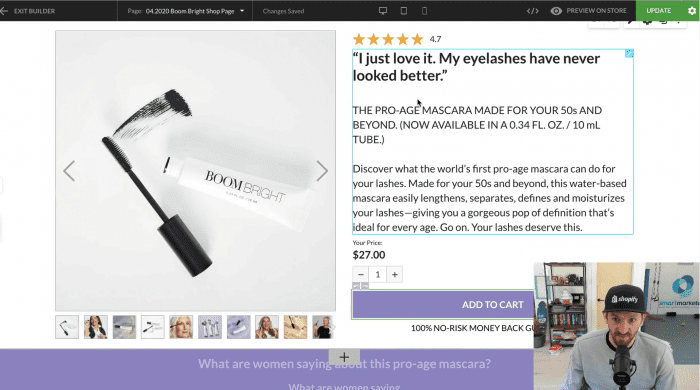
Because Zipify Pages is mobile-friendly, this page easily translates to mobile view, keeping the content and images stacked in an easy-to-digest structure.
For my split test, I tested a sales page similar to the one above against two variants: Variant 1 has a sticky header and Variant 2 has a sticky footer.
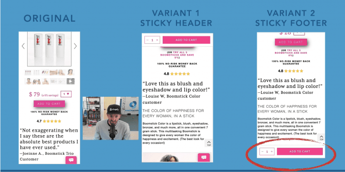
As you can see under the Control page, the “add to cart” button remains right below the buy box. As the user scrolls this button disappears, and with it the user’s ability to add a product to their cart.
Out of my two variants, even before looking at my split test results I had a feeling Variant 2 would perform the best because, to me, it just flowed better when scrolling on mobile. And I was right!
My First Split Test Results
Here’s a quick look at the Google Analytics from this split test:
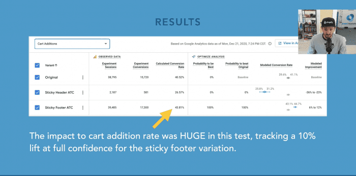
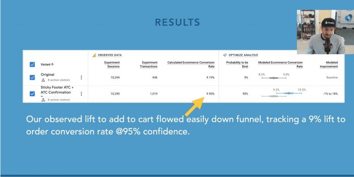
Compared to the original sales page, Variant 2 saw a 10% lift in mobile users clicking the add to cart button and 9% lift in order conversion rate at a 95% confidence rating. Whoa!
To learn how to add mobile “sticky” buttons to your site, check out Mobile “Sticky” Buttons for Zipify Pages: Keep Your CTAs Visible and Clickable on the Zipify blog.
My Second Split Test Results
After this test I was excited to share my win with the Zipify community, but first I wanted to run this experiment again to verify the results.
And the outcome was pretty much the same! My second split test yielded:
- +$1.70 in Average Order Value
- +$0.46 in Per Session Value
- Higher Ecommerce Conversion Rate
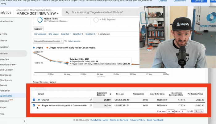
For this test, I used heat mapping software on the sales page to record video of mobile users’ sessions. My hope was that this would give me even more insight into how site visitors were consuming my page. Here’s a preview:
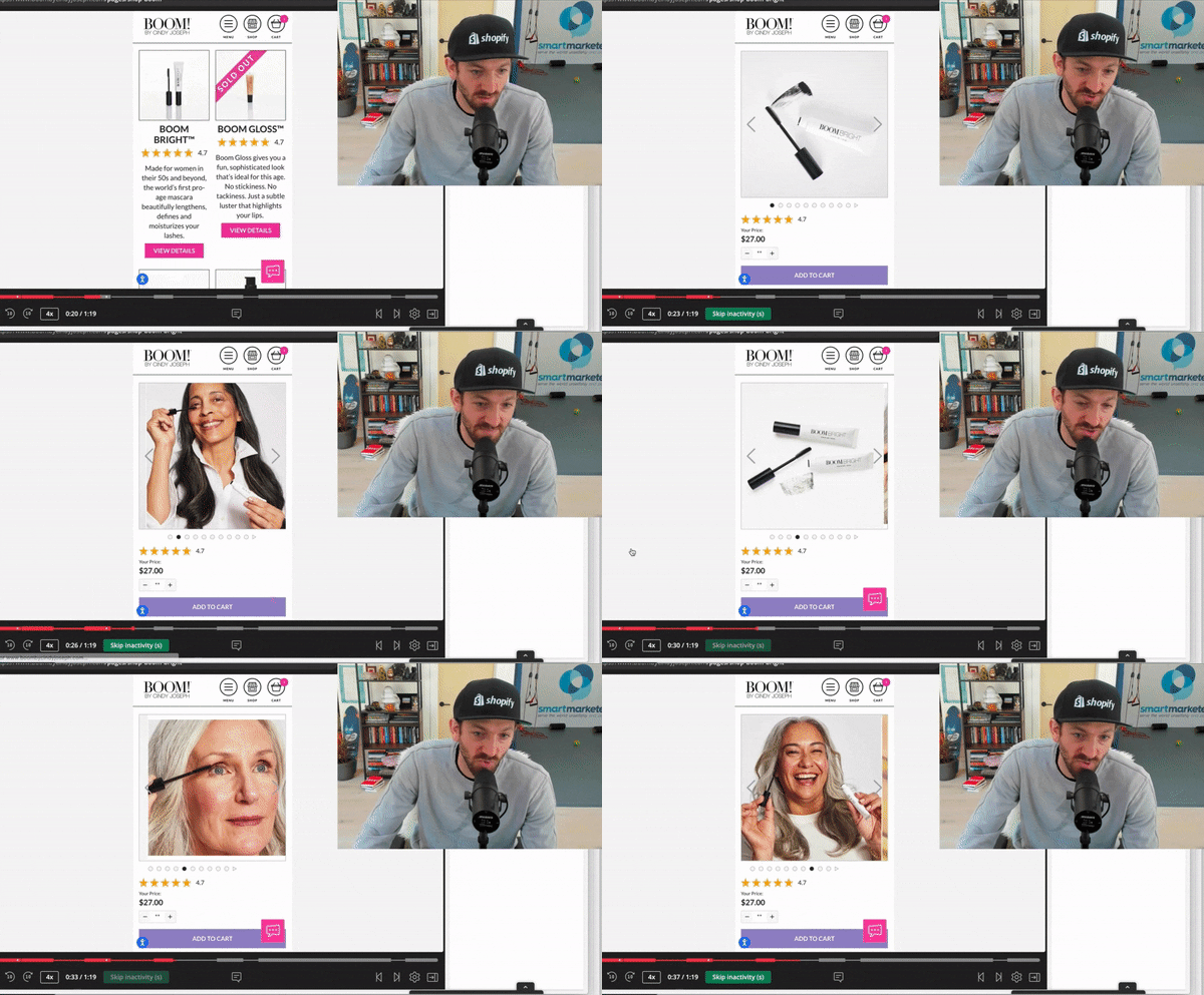
To see the full user interaction, jump to 3:52 in the video at the top of the page.
That’s it — thanks for reading
Want to See More Split Tests?
If you enjoyed this blog post, we recommend watching how to Try This Mobile “Sticky” Button Split Test in 5 Easy Steps (w/ Club EarlyBird)
Watch as Chuckie Gregory, Founder of Club EarlyBird, shows you how he’s running a split test on his store using the in-app feature in Zipify Pages.
Not a Zipify Pages User? Start Your Free 14-day Trial
If you’re not a Zipify member, we want to invite you to join our community!
Visit the Shopify App Store or zipifypages.com to start your free 14-day trial.

