
Shopify landing page examples are easy to find. Useful ones are harder: most roundups show a pretty hero section without saying who the page was built for or whether it loads fast on a phone.
So I sorted 13 live Shopify landing pages by the traffic that lands on them: cold social ads, search, high-ticket shoppers, comparison shoppers, products that need explaining, warm email and SMS lists, and launches. For each one, you get three things to copy, its real-user speed numbers, and what the page does to grow the order.
Key Takeaways
- Pick a landing page by the visitor, not the design. Cold traffic needs a reason to care; warm traffic needs the offer.
- Only 5 of the 12 pages with real-user data passed Google’s Core Web Vitals. Slow response to taps was the most common failure.
- Test your own page in PageSpeed Insights before you send ad traffic to it, and read the real-user data first.
What Is a Shopify Landing Page?
A Shopify landing page is a page built for one group of visitors and one action, like buying a product, building a bundle or joining an email list. Shoppers usually reach it from an ad, an email or a search result rather than from your store menu.
It isn’t a separate page type in Shopify. It can be a product page, a page on a /pages/ URL or a custom theme template. What makes it a landing page is focus: your homepage serves everyone, while a landing page serves the shopper who clicked one specific ad. Of the 13 Shopify landing page examples below, 7 live on /pages/ URLs and 6 are product pages doing a landing page’s job.
Which Landing Page Type Fits Your Traffic?
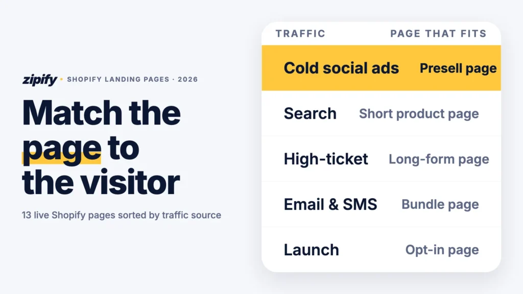
Match the page to how much the visitor already knows. A cold Instagram scroller needs a reason to keep reading, so long-form and presell pages work best. Someone who searched your product name already wants it, so a short page wins.
The 2020 version of this post sorted pages into three classic landing page formats: short-form, long-form and mini-sites. The table adds the deciding question: where the visitor comes from.
| Traffic source | Page type that fits | Examples in this article |
|---|---|---|
| Cold paid social | Presell listicle, long-form sales page, offer page | HexClad (2 pages), SNOW |
| Search and high intent | Short-form product page | Graza, Frank Body |
| High-ticket, considered purchase | Long-form product page with financing | Branch, Ooni |
| Comparison shoppers | Comparison page | Away |
| Product needs explaining | Mini-site or product-family page | Instant Pot, BOOM! |
| Warm email and SMS | Bundle builder or bundle hub | Death Wish Coffee, Brooklinen |
| Launch and list building | Opt-in (squeeze) page | CABINZERO |
How Were These Pages Picked and Tested?
I started from about 25 candidates and kept 13 that were live on November 6, 2026, ran on Shopify (I checked each page’s code for its Shopify store ID) and covered a different traffic source or page type.
Then I ran every page through Google PageSpeed Insights on mobile. Field data comes from real Chrome users over the previous 28 days; lab data is one simulated load on a mid-range phone over slow 4G.
The limits: one lab run per page, no conversion data from these brands, and seasonal pages will change after Black Friday.
Which Landing Page Examples Work for Cold Paid Social Traffic?
Cold traffic hasn’t searched for you, so in these Shopify landing page examples the page’s first job is to earn the scroll. The headline should continue the ad the shopper just tapped and answer “why should I care?” before it asks for money.
1. HexClad: “5 Reasons” presell listicle
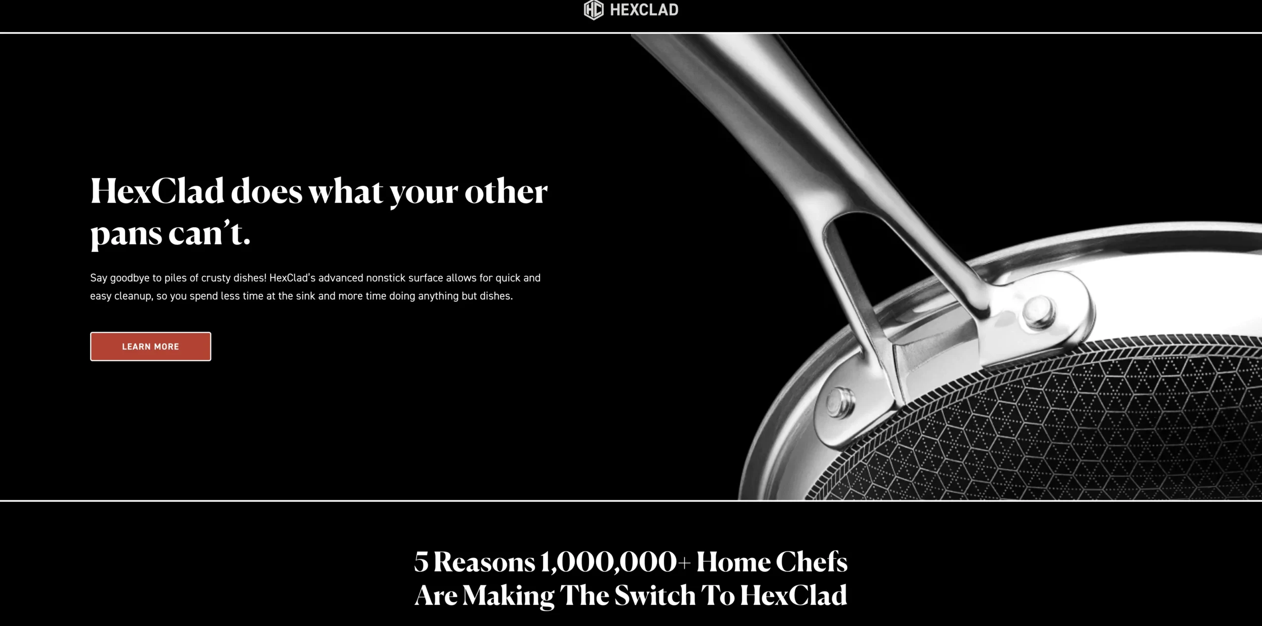
HexClad’s listicle page is a presell: an article-style page that warms up ad traffic before it reaches a product. It suits products people already own a version of.
What to copy
- A numbered “5 Reasons 1,000,000+ Home Chefs Are Making The Switch” format that reads like content, not an ad.
- Separate versions of the listicle for different creators and partners, so each audience lands on matching copy.
- A logo-only header with the store menu hidden, so nothing pulls ad visitors away from the story.
Mobile and speed Real users see the main content in 2.5 seconds, but the page fails Core Web Vitals on tap response (INP 220 ms).
After the click Each reason links to sets at up to 30% off, so the presell hands over a bundle, not a single pan.
2. HexClad: 12-piece sales page
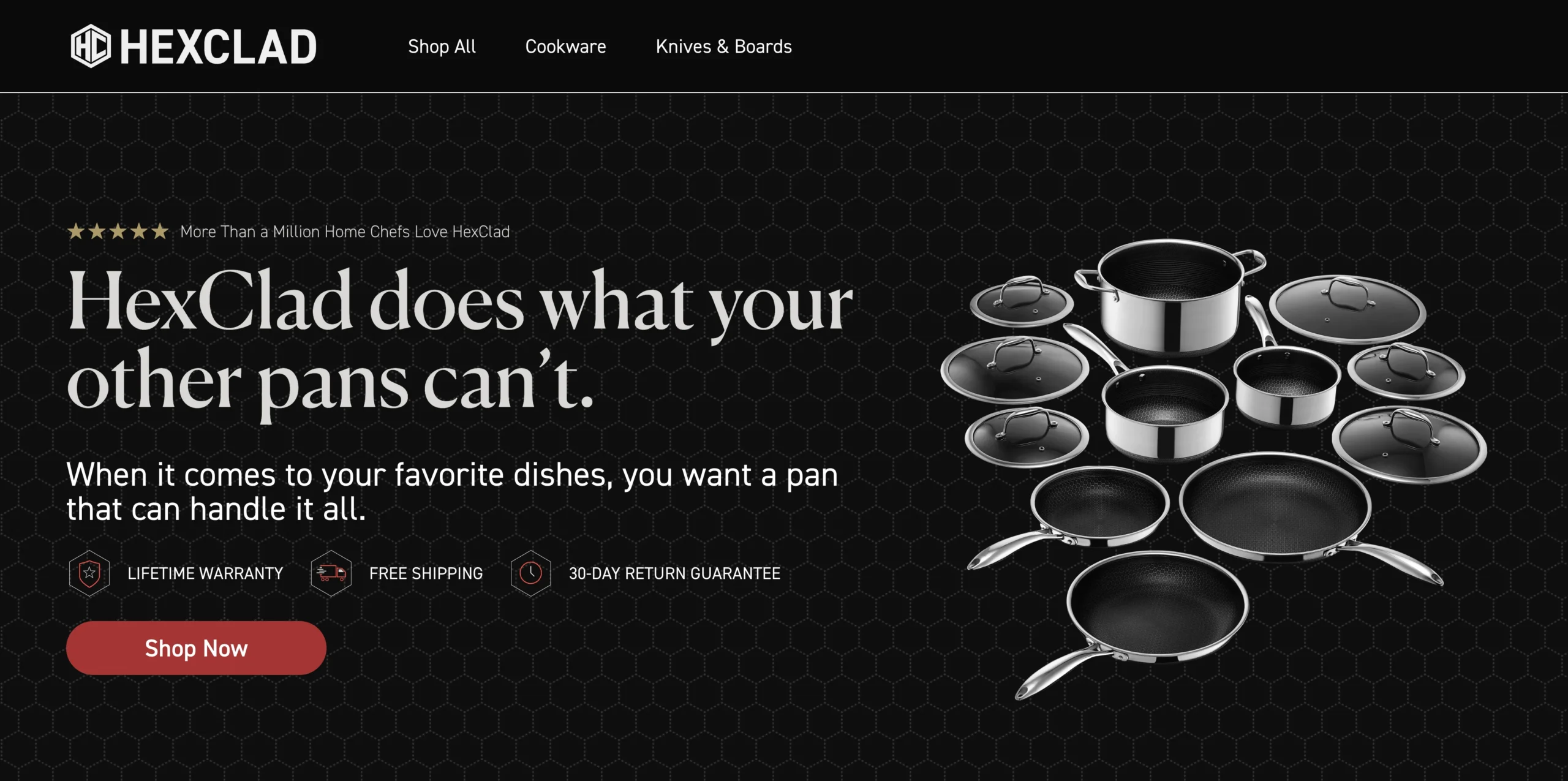
HexClad’s 12-piece set page is a long-form sales page: one set, every objection handled in order. It suits cold traffic from an ad about a specific bundle.
What to copy
- A “HexClad vs Their Pans” table comparing warranty, metal-utensil safety, oven and dishwasher use.
- A popup with third-party lab results that answers “is this coating safe?” before shoppers ask.
- A “Choose your set” picker with a BEST VALUE label, so the decision ends between sets, not between yes and no.
Mobile and speed It passes Core Web Vitals for real users (LCP 2.3 s, INP 187 ms), despite a lab score of 28.
After the click The picker steers shoppers to the largest set. One miss: the browser tab reads “12 PC Landing Page,” which is what people see when they share the link.
3. SNOW: Extra Strength Smile Ritual
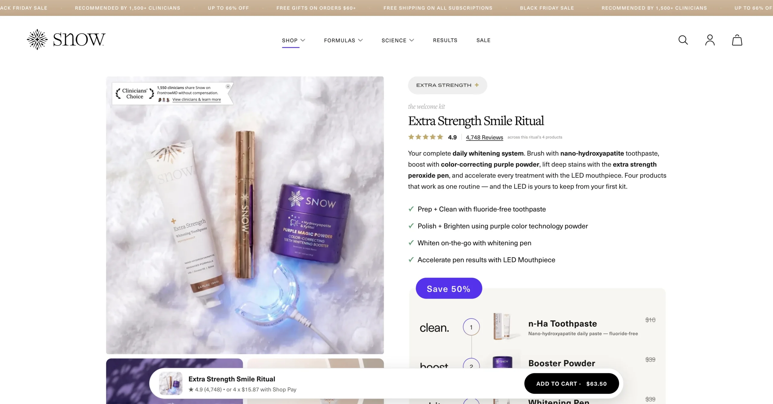
SNOW’s Smile Ritual page sells a four-step kit as a routine. It suits subscription brands sending cold traffic to a first-order deal.
What to copy
- The routine as a numbered list (clean, boost, whiten, glow) with each item’s price, so the kit price feels like a deal.
- Two offers side by side: subscribe and save 50% today (marked MOST POPULAR) or buy once at 40% off.
- Free gifts with their dollar value stated, not a vague “free bonus.”
Mobile and speed One of the fastest pages for real users: LCP 1.4 seconds and a Core Web Vitals pass.
After the click “Add to your ritual” cards offer strips, tablets and serum on the same page, a cross-sell built into the offer.
Which Landing Page Examples Work for Search and High-Intent Visitors?
Search visitors already want the product, so the page should remove friction between that intent and the cart. Put price, reviews and shipping terms next to the button, the idea behind these buy box tips.
4. Graza: The Trio
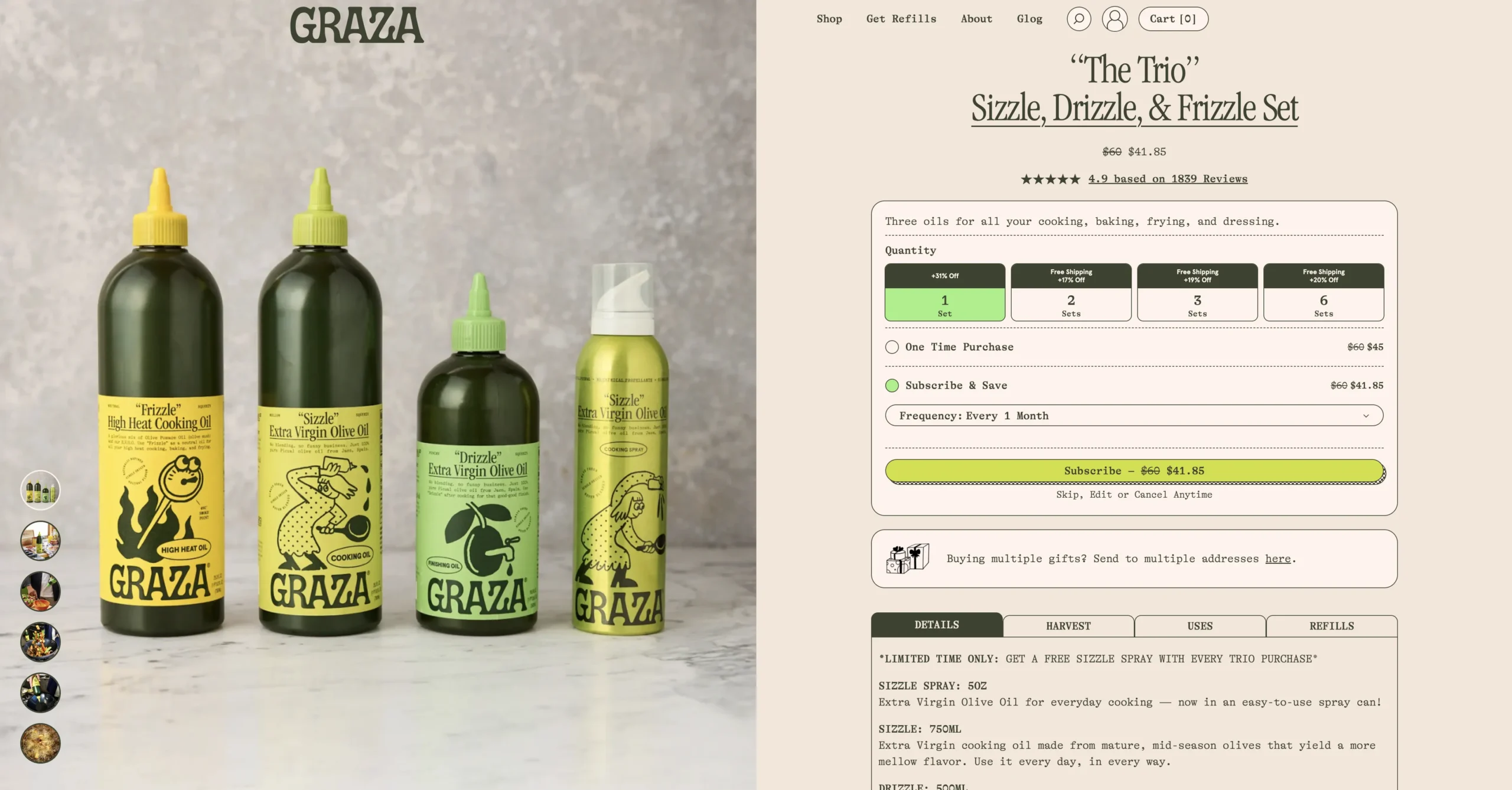
Graza’s The Trio page is a short-form product page for an olive oil set. It suits consumables that people reorder.
What to copy
- Quantity tiers as buttons (1, 2, 3 or 6 sets), each showing its discount and free shipping status.
- A one-time vs subscribe toggle that spells out what arrives first (bottles) and after (refill cans).
- Tabs for Details, Harvest, Uses and Refills, so the page stays short and the answers stay one tap away.
Mobile and speed It fails Core Web Vitals on load speed: real users wait 4.6 seconds for the main content, the slowest in this test.
After the click The quantity tiers make “buy more” the default before the shopper reaches the cart.
5. Frank Body: Original Coffee Scrub
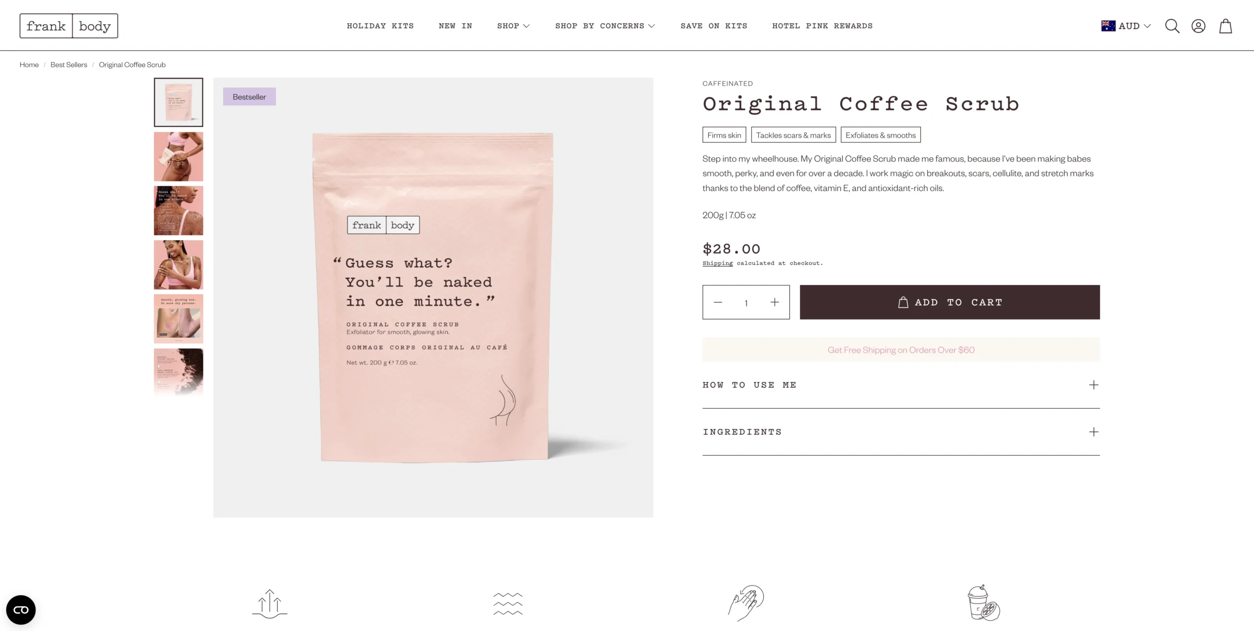
Frank Body’s Coffee Scrub page was the deep-dive example in the 2020 version of this post, and it still works as a short-form page. It suits low-priced, visual products with a strong brand voice.
What to copy
- Three benefit bullets above the button (firms, tackles marks, exfoliates), so the pitch fits one phone screen.
- First-person brand voice (“Step into my wheelhouse”) that turns a commodity into a character.
- A four-step “how to use me” section and before-and-after photos below the button for shoppers who need more proof.
Mobile and speed It passes Core Web Vitals for real users (LCP 1.5 s, INP 123 ms).
After the click A free-shipping threshold next to the price nudges shoppers to add a second item.
Which Landing Page Examples Work for High-Ticket Purchases?
The higher the price, the more questions a shopper brings. High-ticket pages answer them in order, on the page, as Ezra Firestone explains in his product page lessons from $100 million in sales.
6. Branch: Ergonomic Chair Pro
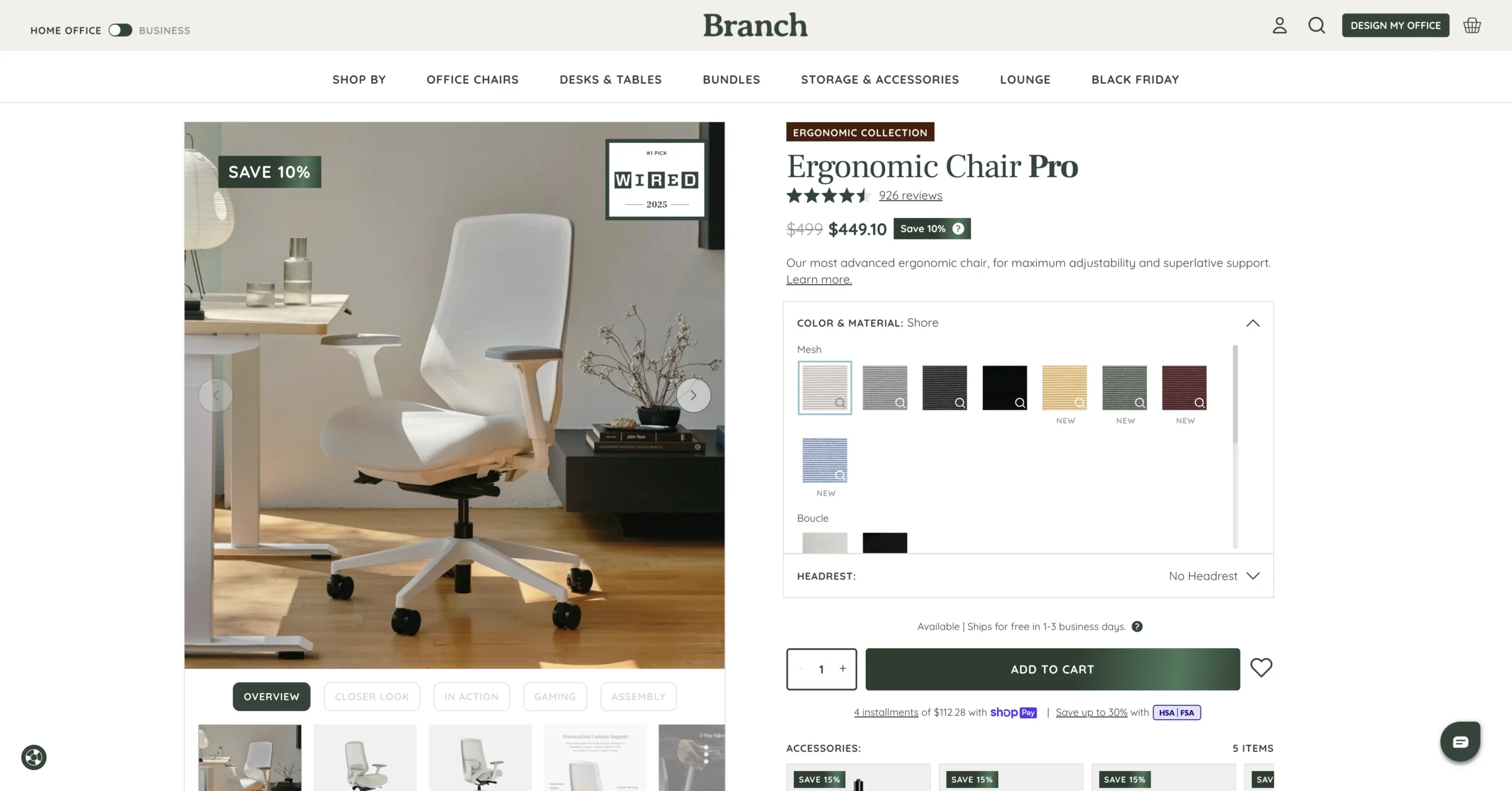
Branch’s Ergonomic Chair Pro page sells a $499 chair on a long page that works like a mini-site. It suits products people want to see in use before they spend.
What to copy
- Jump tabs at the top (Overview, Closer look, In action, Gaming, Assembly) so shoppers skip to their own question.
- A “Which model is right for you?” comparison of three chairs that keeps undecided shoppers on the page.
- Pay-in-4 pricing next to the full price.
Mobile and speed It fails Core Web Vitals on two counts: LCP 3.4 seconds and INP 321 ms, the slowest tap response in this test.
After the click An accessory row (headrest, footrest, chair mat at 10–15% off) and a “Bundle and save” set sit beside the buy button.
7. Ooni: Karu 2 Pro
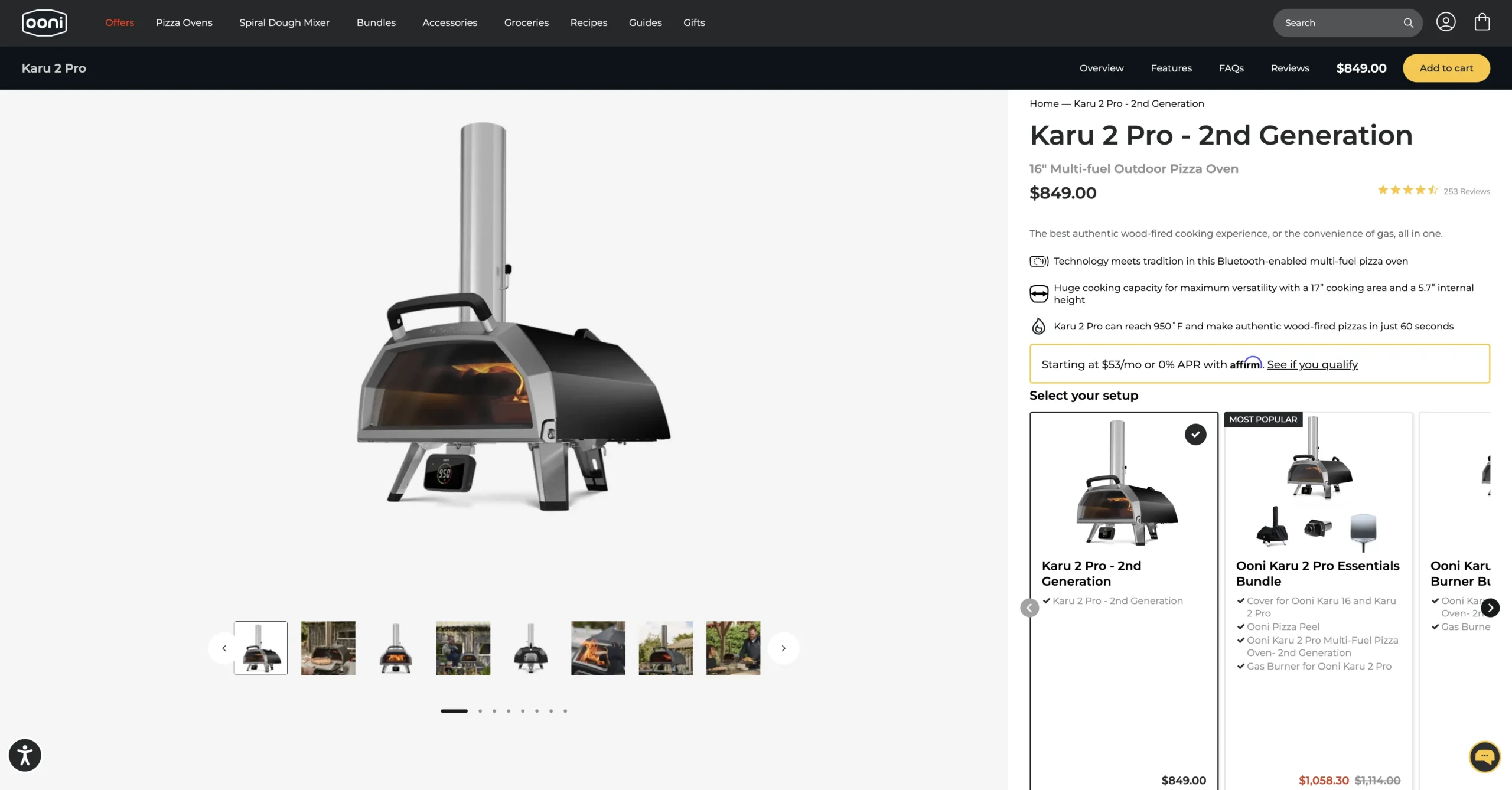
Ooni’s Karu 2 Pro page sells an $849 pizza oven. It suits gear that buyers configure with accessories.
What to copy
- A “Select your setup” picker: the oven alone or one of three bundles at about 5% off, with a running subtotal.
- A monthly price (from $53 a month with Affirm) under the full price.
- A “Why buy direct from Ooni” section and an FAQ for the questions an $849 purchase raises.
Mobile and speed Real users see the main content in 2.5 seconds, but the page fails Core Web Vitals on layout shift (CLS 0.14).
After the click The setup picker sells accessories before the cart, so the bundle is the first choice.
8. Away: Compare Carry-Ons
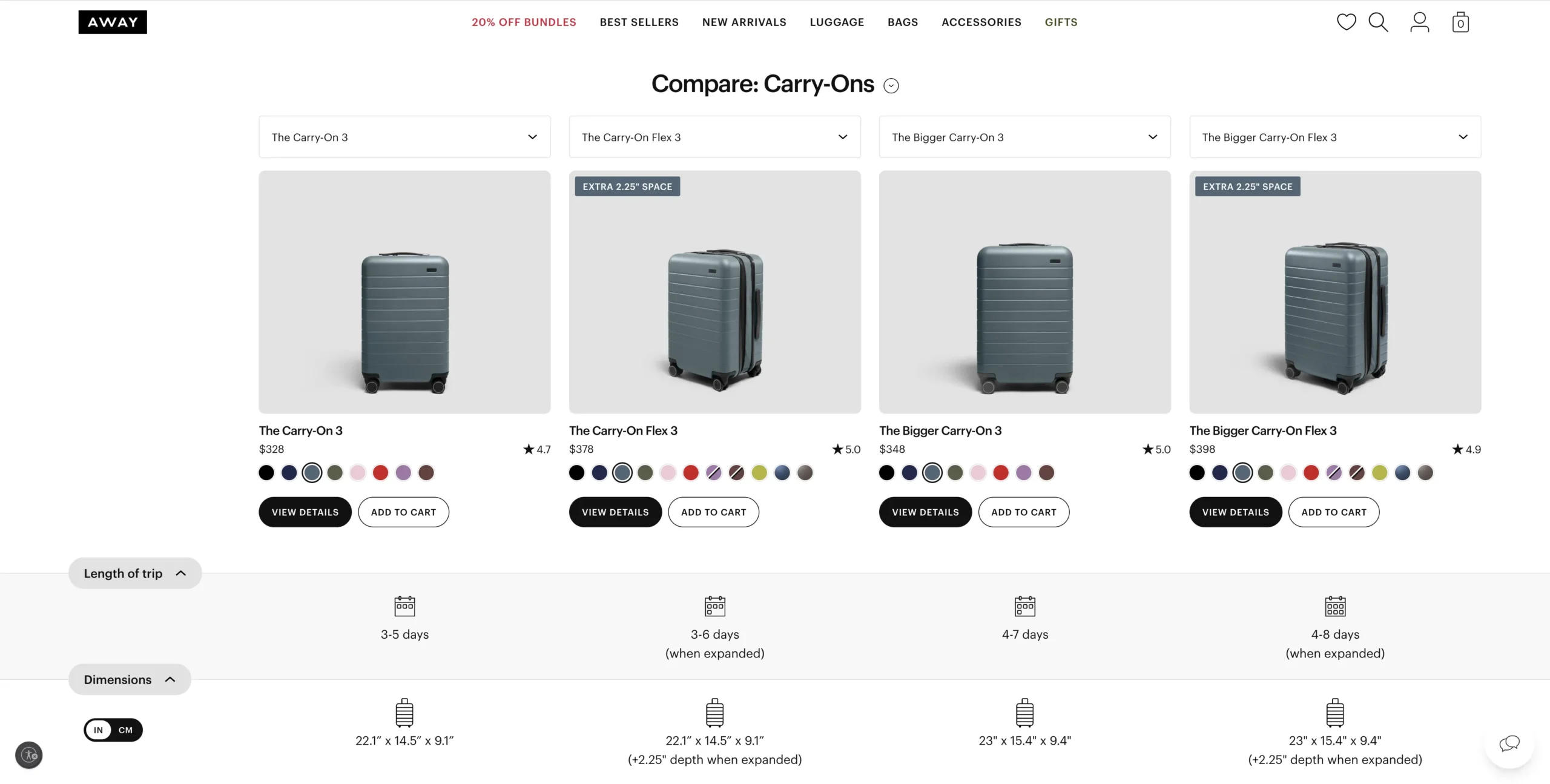
Away’s carry-on comparison page puts four carry-ons side by side. It suits brands whose shoppers can’t decide between your own models.
What to copy
- Rows that answer real questions: trip length, capacity in outfits and liters, weight.
- An add button in each column, so the decision and the purchase happen in one place.
- A “v2” in the URL, so it’s been rebuilt at least once. Comparison pages are worth iterating on.
Mobile and speed It passes Core Web Vitals (LCP 2.4 s) and scored 66 in the lab, the second-highest here.
After the click Category tabs (hardside, checked, backpacks, duffles) send shoppers who need more than a carry-on to the next comparison.
Which Landing Page Examples Work for Products That Need Explaining?
Some products need more explaining than one page can hold. The mini-site idea from the 2020 post still works: split the story into sections or pages the shopper picks.
9. Instant Pot: Dual Action multi-cookers
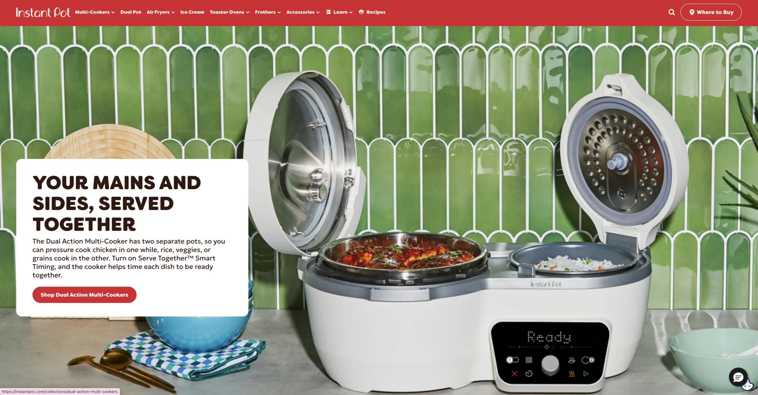
Instant Pot’s Dual Action page introduces a product family rather than one SKU. It suits a new product line that needs a “what is this?” page first.
What to copy
- One-line positioning first (“Your mains and sides, served together”), then four benefit tiles.
- A grid of cooking programs and recipe cards that show what owners actually make.
- Repeated “Shop” buttons into the two color options, so the explainer never becomes a dead end.
Mobile and speed The fastest page for real users in this test: LCP 0.7 seconds, INP 100 ms, a clean pass.
After the click Shoppers arrive on the product page with their color already chosen.
10. BOOM! by Cindy Joseph: product, reviews and story pages
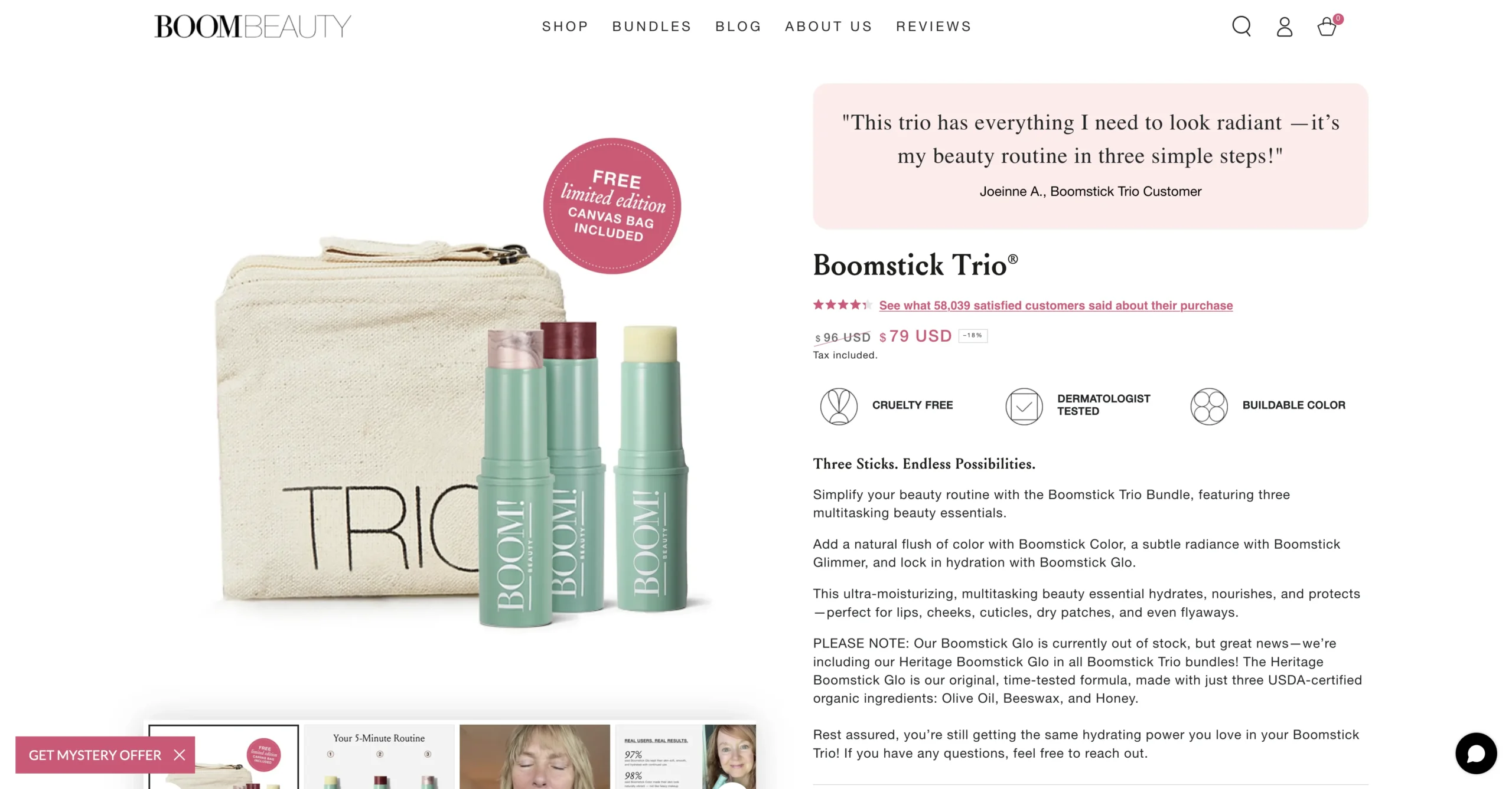
A disclosure first: BOOM! is part of the Zipify family of brands. Its Boomstick Trio page, a separate reviews page and a founder story page work together as a mini-site. It suits brands whose story is part of the reason to buy.
What to copy
- A customer quote at the top of the page, above the product name, where shoppers look first.
- A dedicated reviews page with video testimonials, linked for shoppers who want more proof.
- A story page with a shopping button after each section.
Mobile and speed PageSpeed Insights had no real-user data for this page; the lab score was 29.
After the click A “Love this? Then you may also enjoy” row recommends related products below the reviews.
Which Landing Page Examples Work for Warm Email and SMS Traffic?
Subscribers already trust you, so these pages focus on order value. Bundles do their best work here, and the idea continues after the click when you add a cart or post-purchase upsell with OneClickUpsell (OCU). For more ideas by category, see these upsell examples for Shopify stores.
11. Death Wish Coffee: Build Your Own Bundle
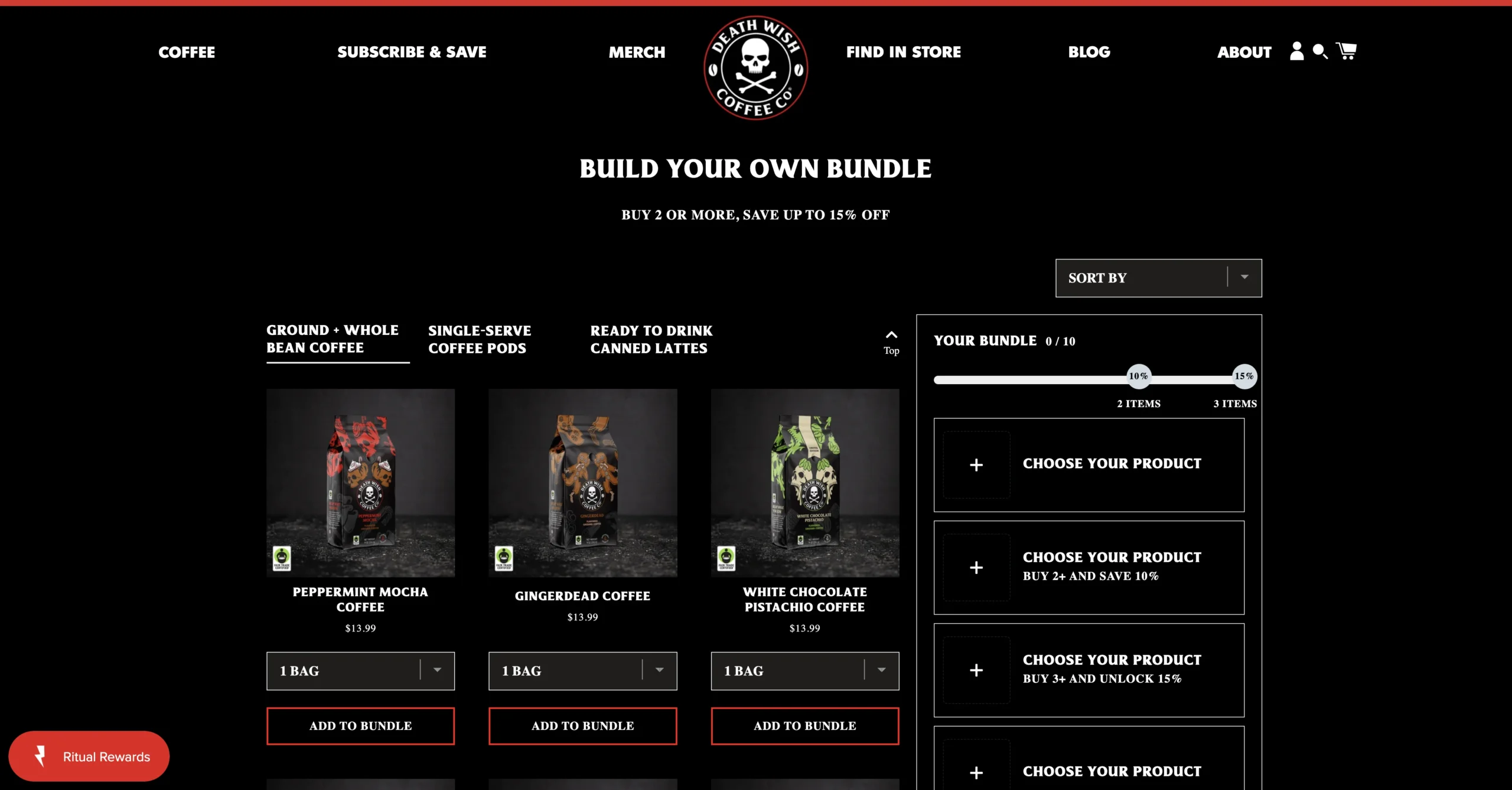
Death Wish Coffee’s bundle builder lets shoppers fill a box with their own picks. It suits consumable brands with many flavors or formats.
What to copy
- A box with 10 slots and a progress bar, so shoppers see how close they are to a full bundle.
- Discount tiers spelled out (buy 2 or more and save 10%, buy 3 or more for 15%).
- Tabs by format (ground and whole bean, pods, ready-to-drink), so the builder isn’t one long scroll.
Mobile and speed It shows the cost of interactive widgets: layout shift for real users is 0.78, far above the 0.1 limit, so it fails Core Web Vitals.
After the click The builder is the upsell: every tier adds a bigger discount for a bigger order.
12. Brooklinen: All Bundles
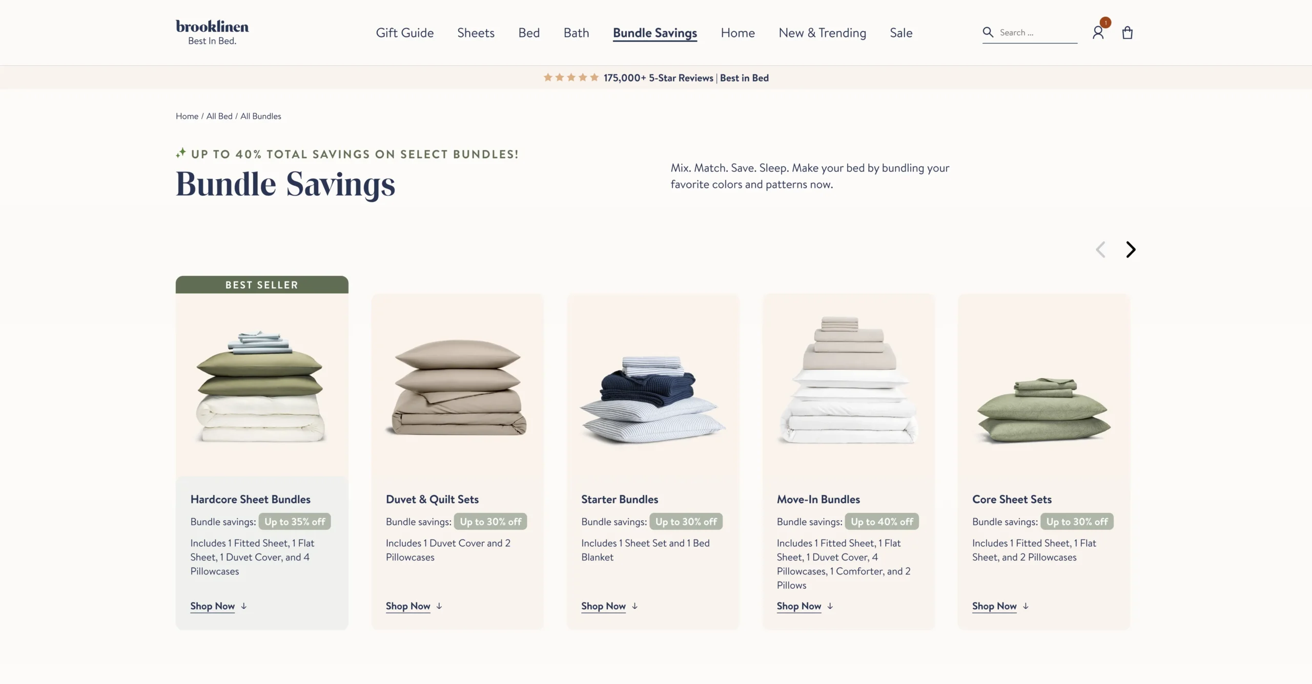
Brooklinen’s bundles page is a hub of ready-made sets. It suits a sale email to a list that already knows the product.
What to copy
- Each bundle lists exactly what’s inside and its maximum saving (up to 35% on the Hardcore Sheet Bundle, up to 40% on Move-In).
- Strike-through prices on every card, so the saving shows before anyone opens a product.
- A “Shop by fabric” filter for shoppers who already know what they like.
Mobile and speed Real users see the main content in 1.7 seconds, but the page fails Core Web Vitals on tap response (INP 206 ms).
After the click Bundles of different sizes sit side by side, so the bigger one is easy to compare.
Which Landing Page Examples Work for Launches and List Building?
Opt-in pages, also called squeeze pages, collect an email address instead of a sale. Brands use them to warm up an audience before a launch or a big sale.
13. CABINZERO: Black Friday early access
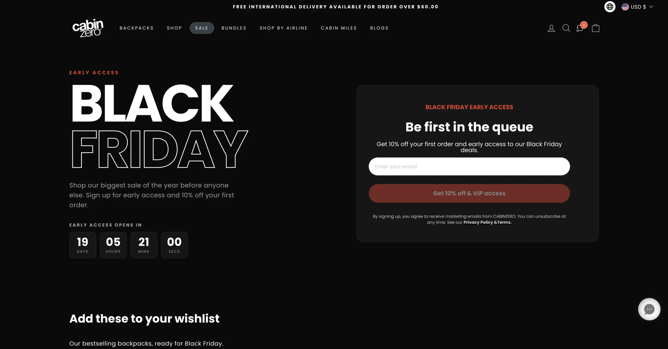
CABINZERO’s early access page asks for one thing: an email address. I didn’t find a live pre-order page on a Shopify store when I checked, so this is the launch-style example.
What to copy
- One email field with a clear trade: 10% off plus early access.
- A live countdown to the date early access opens.
- A five-question FAQ below the form (when it opens, how to use the code, how to unsubscribe).
Mobile and speed The highest lab score here (82), but real users see a slow tap response (INP 270 ms), so it fails Core Web Vitals.
After the click A wishlist row shows four backpacks with prices, so subscribers know what to come back for.
How Fast Do These Shopify Landing Page Examples Load on a Phone?
Most of these pages show their main content fast, but fewer than half pass all of Google’s Core Web Vitals. Of the 12 pages with real-user data, 9 had a good largest contentful paint (LCP) of 2.5 seconds or less, and only 5 passed all three metrics.
Google’s Core Web Vitals thresholds are LCP of 2.5 seconds or less (main content appears), INP of 200 milliseconds or less (the page responds to a tap) and CLS of 0.1 or less (the layout stays put). A page passes when 75% of visits meet all three.
Scroll sideways for more →
| Page | Core Web Vitals | LCP | INP | CLS | Lab score |
|---|---|---|---|---|---|
| HexClad listicle | Failed | 2.5 s | 220 ms | 0.03 | 30 |
| HexClad 12-piece | Passed | 2.3 s | 187 ms | 0.02 | 28 |
| SNOW | Passed | 1.4 s | 136 ms | 0 | 38 |
| Graza | Failed | 4.6 s | 153 ms | 0 | 33 |
| Frank Body | Passed | 1.5 s | 123 ms | 0.05 | 62 |
| Branch | Failed | 3.4 s | 321 ms | 0.01 | 41 |
| Ooni | Failed | 2.5 s | 179 ms | 0.14 | 21 |
| Away | Passed | 2.4 s | 195 ms | 0.02 | 66 |
| Instant Pot | Passed | 0.7 s | 100 ms | 0 | 35 |
| BOOM! | No data | – | – | – | 29 |
| Death Wish Coffee | Failed | 2.6 s | 186 ms | 0.78 | 29 |
| Brooklinen | Failed | 1.7 s | 206 ms | 0.04 | 30 |
| CABINZERO | Failed | 1.9 s | 270 ms | 0.03 | 82 |
Source: Google PageSpeed Insights, mobile, November 6, 2026. Core Web Vitals, LCP, INP and CLS are real-user data for the previous 28 days; the lab score is one simulated run.
Two patterns stood out. Tap response was the most common failure: 4 of the 7 failing pages respond slower than 200 milliseconds, and they lean on pickers, bundle widgets and popups. And lab scores look alarming (median 33 out of 100) on pages real shoppers find fast, so read field data first and use the lab report to find fixes.
What Do the Best Shopify Landing Pages Have in Common?
Five habits repeat across these 13 Shopify landing page examples, whatever the product or traffic source:
- The headline continues the traffic source. HexClad builds a separate listicle for each partner’s audience.
- Proof sits next to the price. Review counts, ratings or press quotes appear near the buy button, not only at the bottom.
- The biggest objection gets its own section. Coating safety for HexClad, assembly for Branch, capacity for Away.
- One next step stays obvious. Long pages repeat the same call to action instead of offering five.
- The page grows the order. 8 of the 13 pages put a bundle, quantity tier or add-on next to the main offer.
For the full checklist, see the elements every high-converting landing page needs and how to write landing page copy that converts.
How Do You Build a Landing Page Like These on Shopify?
You can build a landing page on Shopify with your theme’s editor or with a page builder app. The theme route is free: you create a page template in the theme editor, build it from your theme’s sections (up to 25 per template) and assign it to a page or product. The limit is which sections your theme has. No comparison table or bundle picker means a developer.
A page builder app adds drag-and-drop layouts, templates and usually split testing. Zipify Pages is ours, made for direct-response pages like the presells, long-form pages and bundle pages above. It has 125+ templates tested on Zipify’s own brands, split testing on every plan, and plans from $19 a month after a 14-day free trial. To weigh several tools, see where I compared Shopify landing page builders.
After you publish, check the page in PageSpeed Insights and in Shopify’s web performance report, because widgets and apps add weight. Then split-test the headline and the offer before anything cosmetic; these split test strategies for product pages show where to start.
The Verdict
The best Shopify landing page examples aren’t the prettiest ones. They’re the ones built for a specific visitor. Find the section that matches your biggest traffic source, copy three elements from one example, and test the page on a phone before you pay to send ads to it. If you want to build and split-test those pages without waiting on a developer, that’s what Zipify Pages is for.
Frequently Asked Questions
Can you build a landing page on Shopify without an app?
Yes. Create a page template in your theme’s editor, add the sections your theme offers, and assign the template to a page or product. It’s free. Comparison tables, bundle pickers and split testing usually need a developer or an app.
Should a landing page keep your store’s navigation menu?
It depends on the traffic. Removing the menu keeps cold visitors focused on one action, which is why many presell pages drop it. HexClad’s listicle shows only its logo, while its 12-piece sales page keeps a short three-link menu for shoppers who want to browse. If you’re unsure, split-test both versions on the same ad and compare orders, not clicks.
Do presell or advertorial pages need an ad disclosure?
Yes, when a partner or creator is paid or gets free products to endorse you. The FTC’s Endorsement Guides FAQ says that connection must be clearly disclosed. An article-style page that’s really an ad shouldn’t hide it, especially on per-creator versions of the same page.
How many landing pages does a Shopify store need?
Start with one page per traffic source that gets real ad spend, plus one per major offer. For most growing stores, that’s 2 to 4 pages: cold social, your best-selling bundle and email promotions. Add a page when a new audience or offer earns its own budget, and use the Shopify landing page examples above as your starting templates.