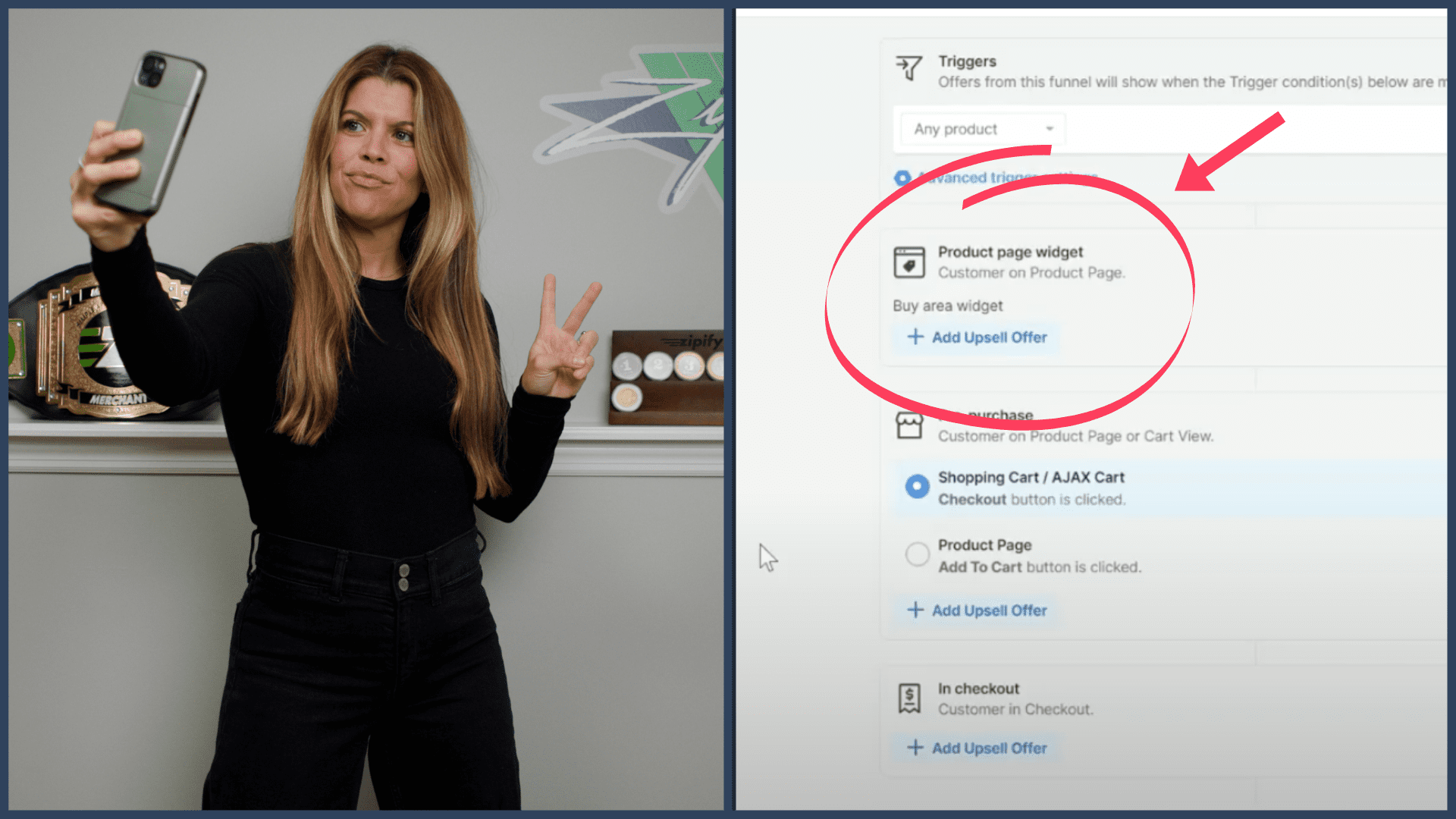

HEATMAP ANALYSIS: 4 WINNING CONVERSION STRATEGIES
In this video, Zipify Founder Ezra Firestone uses heatmap software to analyze a few of our pages…
And gives you some of our new winning conversion strategies. Take a look!
THE #1 SPOT ON YOUR CATEGORY PAGE
When looking at the heatmap of our store’s category page, we saw that the product at the top left of the page was getting the most clicks.
So we tried moving our flagship product (with a higher price) to the top left spot, and — lo and behold! — it started getting the most clicks.
We recommend running a test where you move your favorite product to the top left of your category page and see how it performs.
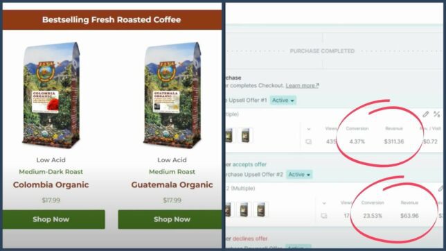
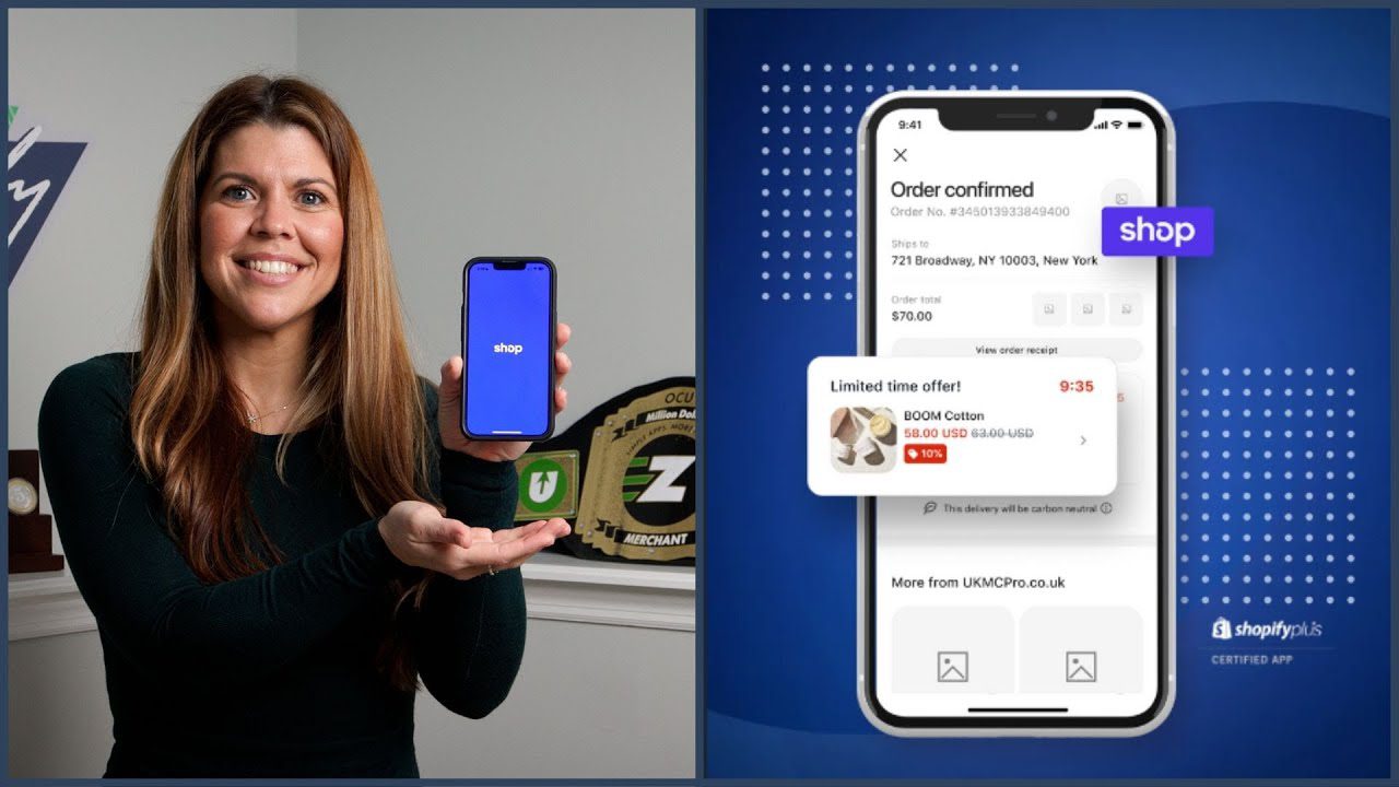
COUPON BAR CONVERTS AT 12% TO COLD TRAFFIC
On our 2017 Holiday Sales Page, we incorporated a sticky bar that stayed with visitors on the side of their screen as they scrolled.
This bar featured that day’s coupon code as well as a countdown timer, reminding people that we were running a sale and that this discount was a limited time offer.
And it did very well.
Then we had this idea: What if we included the same sticky bar on our site’s store, showing it to cold traffic viewing our category page and product pages?
So we tested it, and the conversion rate difference was astronomical, converting at 12% to cold traffic on our site.
We’ll definitely be using this strategy during our next promotion (and we’ve added the Sticky Coupon Bar functionality to our ecommerce landing page builder, Zipify Pages).
INCREASE CONVERSIONS ON YOUR SALES PAGES
This is nothing new, but it’s so important…
Sticking countdown timers at the top of your pages will almost always generate more conversions.
That’s why we include them on so many of our single-event, urgency-driven sales pages.
Your visitors are so bombarded with emails, ads and phone calls that to attract their attention and get them to take action, you need the extra urgency to say “Hey, this is a limited time offer. Buy now!”
KEEP YOUR CTA VISIBLE WITH A “STICKY HEADER”
When visitors are on your pages, it’s so important that they have easy access to a prominent, clear call to action.
That’s why we started using “stick headers” on some of our pages.
As visitors scroll through a page consuming content, the header “sticks” to the top of the page and remains visible…
Along with the header’s call to action. (Note: You should be including CTAs in your headers.)
In the video, you can see that this sticky header is getting a ton of clicks on both desktop and mobile…
Which is why we’re now experimenting with a sticky buy box. It’s winning the test right now, and we have a feeling you’ll be seeing it soon!
ADD THESE FEATURES (AND MORE) TO YOUR STORE
If you use Shopify, and you want to supercharge your store with these features and more winning conversion strategies…
Check out our ecommerce landing page builder, Zipify Pages: High-converting sales pages and funnels made easy.
Try Zipify Pages