

Want to make more money from mobile traffic?
Ezra here, and In this post I’m going to help you copy the two small changes I made to my online store that more than doubled my mobile conversion rate, increased email subscribers by 22% and greatly improved the shopping experience for my customers.
And the nice thing is, you don’t need to change anything about your actual sales pages or the content of your store…
All you need to do to get results is update the header on your store.
(And if you’re already a Zipify Pages user, all you need to do is click a few buttons to enable these features.)
Let’s start with the changes I made to the mobile header of my store.
Mobile Header “Phase 1”
In August 2017, this is the layout I was using for my store’s mobile header:
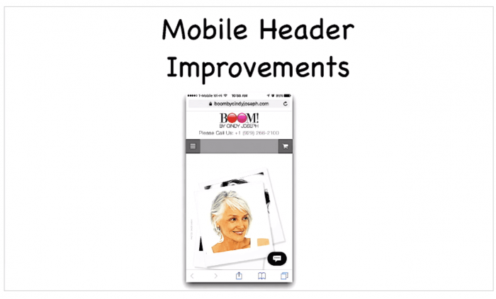
It’s not a very good one, and here’s why:
- There’s a huge logo at the top that takes up too much space
- The phone number is front and center (again, taking up space)
- And see that big grey bar? It’s doesn’t do anything!
During the time I was using this header, 52% of my total traffic was viewing my website on a smartphone and 25% was viewing it on tablet.
So essentially, 77% of everyone interacting with my brand was forced to engage with this header, and that traffic represented millions of dollars in Facebook ad spend.
Here Was the Problem…
My mobile conversion rate was down (way down) compared to desktop, and my per session value on mobile wasn’t good either:
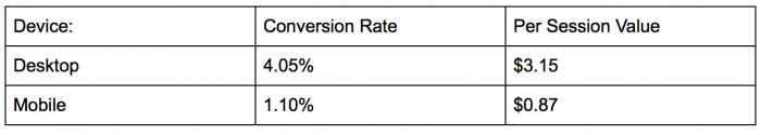
I needed to get these numbers up, so I started toying with our mobile header.
The reason I focused on the mobile navigation and not, say, our sales copy, is because anyone who engages with my store on mobile must engage with this header first.
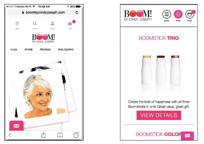
So, I made some simple design improvements, added a few buttons, and this is what it ended up looking like:
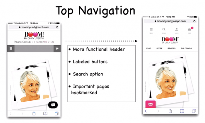
The first thing you see is that the new header takes up a lot more screen real estate, but there’s also a lot more action they can take.
(This is not the final version, by the way, but it was a major improvement.)
I also added a “back to top” button to our mobile pages that appeared whenever the user started scrolling back up, automatically returning them to the top of the page. Similarly, the header menu and icons automatically dropped down whenever you started scrolling back to the top of the page.
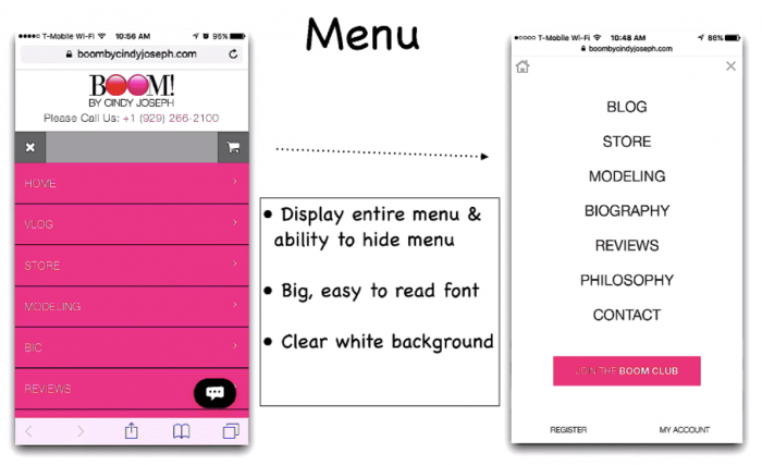
And finally, I redesigned our fly-out menu to be easier to read:
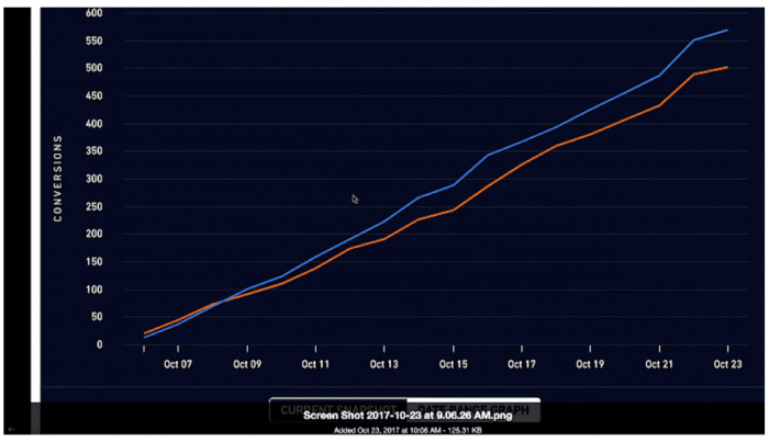
After making these improvements to our mobile header, the change in conversion rate from August 2017 to April 2018 was very significant:
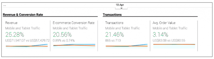
Mobile revenue shot up 25%, mobile conversion rate went up 20%, and the number of transactions increased 21%.
(This is all from cold traffic, by the way!)
A 20% increase in conversions means a 20% increase in total sales from mobile traffic on our store, just by improving the shopping experience on a mobile device. That’s a huge win for any business.
Here are some other exciting results from this change:
- Average revenue per user increased from $6.87 to $7.25.
- Average order value jumped from $65.84 to $70.34.
Now I’ll show you what I’ve done to this header since April 2018 to get these numbers even higher and increase visits to our product pages.
Mobile Header “Phase 2”
Once we saw these initial results from optimizing our mobile experience, we went all in.
We scaled down our header to adhere to what I call the 15% Height Rule, taking up less real estate above the fold.
To show you what I mean, here’s our header from Phase 1 on the left (look how much space it takes up at the top!), versus our new header from Phase 2 on the right:
By following the 15% Height Rule, I have more space to show off the products without losing any functionality.
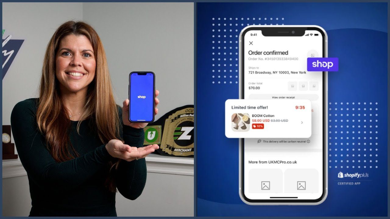
I also added a “Shop” icon:
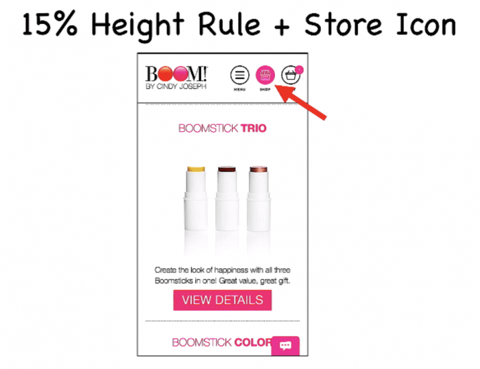
And want to hear something crazy? This “Shop” icon is a game-changer! This one little tweak increased visits to our store page by 86%…
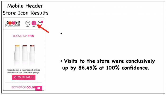
86% more people shopped our products because of one icon. That’s incredible.
My biggest goal for cold traffic is to get them to view my products, so with 86% more product views, just think about the impact that can have on your business.
Changes to the Fly-out Menu
Another update we made to our mobile header was to make the fly-out menu even easier to read and exit out of:
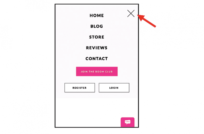
The text is bigger, and that big “X” means users can quickly flip between your mobile navigation and your actual store pages.
Plus, simplifying the menu means it’s one less point of friction for your customers that might otherwise harm their mobile shopping experience.
Final Results: Oct. 2018 to Feb. 2019
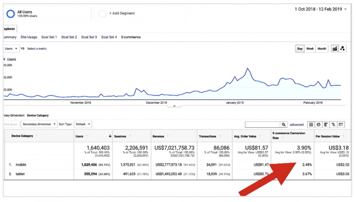
Since August of 2017 our mobile conversion has more than doubled from 1.1% up to 2.48%, and up to 3.67% on tablet.
Converting more of your mobile traffic is one of the biggest sales opportunities you have right now in your business, but it’s also one of the areas most stores struggle with.
To help you take what you learned in this post and instantly copy it for your store, I’ve added all of these new features to Zipify Pages, my landing page and sales funnel builder for Shopify.
Check out the 6:00 minute mark of this video to see how easy it is to use.
Optimizing for Desktop Traffic: How I Increased Email Sign-ups by 22%
Next, I’m going to tell you about a test I ran on my store that gave us a massive boost in email subscribers.
We drive a lot of cold traffic / awareness traffic to article pages, and in particular, an article called “5 Makeup Tips for Older Women”.
This is called a pre-sell engagement article because it engages new visitors in a conversation about a problem then introduces our product as the solution. On this page, we only have two goals:
- Get subscribers to our email list so we can communicate with them later
- Get people to check out our products
That’s it. Those are the only two things we want these people to do, and that’s why we created a “double header” for this page:
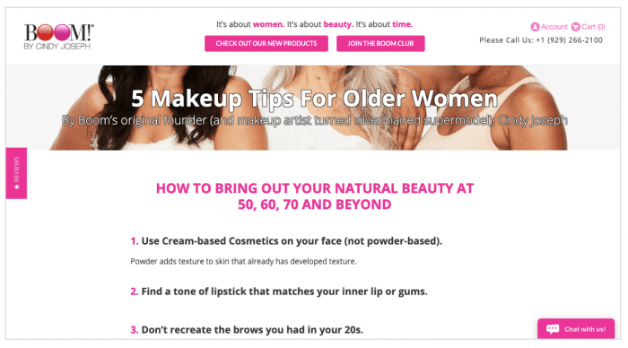
This is actually a “sticky” header, which means it sticks to the top of the page even as they scroll down, so those two calls to action are always visible.
Since we started testing this two years ago, this style of header has become very popular among ecommerce brands. Let me show you why.
With this small change to our header, I was able to:
- Increase our value per visitor from $1.47 to $1.67
- Increase clicks to Join Our Club by 20%
- Increase email opt-ins by 22%
And unlike most split tests I’ve run, this sticky header never lost to the traditional desktop header it ran against, not even for one day. It was winning the entire time:
Since then, I’ve tested the sticky header concept all across my store: on product offer pages, holiday sales pages, email landing pages… and it continues to perform extremely well.
This sticky header is now built into Zipify Pages, so no matter what call to action you want in your header, you can pin it to the top of the page with the click of a button.
Desktop Traffic Is Still 50% of Revenue
For your business it’s very likely that only 15 – 20% of your traffic is viewing your store on a laptop. However, that 15% of traffic will be worth half your revenue.
Because as prevalent as mobile is, a big percentage of your customers are still going to switch to a desktop or laptop to make a purchase decision. They might see your ad or visit your store on an iPhone, but very likely they’ll switch to a larger device before they convert.
So even though it’s a small percentage of your overall traffic, it’s worth a lot and it’s worth optimizing.
See More at ZipifyPages.com
I love engaging with this community of entrepreneurs and online business owners who are creating great products and sharing them with the world.
And it’s my opinion that if you’re going to spend the money and energy to do all this…
It’s worth it to optimize your sales process to get the highest possible ROI, deliver the best shopping experience to your customers, and continue to grow your business.
Both the mobile and desktop headers I featured in this article are included in Zipify Pages, my landing page and sales funnel builder for Shopify.
Learn more about Zipify Pages at ZipifyPages.com.
Try Zipify Pages