
The Product Offer Page Behind My
$17,269,718.29 Ecommerce Business:
Make more sales from your store’s most valuable page
 Hi, my name is Ezra and I’m an
Ecommerce Expert.
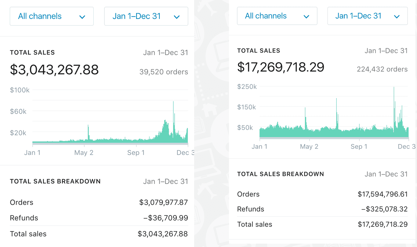
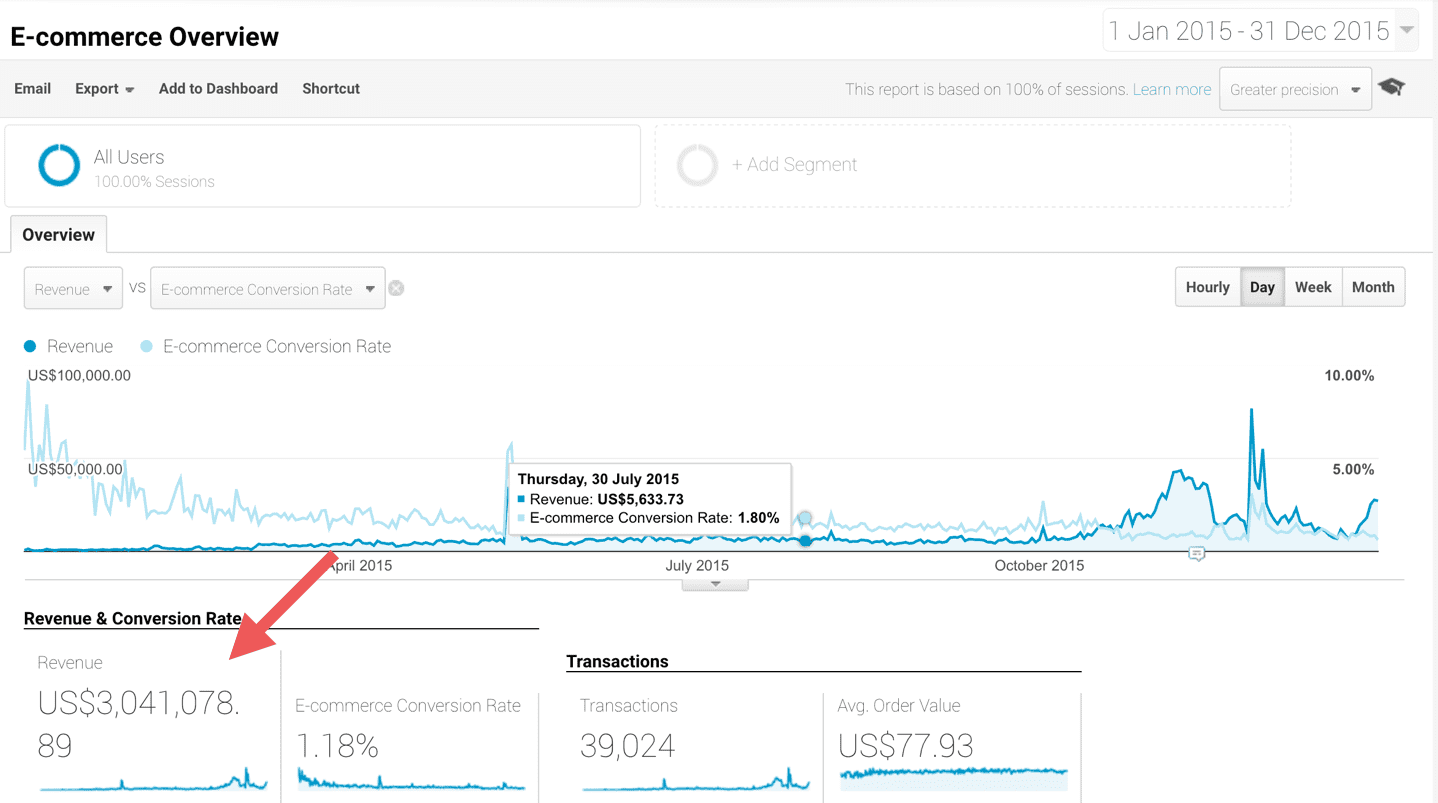
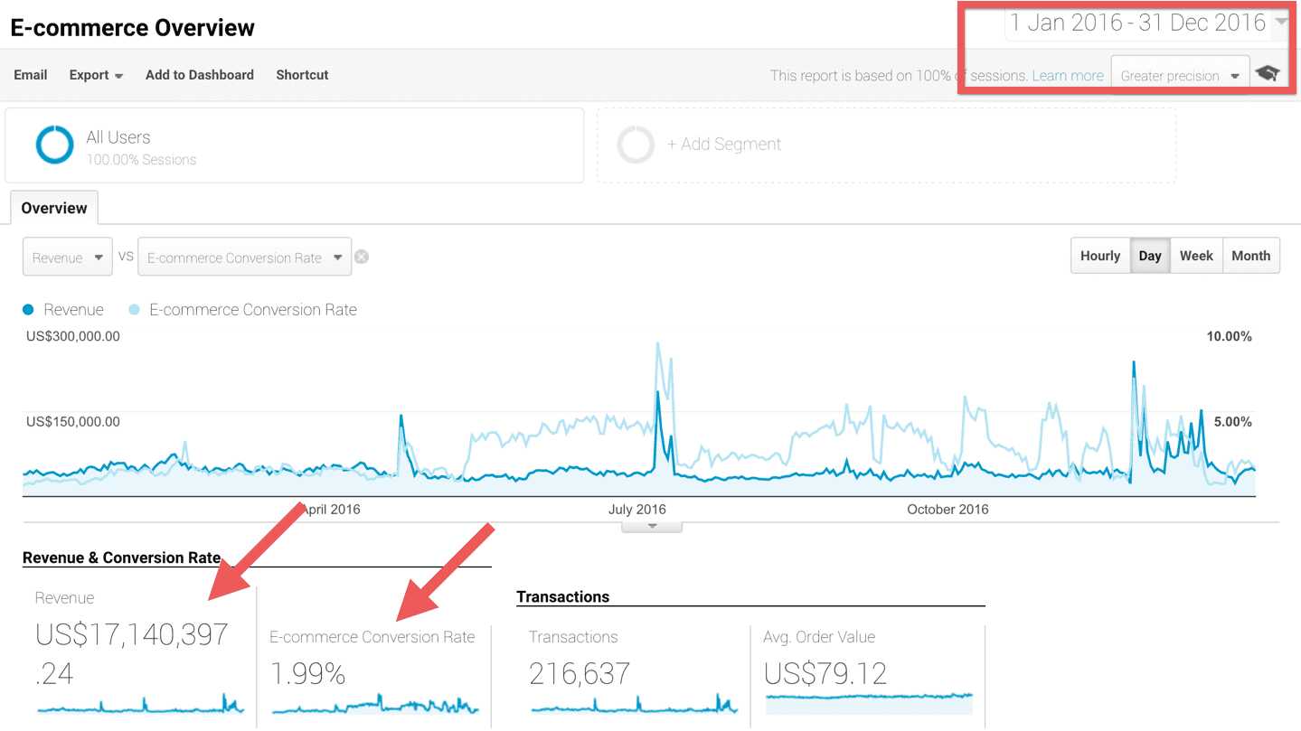
Last year was a very good year for me. My ecommerce businesses generated $22,500,000 in revenue, and $17,269,718.29 of that was from one store that I grew 5x from the year before.
20152016
On top of that I am the leading authority in ecommerce education, I speak at all the major industry events, and I even make ecommerce applications for my good friends at Shopify.
I only tell you all this to communicate that I love this stuff, and that when it comes to how to build a successful ecommerce business…
You can trust that I know what I’m talking about.
And I want to help you grow your business by showing you how to optimize your product offer pages to make more sales.
In this article, you will get…
The 11 conversion assets you need for a high-converting sales page, how to acquire those elements without a designer or developer, and even how to easily copy the winning product offer page behind my $17,269,718.29 ecommerce business.
What is a product offer page?
A product offer page is any page on your website that shows a customer a single product and tells them why they should buy it.
And I’m going to make a bold statement about this page: Your product offer page is the most important page on your website.
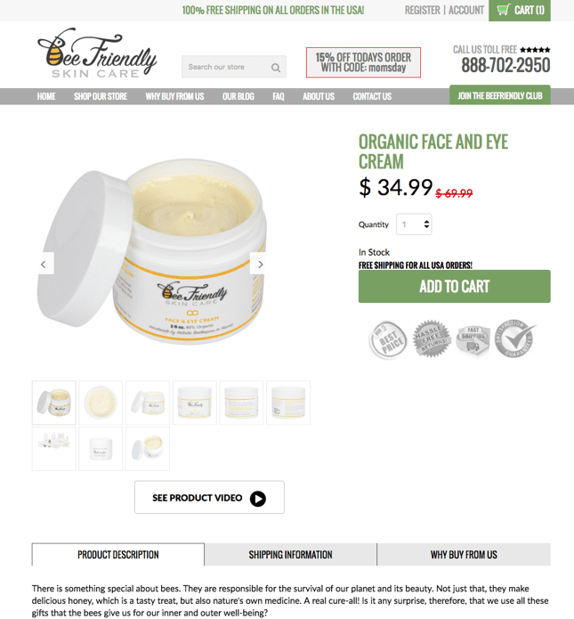
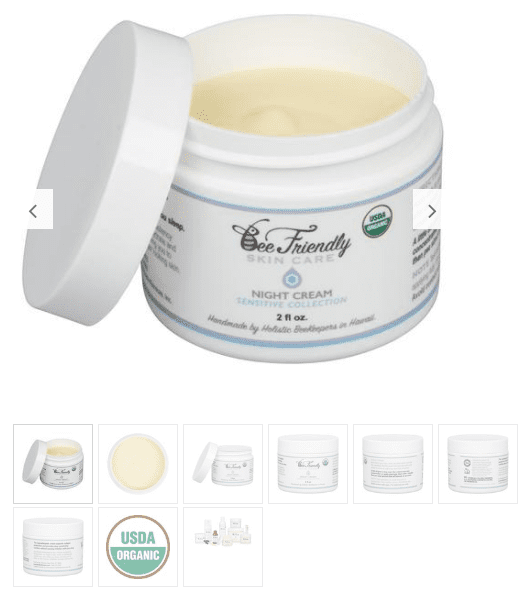
Here is one of the product offer page templates we use for BeeFriendly, my organic skincare Brand:

{hover over image to see full design}
Think about it: A customer has made it deep enough into your funnel to actually view a product. So they stopped scrolling through Facebook to look at your ad, they clicked on it, they might have even clicked through from your home page…
And now they’re finally looking at your product and considering whether or not to do business with you. They’ve shown a lot interest so far—they’re close to becoming a customer!—and now they just need that last little bit of encouragement.
At this moment, it is your job to seal the deal by providing the most compelling pitch for your product.
So how do you use a product offer page to turn a looker into a buyer? What separates a bad product offer page from a good product offer page, or a good one from a great one?
What makes a great product offer page?
I’ve been obsessed with this question since I first got into ecommerce over 10 years ago, and my work in optimizing offer pages is what made me famous in this industry.
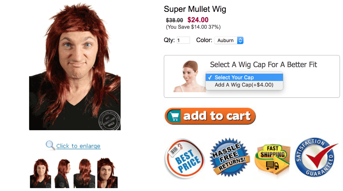
This is my first ecommerce store that I built in 2007. (I was once the #1 seller of mullet wigs in the country!) The design doesn’t look like much by today’s standards, but by implementing some of the page elements I’m about to show you, I steadily increased my conversion rate and average order value until I sold my business (that I created in my NYC bedroom) for $225,500. Not too shabby for a first try.
So what makes a great product offer page? Simply put: It’s great if it converts—if enough people are saying “YES” to your offer.
Last year, by incorporating all the elements I’m about to show you, we not only increased our revenue by 600%, but we also nearly doubled our conversion rate from 1.18% to 1.99%!
The question then becomes, how do you get people to want to say yes?
When analyzing product offers pages, most people will focus on page structure—on what goes where. Specifically, they will focus on the traditional layout vs. the long form layout.
Traditional
The “traditional” offer page is how everyone used to do it. It comes from a time when you wanted everything above the fold (meaning visible when the page loads), because then people don’t have to scroll to view your offer.
Long Form
The “long form” offer page is a more recent trend. It doesn’t worry about getting everything above the fold, the argument being that people are happy to scroll these days (just think of your Facebook News Feed). And by putting page elements below the fold, you can fit more content without hiding it behind tabs. Commerce giants like Apple and Amazon are just two of the brands that have started using long form pages.
So which is better? Well I’ve tested both to death, and I’m happy to say that after 10 years in the business and millions of dollars in ad spend, I can finally provide an answer: Neither is better! It doesn’t matter whether your offer page is traditional or long form, and I’ve built successful brands using both.
The important things are the elements you have on the page, not where those elements are.
I call these elements conversion assets. A conversion asset is a piece of content that assists in converting customers by strengthening your offer. Product description, product images, and unique seller proposition badges are common examples of conversion assets.
So what are the conversion assets I use on the product offer pages of my $17,269,718.29 ecommerce store?
Let’s look at the collection of conversion assets I use, how you can acquire the same assets for your store, and how you can easily copy my exact product offer page and start making more sales in your own ecommerce business.
11 elements you need on your product offer page.
Because different people like to consume content in different ways, these elements will be a mix of text, image and video formats.
The goals of these elements are to:
- Describe the features and benefits of your product
- Provide the details of your offer: price, shipping, guarantees, etc.
- Give social proof
- Establish the authority of your brand
- Cross-sell additional products
And while we said it doesn’t matter whether you use a long form or traditional layout, there are certain elements that you definitely want above the fold. Let’s start with those.
Elements to Have Above the Fold
1. Multiple High-Quality Product Images
You need clear, professional images of your product, and you need a lot of them.
You want multiple images from different angles and distances that show the details and quality of your product (especially anything unique about it). *If possible, you want these images to zoom capability. We already have a lot of images for our products, and I plan on getting more—ideally about 20 images for each of my products.
There are many good product photographers out there, and these images are worth getting professionally done.
2. Well Done Product Descriptions
You want your description to be well formatted—i.e., with headlines, bullets and bolding—so that it is scannable and easy to consume.
It’s also very important that you understand the difference between product features and ownership benefits. Features are the physical attributes of your product—size, ingredients, components, material, etc. Benefits, however, are the reason someone buys your product. It’s the value your product gives them, and that’s what sells.
Ownership benefits will usually be the focus of your description above the fold, while product description usually comes further down.
If you don’t feel comfortable doing this for your product(s), again, it would be worth getting it professionally done by a trained copywriter. Communicating the value of your product is so important.
3. Product Sales Video
“96% of consumers find video helpful when making purchase decisions online.” – Animoto
Your product sales video should provide the ownership benefits and product description in video format so that people who prefer to consume video over image or text can consume your full offer in one place.
We already have image and text, and with video we complete the trifecta of content formats. Once again, it is important that this is professionally done, and you can get a professional product video for relatively cheap—I even have a guy if you’re interested. Just email ezra@smartmarketer.com and I’ll set you up. (I get no commission, he’s just a good dude).
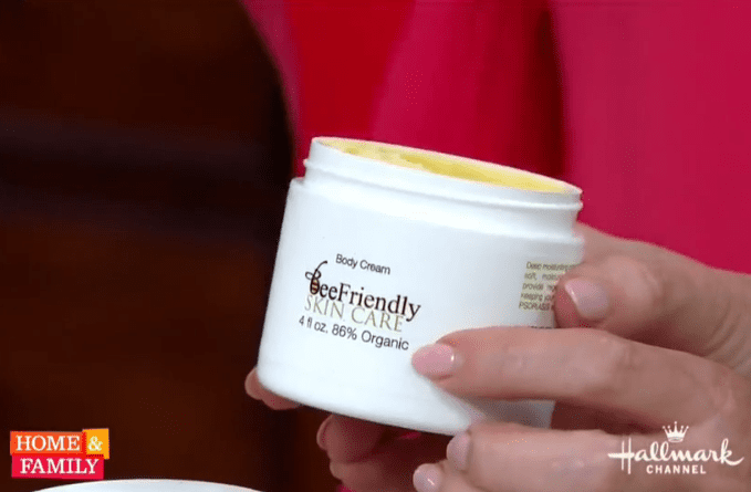
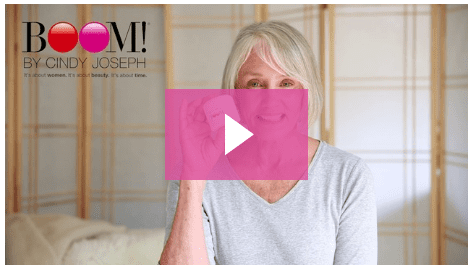
4. 3rd Party Pitch Video/Press Videos
Unlike the Product Sales Video, the 3rd Party Pitch Video is made by someone other than you. Of course we like our product, but customers want to hear that our product is good from outside sources. This is something that will come up again in this article.
Preferably this source is an authority that is relevant to your market—we like to go through Hallmark Home & Family, QVC or local press outlets.
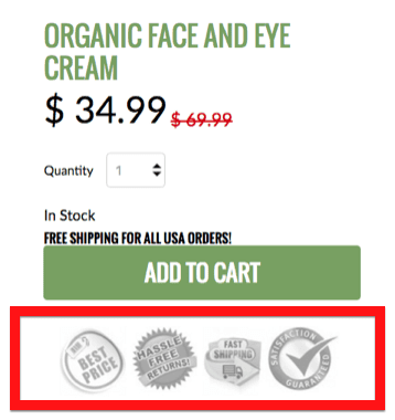
5. Unique Seller Proposition Badges
Your unique seller propositions are the benefits of doing business with your brand: free shipping, satisfaction guaranteed, organic, made in USA, etc.
USP’s are benefits that often do not come from the product itself; rather, they apply to the overall value of your offer.
Think about the USP’s for your offer. You can often find these badges online, or if you need to get one designed, you can do so at very little cost.
6. Add to Cart Button Above the Fold
Even though customers are used to scrolling, you want them to be able to buy right when they land on the page. This is the final element that you need above the fold. With the preceding elements, you’ve given your customer strong reasons why they should buy your product—and now they need to be able to do it!
Many people will argue over what color your add to cart button should be, but in my experience what’s more important is that it stands out on your page. So try to isolate a color on your product detail page that is specifically for calls to action.
5 Other Must-Have Elements
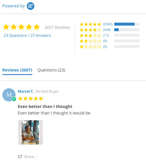
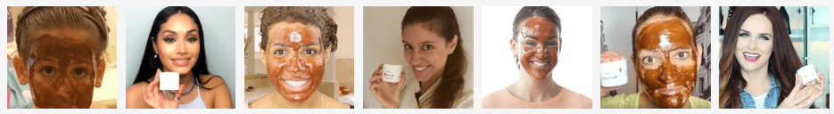
7. Customer Reviews and Selfies.
Reviews and customer selfies are very persuasive forms of social proof, and Amazon has practically cemented the need for reviews (customers really like to see those 5 golden stars!).
This goes back to what we talked about earlier: Customers want to know that other people (who aren’t you) like your product… Especially people just like them! Consider installing a review app like YotPo that integrates with your ecommerce store.
People also love seeing smiling folks holding your product, which is why we showcase customer selfies on our store. A great place to get these is in a post-purchase email, where you incentivize a customer to send you a selfie while holding your product in return for a $10 gift card to your store.
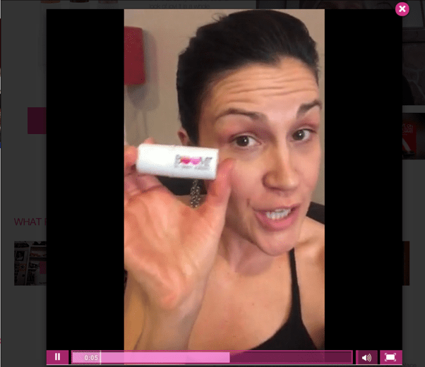
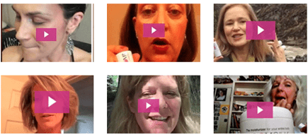
8. Customer Video Reviews
This is probably the most valuable conversion asset on your product detail page. A customer video review combines the power of social proof with the engagement of video.
Similar to customer selfies, you can acquire these by incentivizing customers in a post-purchase email. In this case however, instead of asking for a selfie you’re asking for a short video review of your product. Customers can actually see these people’s smiles, hear their words, and feel their excitement. It’s very powerful.
This element is so important that I made a template specifically for generating these reviews: I call it the Video Review Generator, and the conversion rate is very high. And not only can you use this to increase the power of your product detail page, but you can use it throughout your store and marketing campaigns.
At the end of this article, in addition to telling you how to copy my Product Detail Page, I will also tell you how to copy my Video Review Generator template.
9. “You Might Also Like” Cross-Sells
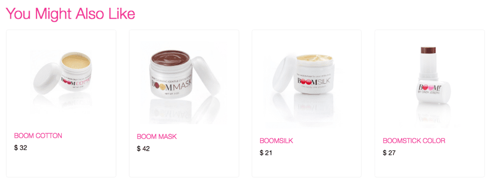
“You might also like” cross-sells are often found at the bottom of the page, where you offer the customer additional products relevant to the one they are viewing on your product detail page.
This is a great page element for increasing average order value and customer lifetime value, two essential metrics for growing an ecommerce business.
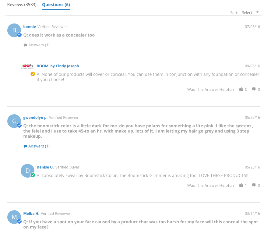
10. FAQ / Q&A
This is more customer-generated content. FAQs and Q&As help answer questions and appease any concerns that a customer might have. You don’t want a customer leaving your page to find information, so this helps keep them around.
The best sources to mine for this content are customer support tickets and post-purchase surveys, which is yet another email I send out in my post-purchase email sequence.
11. The Order Bump “Johnson Box”
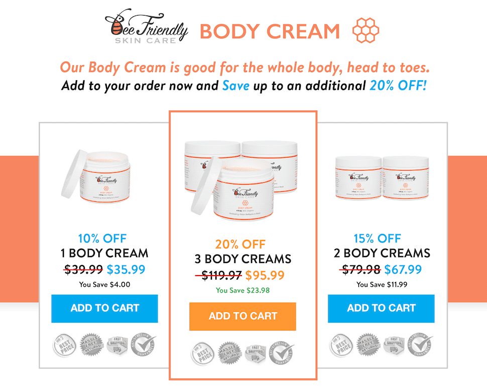
This pre-purchase order bump is an element designed to get customers to buy more than one of your product, and is another way to increase your average order value and customer lifetime value.
When someone is buying one product, we offer them a discount if they buy more than one. And on average, we will sell two. Going from selling 1 product on average to two is doubling your revenue, and it’s pretty astonishing.
12. No Left Navigation! *BONUS TIP*
The space on your page should be dedicated to your offer!
Don’t take up valuable room with a navigation going down the left side of your page. This real estate can be used much more effectively with other content—i.e. larger images, 3rd party pitch videos and other brand promotion, reviews, etc.
There you go. Those are the 11 conversion assets (and 1 bonus tip) I use on the product offer page behind my $17 million business.
Earlier I mentioned a new way for you to quickly copy my product offer page without a designer or developer.
You can do that with an application I created called Zipify Pages. Let me tell you a little about it.
Zipify Pages is a landing page builder for Shopify that lets you easily publish high-converting landing pages right onto your Shopify store. No plugins, no subdomains. The pages publish under your actual store’s URL which makes tracking and retargeting your customers way simpler.
There are other landing page builders out there, so let me tell you why I created this one and why it’s uniquely effective for ecommerce business owners.
First, other landing page builders wouldn’t publish under my Shopify store URL, meaning I had to use subdomains that made it impossible to track my customers for retargeting and attribution. Also, none of the other builders had all 11 of these page elements I was using to grow my ecommerce stores.
So every time I wanted a new product offer page, or wanted to run a holiday sale or launch a new marketing campaign, I had to ask my team to design and code a whole new landing page.
That takes a lot of time and a lot of money. I figure it would take me and my team about 6 weeks. And if I wanted to continue scaling my business, I needed to find a better solution.
So I created Zipify Pages to allow me to quickly launch new sales, marketing campaigns and product pages for my Shopify store as soon as I need them.
Not only does this page builder have all of the most effective elements for ecommerce stores, and a drag and drop builder and WYSIWYG editor that let you easily make custom pages…
But it also includes all of my best page templates from my top-performing funnels. I've spent years and millions of dollars optimizing these pages, and with Zipify Pages you can copy all of them with the click of a button to use in your campaigns.
So in addition to the Product Offer Page Template behind my $17 million dollar business…
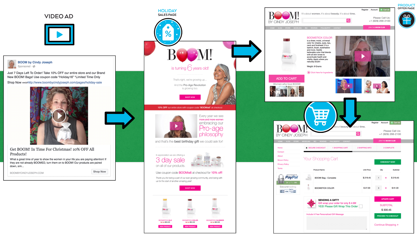
You also get the Holiday Sales Page Template that made me $1 million during my holiday sale last year…
{hover over image to see full design}
Holiday Promotion Sales Page
Are You Running Sales?
You should be! Leading eCommerce stores are running promotional sales every 2 months to prospects and customers alike.
- Run sales year round
- Works for new prospects AND returning customers
- Show products right on sales page
- Top performer from our holiday campaigns
- Generates millions in revenue
- Integrates with Facebook pixel, allowing for easy retargeting
The Pre-sell Engagement Page Template that I built my business on and that I’ve sent roughly $15 million worth of traffic to…
{hover over image to see full design}
5 Tips Pre-sell engagement page
Our secret weapon...
This page has generated more than $15 million to date.
- Perfect for generating leads and sales
- Offer your products right from the article page
- Using the block library, there's no limit to the value this page can add to your funnel
- Works for physical products, information products, services and SaaS
- This template is also perfect for case studies
The Customer Video Review Generator Template that I use to get my store’s most effective conversion asset, which will help you sell more across all your pages…
{hover over image to see full design}
Incentivized Video Review Generator
Your most valuable conversion asset -
User-submitted video reviews are the most compelling social proof you can use in your business.
- Compelling social proof
- Visual directives increase review conversions
- Increase trust in your products and brand
- Perfect for offer pages, email marketing, & ad campaigns
The Free Plus Shipping template for quickly launching new products and incentivizing new buyers…
{hover over image to see full design}
Free Plus Shipping
A pillar in our industry -
The free plus shipping model is a highly effective way to incentivize new buyers.
- Multiple product images
- Product demo video
- Customizable countdown timer (capable of redirecting traffic after it expires)
- Repeated call-to-action buttons
- Left-right content blocks
- Eye-catching design
And many more (plus we add new templates regularly.)
Never before have Shopify users been able to easily publish new landing pages to use in their marketing campaigns and have them hosted right on their store.
It is simply the best landing page builder on the market for growing your ecommerce business.
Want to see all the ways this app will benefit your Shopify Store?